---
url: /components/search/accessibility.md
description: >-
Search lets people enter a keyword or phrase to get relevant information.
Search bars can display suggested keywords or phrases as the user types.
---
# Search
Search lets people enter a keyword or phrase to get relevant information. Search bars can display suggested keywords or phrases as the user types.
[Overview](overview.md) · [Specs](specs.md) · [Guidelines](guidelines.md) · **Accessibility**
## Use cases
People should be able to use assistive technology to:
* Navigate to and focus on a search bar
* View the hinted search text or persistent label
* Input text and complete a search
* Interact with a list of search suggestions and results
* Clear the input text
## Interaction & style
### Autosuggest
When search suggestions and results appear, the screen reader must announce the change. This lets people know list items are available for selection.
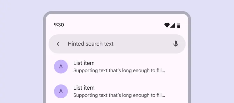
Autocomplete results should be announced by the screen reader
## Initial focus
Initial [focus](../../foundations/interaction/states/applying-states.md#bc6d6853-48ef-490e-8076-448e89e69f0f "A focused state communicates when a user has highlighted an element, using an input method such as a keyboard or voice.") lands on the first interactive element. This is often a leading [icon button](../icon-buttons/overview.md "Icon buttons help people take minor actions with one tap.") or [text field](../text-fields/overview.md "Text fields let users enter text into a UI."). A leading icon button usually activates search directly or opens a navigation component.
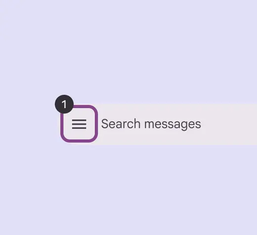
Initial focus can land on a leading icon
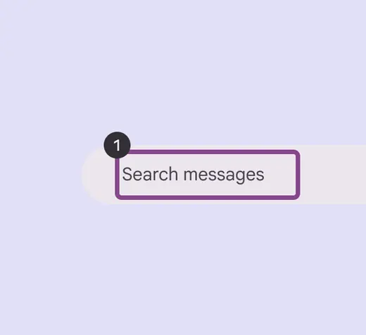
If there’s no leading icon, focus lands on the text field
## Keyboard navigation
| **Keys** | **Actions** |
| ------------------------------ | ---------------------------------------- |
| **Tab** or **Shift** + **Tab** | Navigate between interactive elements |
| **Space** or **Enter** | Activate the search text field for input |
| **Arrows** | Navigate between search result items |
## Labeling elements
The hinted search text should be used as the accessibility label describing the search bar.
The role for the input field should be:
* Android: **Text field**
* iOS: **Search field**
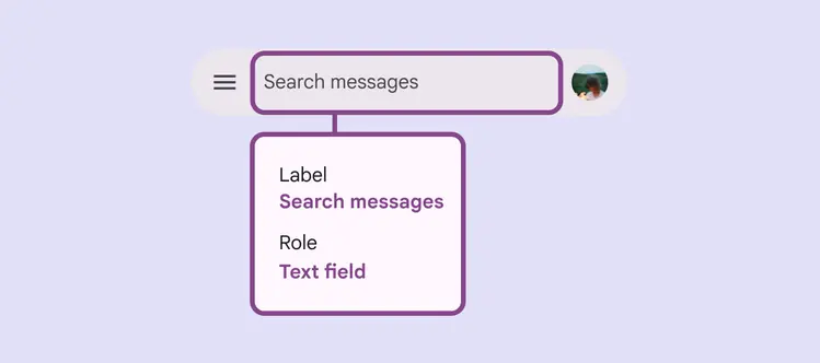
The accessibility label should match the hinted search text
Leading and trailing icon buttons should be labeled according to their [accessibility guidance](../icon-buttons/accessibility.md).
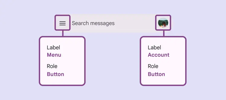
Use icon labels for icon buttons
Search suggestions and results use the list component. Screen readers automatically announce the results as a list.
For accessibility labels, follow the [list accessibility guidelines](../lists/accessibility.md).
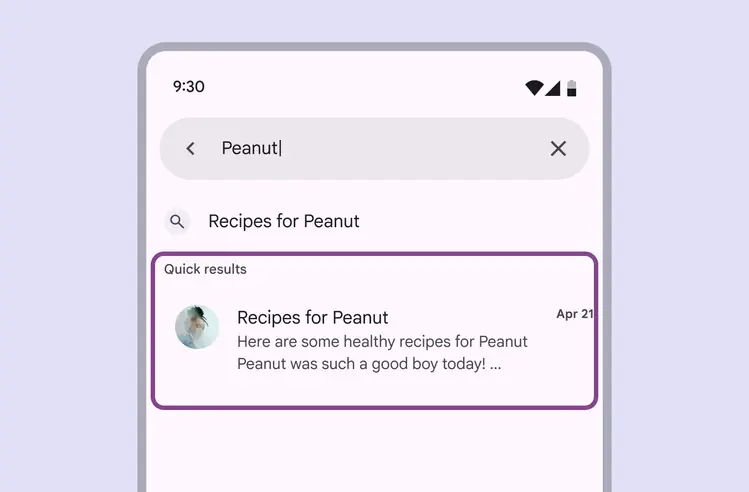
Search suggestions and results are created using lists