---
url: /components/progress-indicators/specs.md
description: >-
Progress indicators inform users about the status of ongoing processes, such
as loading an app. It show the status of a process in real time.
---
# Progress indicators
Progress indicators inform users about the status of ongoing processes, such as loading an app. It show the status of a process in real time.
[Overview](overview.md) · **Specs** · [Guidelines](guidelines.md) · [Accessibility](accessibility.md)
## Variants

1. Linear progress indicator
2. Circular progress indicator
| Variant | M3 | M3 Expressive |
| --------------------------- | :-------: | :-----------: |
| Linear progress indicator | Available | Available |
| Circular progress indicator | Available | Available |
## Configurations
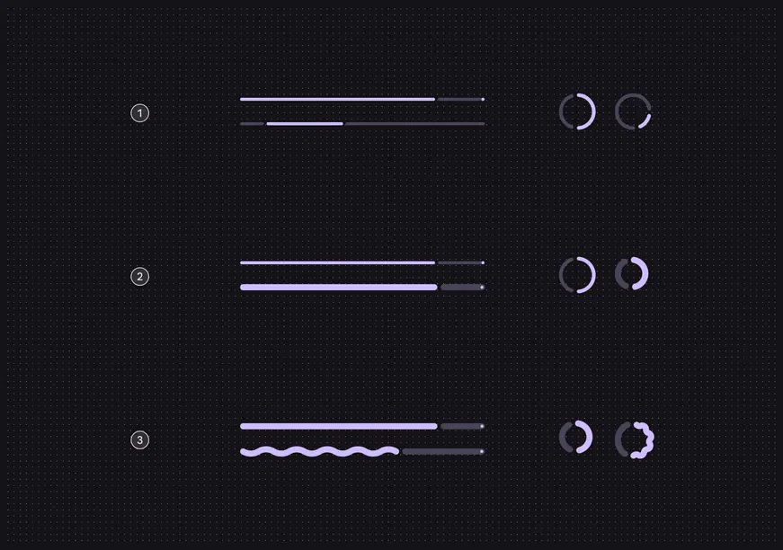
1. Behavior: Determinate and indeterminate
2. Thickness: Default (4dp) and variable
3. Shape: Flat and wavy
| Category | Configuration | M3 | M3 Expressive |
| --------------- | ------------------------------------ | :-------: | :-----------: |
| Behavior | Determinate (default), Indeterminate | Available | Available |
| Track thickness | Fixed (4dp) | Available | Available |
| Track thickness | Configurable | -- | Available |
| Shape | Flat (default) | Available | Available |
| Shape | Wavy | -- | Available |
## Tokens & specs
Browse the component elements, attributes, tokens, and their values. [View baseline tokens](#c6f484b0-2bc6-4d37-bd75-f859a35a3594)
::: token-table token-table-6f51f7ab7775a392-ab026e7f
**Progress indicators tokens** · 3 token sets · 38 tokens · [live token table](https://m3.material.io/components/progress-indicators/specs) · DSDB `TOKEN_TABLE.6f51f7ab7775a392`
* Default context: Theme: Light · Platform: Android · Audience: 3P · Contrast: Default · iOS dark theme elevation: None · iOS weight setting: Default
* Not configurable here (group default used): Motion scheme: Standard · Font: Static · Language height: Small
* Other contexts: Theme: Dark · Contrast: Medium contrast, High contrast. "Other contexts" lists values that differ from the default when only that one context changes.
* Reference chain: aliases from the token to its source value (`token → alias → … → value`). "—" means the token holds a literal value.
**Progress indicator - Linear** · `md.comp.progress-indicator.linear` · 17 tokens
For linear progress indicators.
| Group | Token | Type | Reference chain | Resolved value | Other contexts |
| --- | --- | --- | --- | --- | --- |
| Linear - baseline | `md.comp.progress-indicator.linear.with-wave.height` | Length | — | `10dp` | — |
| Linear - baseline | `md.comp.progress-indicator.linear.active-indicator.thickness` | Length | — | `4dp` | — |
| Linear - baseline | `md.comp.progress-indicator.linear.track.thickness` | Length | — | `4dp` | — |
| Linear - baseline | `md.comp.progress-indicator.linear.stop-indicator.size` | Length | — | `4dp` | — |
| Linear - baseline | `md.comp.progress-indicator.linear.track-active-indicator-space` | Length | `md.sys.measurement.space50` | `4dp` | — |
| Linear - baseline | `md.comp.progress-indicator.linear.stop-indicator.trailing-space` | Length | `md.sys.measurement.space0` | `0dp` | — |
| Linear - baseline | `md.comp.progress-indicator.linear.active-indicator.wave.amplitude` | Length | — | `3dp` | — |
| Linear - baseline | `md.comp.progress-indicator.linear.active-indicator.wave.wavelength` | Length | — | `40dp` | — |
| Linear - baseline | `md.comp.progress-indicator.linear.indeterminate.active-indicator.wave.wavelength` | Length | — | `20dp` | — |
| Linear - baseline | `md.comp.progress-indicator.linear.height` | Length | — | `4dp` | — |
| \[Deprecated] Linear - thick | `md.comp.progress-indicator.linear.thick.active-indicator.thickness` (deprecated) | Length | — | `8dp` | — |
| \[Deprecated] Linear - thick | `md.comp.progress-indicator.linear.thick.with-wave.height` (deprecated) | Length | — | `14dp` | — |
| \[Deprecated] Linear - thick | `md.comp.progress-indicator.linear.thick.track.thickness` (deprecated) | Length | — | `8dp` | — |
| \[Deprecated] Linear - thick | `md.comp.progress-indicator.linear.thick.stop-indicator.size` (deprecated) | Length | — | `4dp` | — |
| \[Deprecated] Linear - thick | `md.comp.progress-indicator.linear.thick.track-active-indicator-space` (deprecated) | Length | — | `4dp` | — |
| \[Deprecated] Linear - thick | `md.comp.progress-indicator.linear.thick.stop-indicator.trailing-space` (deprecated) | Length | — | `2dp` | — |
| \[Deprecated] Linear - thick | `md.comp.progress-indicator.linear.thick.height` (deprecated) | Length | — | `8dp` | — |
**Progress indicator - Circular** · `md.comp.progress-indicator.circular` · 11 tokens
For circular progress indicators.
| Group | Token | Type | Reference chain | Resolved value | Other contexts |
| --- | --- | --- | --- | --- | --- |
| Circular - baseline | `md.comp.progress-indicator.circular.with-wave.size` | Length | — | `48dp` | — |
| Circular - baseline | `md.comp.progress-indicator.circular.active-indicator.thickness` | Length | — | `4dp` | — |
| Circular - baseline | `md.comp.progress-indicator.circular.track.thickness` | Length | — | `4dp` | — |
| Circular - baseline | `md.comp.progress-indicator.circular.track-active-indicator-space` | Length | `md.sys.measurement.space50` | `4dp` | — |
| Circular - baseline | `md.comp.progress-indicator.circular.active-indicator.wave.amplitude` | Length | — | `1.6dp` | — |
| Circular - baseline | `md.comp.progress-indicator.circular.active-indicator.wave.wavelength` | Length | — | `15dp` | — |
| Circular - baseline | `md.comp.progress-indicator.circular.size` | Length | — | `40dp` | — |
| \[Deprecated] Circular - thick | `md.comp.progress-indicator.circular.thick.active-indicator.thickness` (deprecated) | Length | — | `8dp` | — |
| \[Deprecated] Circular - thick | `md.comp.progress-indicator.circular.thick.track.thickness` (deprecated) | Length | — | `8dp` | — |
| \[Deprecated] Circular - thick | `md.comp.progress-indicator.circular.thick.track-active-indicator-space` (deprecated) | Length | — | `4dp` | — |
| \[Deprecated] Circular - thick | `md.comp.progress-indicator.circular.thick.size` (deprecated) | Length | — | `52dp` | — |
**Progress Indicator - Common** · `md.comp.progress-indicator` · 10 tokens
Common tokens for circular and linear progress indicators.
| Group | Token | Type | Reference chain | Resolved value | Other contexts |
| --- | --- | --- | --- | --- | --- |
| Color | `md.comp.progress-indicator.track.color` | Color | `md.sys.color.secondary-container` → `md.ref.palette.secondary90` | `#E8DEF8` | Dark: `#4A4458` via `md.ref.palette.secondary30`
Medium contrast: `#625B71` via `md.ref.palette.secondary40`
High contrast: `#4A4458` via `md.ref.palette.secondary30` |
| Color | `md.comp.progress-indicator.stop-indicator.color` | Color | `md.sys.color.primary` → `md.ref.palette.primary40` | `#6750A4` | Dark: `#D0BCFF` via `md.ref.palette.primary80`
Medium contrast: `#4F378B` via `md.ref.palette.primary30`
High contrast: `#381E72` via `md.ref.palette.primary20` |
| Color | `md.comp.progress-indicator.active-indicator.color` | Color | `md.sys.color.primary` → `md.ref.palette.primary40` | `#6750A4` | Dark: `#D0BCFF` via `md.ref.palette.primary80`
Medium contrast: `#4F378B` via `md.ref.palette.primary30`
High contrast: `#381E72` via `md.ref.palette.primary20` |
| Shape | `md.comp.progress-indicator.track.shape` | Shape | `md.sys.shape.corner.full` | `Circular (fully rounded)` | — |
| Shape | `md.comp.progress-indicator.stop-indicator.shape` | Shape | `md.sys.shape.corner.full` | `Circular (fully rounded)` | — |
| Shape | `md.comp.progress-indicator.active-indicator.shape` | Shape | `md.sys.shape.corner.full` | `Circular (fully rounded)` | — |
| \[Deprecated] Enabled › \[Deprecated] Active Indicator | `md.comp.progress-indicator.active-indicator.thickness` (deprecated) | Length | — | `4dp` | — |
| \[Deprecated] Enabled › \[Deprecated] Track | `md.comp.progress-indicator.track.thickness` (deprecated) | Length | — | `4dp` | — |
| \[Deprecated] Enabled › \[Deprecated] Stop indicator | `md.comp.progress-indicator.stop-indicator.size` (deprecated) | Length | — | `4dp` | — |
| \[Deprecated] Enabled › \[Deprecated] Spacing | `md.comp.progress-indicator.active-indicator-track-space` (deprecated) | Length | — | `4dp` | — |
:::
## Anatomy
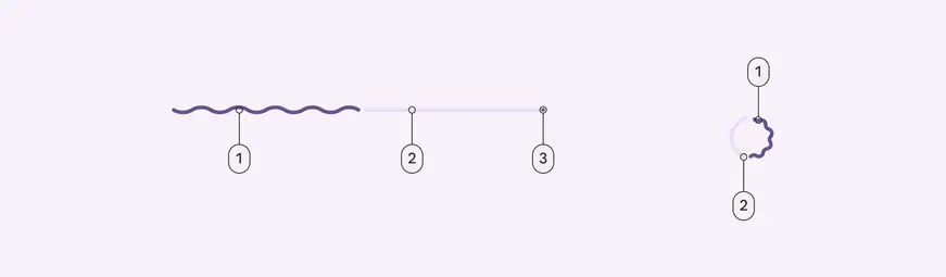
1. Active indicator
2. Track
3. Stop indicator
## Color
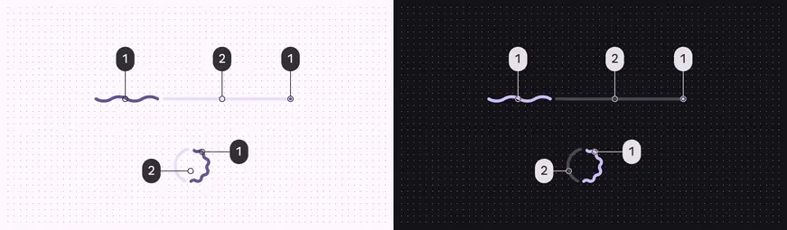
Progress indicator color roles used for light and dark schemes:
1. Primary
2. Secondary container
## Measurements
Wavy indicators use **amplitude** and **wavelength** to determine the shape of the wave. The height is the overall container height.
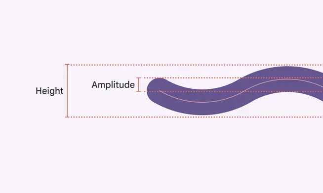
**Amplitude** measures from the center of the resting position to the center of the peak
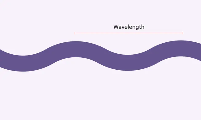
**Wavelength** measures the distance between two adjacent peaks
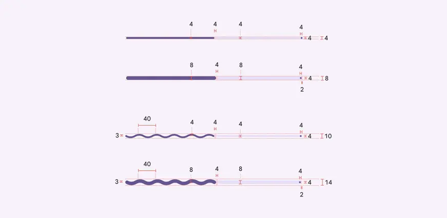
Size measurements for linear progress indicators. The thicker variants are provided as sample measurement for makers to adjust the default version based on their use cases.
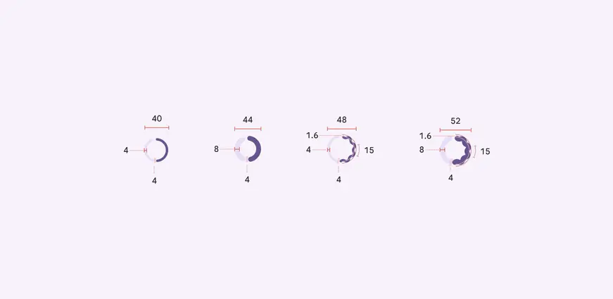
Size measurements for circular progress indicators. The thicker variants are provided as sample measurement for makers to adjust the default version based on their use cases.

The linear progress indicator is inset from the edge of the screen by 4dp
## Baseline tokens
The circular and linear progress indicator had separate token sets. These are no longer recommended.
::: token-table token-table-6f51f7ab7775a392-199fd9a8
**Progress indicators tokens** · 2 token sets · 18 tokens · [live token table](https://m3.material.io/components/progress-indicators/specs) · DSDB `TOKEN_TABLE.6f51f7ab7775a392`
* Default context: Theme: Light · Platform: Android · Audience: 3P · Contrast: Default · iOS dark theme elevation: None · iOS weight setting: Default
* Not configurable here (group default used): Motion scheme: Standard · Font: Static · Language height: Small
* Other contexts: Theme: Dark · Contrast: Medium contrast, High contrast. "Other contexts" lists values that differ from the default when only that one context changes.
* Reference chain: aliases from the token to its source value (`token → alias → … → value`). "—" means the token holds a literal value.
**\[Deprecated] Progress indicator - Circular** · `md.comp.circular-progress-indicator` · 8 tokens
This token set is deprecated. Use \`md.comp.progress-indicator.circular\` instead. Original tokens for the circular progress indicator.
| Group | Token | Type | Reference chain | Resolved value | Other contexts |
| --- | --- | --- | --- | --- | --- |
| \[Deprecated] Enabled › \[Deprecated] Active indicator | `md.comp.circular-progress-indicator.size` (deprecated) | Length | — | `48dp` | — |
| \[Deprecated] Enabled › \[Deprecated] Active indicator | `md.comp.circular-progress-indicator.active-indicator.width` (deprecated) | Length | — | `4dp` | — |
| \[Deprecated] Enabled › \[Deprecated] Active indicator | `md.comp.circular-progress-indicator.active-indicator.shape` (deprecated) | Shape | `md.sys.shape.corner.none` | `Rounded corners 0dp` | — |
| \[Deprecated] Enabled › \[Deprecated] Active indicator | `md.comp.circular-progress-indicator.active-indicator.color` (deprecated) | Color | `md.sys.color.primary` → `md.ref.palette.primary40` | `#6750A4` | Dark: `#D0BCFF` via `md.ref.palette.primary80`
Medium contrast: `#4F378B` via `md.ref.palette.primary30`
High contrast: `#381E72` via `md.ref.palette.primary20` |
| \[Deprecated] Enabled › \[Deprecated] Active indicator | `md.comp.circular-progress-indicator.four-color.active-indicator.one.color` (deprecated) | Color | `md.sys.color.primary` → `md.ref.palette.primary40` | `#6750A4` | Dark: `#D0BCFF` via `md.ref.palette.primary80`
Medium contrast: `#4F378B` via `md.ref.palette.primary30`
High contrast: `#381E72` via `md.ref.palette.primary20` |
| \[Deprecated] Enabled › \[Deprecated] Active indicator | `md.comp.circular-progress-indicator.four-color.active-indicator.two.color` (deprecated) | Color | `md.sys.color.primary-container` → `md.ref.palette.primary90` | `#EADDFF` | Dark: `#4F378B` via `md.ref.palette.primary30`
Medium contrast: `#6750A4` via `md.ref.palette.primary40`
High contrast: `#4F378B` via `md.ref.palette.primary30` |
| \[Deprecated] Enabled › \[Deprecated] Active indicator | `md.comp.circular-progress-indicator.four-color.active-indicator.three.color` (deprecated) | Color | `md.sys.color.tertiary` → `md.ref.palette.tertiary40` | `#7D5260` | Dark: `#EFB8C8` via `md.ref.palette.tertiary80`
Medium contrast: `#633B48` via `md.ref.palette.tertiary30`
High contrast: `#492532` via `md.ref.palette.tertiary20` |
| \[Deprecated] Enabled › \[Deprecated] Active indicator | `md.comp.circular-progress-indicator.four-color.active-indicator.four.color` (deprecated) | Color | `md.sys.color.tertiary-container` → `md.ref.palette.tertiary90` | `#FFD8E4` | Dark: `#633B48` via `md.ref.palette.tertiary30`
Medium contrast: `#7D5260` via `md.ref.palette.tertiary40`
High contrast: `#633B48` via `md.ref.palette.tertiary30` |
**\[Deprecated] Progress indicator - Linear** · `md.comp.linear-progress-indicator` · 10 tokens
This token set is deprecated. Use \`md.comp.progress-indicator.linear\` instead. Original tokens for the linear progress indicator.
| Group | Token | Type | Reference chain | Resolved value | Other contexts |
| --- | --- | --- | --- | --- | --- |
| \[Deprecated] Enabled › \[Deprecated] Track | `md.comp.linear-progress-indicator.track.height` (deprecated) | Length | — | `4dp` | — |
| \[Deprecated] Enabled › \[Deprecated] Track | `md.comp.linear-progress-indicator.track.shape` (deprecated) | Shape | `md.sys.shape.corner.none` | `Rounded corners 0dp` | — |
| \[Deprecated] Enabled › \[Deprecated] Track | `md.comp.linear-progress-indicator.track.color` (deprecated) | Color | `md.sys.color.surface-container-highest` → `md.ref.palette.neutral90` | `#E6E0E9` | Dark: `#36343B` via `md.ref.palette.neutral22` |
| \[Deprecated] Enabled › \[Deprecated] Active indicator | `md.comp.linear-progress-indicator.active-indicator.height` (deprecated) | Length | — | `4dp` | — |
| \[Deprecated] Enabled › \[Deprecated] Active indicator | `md.comp.linear-progress-indicator.active-indicator.shape` (deprecated) | Shape | `md.sys.shape.corner.none` | `Rounded corners 0dp` | — |
| \[Deprecated] Enabled › \[Deprecated] Active indicator | `md.comp.linear-progress-indicator.active-indicator.color` (deprecated) | Color | `md.sys.color.primary` → `md.ref.palette.primary40` | `#6750A4` | Dark: `#D0BCFF` via `md.ref.palette.primary80`
Medium contrast: `#4F378B` via `md.ref.palette.primary30`
High contrast: `#381E72` via `md.ref.palette.primary20` |
| \[Deprecated] Enabled › \[Deprecated] Active indicator | `md.comp.linear-progress-indicator.four-color.active-indicator.one.color` (deprecated) | Color | `md.sys.color.primary` → `md.ref.palette.primary40` | `#6750A4` | Dark: `#D0BCFF` via `md.ref.palette.primary80`
Medium contrast: `#4F378B` via `md.ref.palette.primary30`
High contrast: `#381E72` via `md.ref.palette.primary20` |
| \[Deprecated] Enabled › \[Deprecated] Active indicator | `md.comp.linear-progress-indicator.four-color.active-indicator.two.color` (deprecated) | Color | `md.sys.color.primary-container` → `md.ref.palette.primary90` | `#EADDFF` | Dark: `#4F378B` via `md.ref.palette.primary30`
Medium contrast: `#6750A4` via `md.ref.palette.primary40`
High contrast: `#4F378B` via `md.ref.palette.primary30` |
| \[Deprecated] Enabled › \[Deprecated] Active indicator | `md.comp.linear-progress-indicator.four-color.active-indicator.three.color` (deprecated) | Color | `md.sys.color.tertiary` → `md.ref.palette.tertiary40` | `#7D5260` | Dark: `#EFB8C8` via `md.ref.palette.tertiary80`
Medium contrast: `#633B48` via `md.ref.palette.tertiary30`
High contrast: `#492532` via `md.ref.palette.tertiary20` |
| \[Deprecated] Enabled › \[Deprecated] Active indicator | `md.comp.linear-progress-indicator.four-color.active-indicator.four.color` (deprecated) | Color | `md.sys.color.tertiary-container` → `md.ref.palette.tertiary90` | `#FFD8E4` | Dark: `#633B48` via `md.ref.palette.tertiary30`
Medium contrast: `#7D5260` via `md.ref.palette.tertiary40`
High contrast: `#633B48` via `md.ref.palette.tertiary30` |
:::