---
url: /components/navigation-rail/overview.md
description: >-
Navigation rails let people switch between UI views on mid-sized devices. They
can contain 3-7 destinations plus an optional FAB.
---
# Navigation rail
Navigation rails let people switch between UI views on mid-sized devices. They can contain 3-7 destinations plus an optional FAB.
**Overview** · [Specs](specs.md) · [Guidelines](guidelines.md) · [Accessibility](accessibility.md)
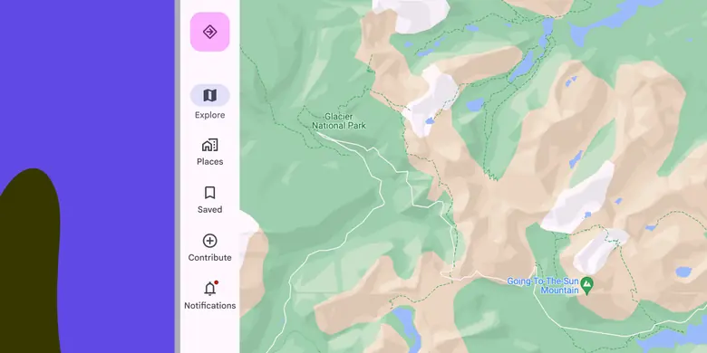
* Use navigation rails in medium, expanded, large, or extra-large window sizes
* Can contain 3-7 destinations plus an optional FAB
* Always put the rail in the same place, even on different screens of an app
Collapsed and expanded navigation rails can transition between each other on any device, including:
1\. Large or medium window size classes like tablets
2. Compact window size classes like phones in portrait orientation
## Availability & resources
| Type | Resource | Status |
| --- | --- | --- |
| Design | [Design Kit (Figma)](https://www.figma.com/community/file/1035203688168086460) | Available |
| Implementation | [Flutter](https://api.flutter.dev/flutter/material/NavigationRail-class.html) | Available |
| Implementation | [Jetpack Compose](https://developer.android.com/develop/ui/compose/components/navigation-rail) | Available |
| Implementation | [Jetpack Compose: Expressive](https://developer.android.com/reference/kotlin/androidx/compose/material3/package-summary#NavigationRail\(androidx.compose.ui.Modifier,androidx.compose.ui.graphics.Color,androidx.compose.ui.graphics.Color,kotlin.Function1,androidx.compose.foundation.layout.WindowInsets,kotlin.Function1\)) | Available |
| Implementation | [Android Views (MDC-Android)](https://github.com/material-components/material-components-android/blob/master/docs/components/NavigationRail.md) | Available |
| Implementation | [Android Views (MDC-Android): Expressive](https://github.com/material-components/material-components-android/blob/master/docs/components/NavigationRail.md) | Available |
| Implementation | Web | Unavailable |
| Implementation | Web: Expressive | Unavailable |
## M3 Expressive update
**May 2025**
A **collapsed** and **expanded** navigation rail have been introduced to replace the baseline nav rail. The expanded nav rail is meant to replace the [navigation drawer](../navigation-drawer/overview.md "Navigation drawers let people switch between UI views on larger devices. In the expressive update, use an expanded navigation rail."). [More on M3 Expressive](https://m3.material.io/blog/building-with-m3-expressive)
Variants and naming:
* The baseline **navigation rail** is no longer recommended
* Added two wider navigation rails:
* **Collapsed:** replaces baseline nav rail
* **Expanded**: replaces [navigation drawer](../navigation-drawer/overview.md "Navigation drawers let people switch between UI views on larger devices. In the expressive update, use an expanded navigation rail.")
Configurations:
* Expanded rail modality:
* Non-modal
* Modal
* Expanded behavior:
* Transition to collapsed navigation rail
* Hide when collapsed
* Color:
* Active label on vertical items changed from **on surface variant** to **secondary **
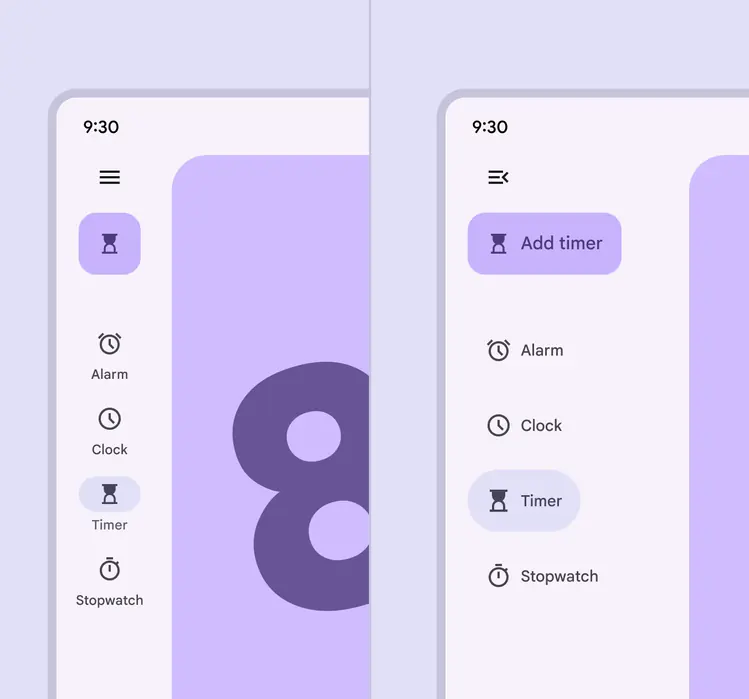
The collapsed and expanded navigation rails match visually and can transition into each other
## Differences from M2
* Behavior: Predictive back interaction
* Color: New color mappings and compatibility with dynamic color
* States: The active destination can be indicated with a pill shape in a contrasting color
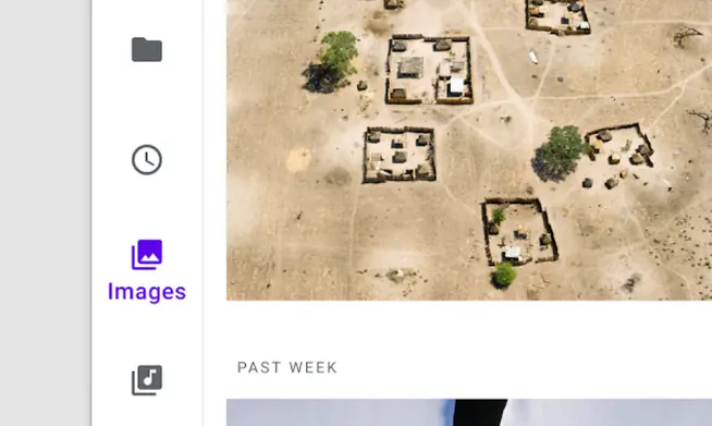
M2: The navigation rail uses icon color, weight, and fill to communicate which destination is active
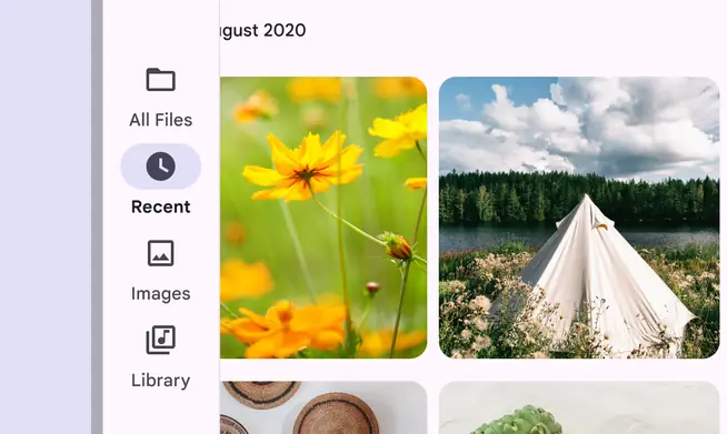
M3: The navigation rail uses a pill-shaped active indicator to communicate which destination is active