---
url: /components/navigation-drawer/accessibility.md
description: >-
Navigation drawers let people switch between UI views on larger devices.
Navigation drawers provide access to destinations in your app.
---
# Navigation drawer
Navigation drawers let people switch between UI views on larger devices. Navigation drawers provide access to destinations in your app.
[Overview](overview.md) · [Specs](specs.md) · [Guidelines](guidelines.md) · **Accessibility**
::: info Note
The navigation drawer is no longer recommended in the Material 3 Expressive update. For those who have updated, use an [expanded navigation rail](../navigation-rail/overview.md), which has mostly the same functionality of the navigation drawer and adapts better across window size classes.
:::
## Use cases
Users should be able to:
* Move between navigation destinations with assistive technology
* Select a particular navigation destination from a set
* Get appropriate feedback based on [input](../../foundations/interaction/inputs.md "Device inputs provide interactive control of an app. Common inputs include a mouse, keyboard, and touchpad.") type
## Interaction & style
**Touch**
* When a navigation item is tapped, the active indicator appears in place, providing feedback to the user that it is selected
* A touch ripple passes through the indicator
* The icon switches from outlined to filled
* The icon changes color, becoming darker
Touch: Tap
**Cursor**
* When hovered, the [hover](../../foundations/interaction/states/applying-states.md#71c347c2-dd75-485b-892e-04d2900bd844 "A hover state communicates when a user has placed a cursor above an interactive element.") indicator appears providing a visual cue that the destination is interactive
* When clicked, a ripple passes through the indicator
* The icon switches from outlined to filled
* The icon changes color, becoming darker in light theme and lighter in dark theme, to increase the contrast
Cursor: Hover, Click
## Initial focus
Initial focus lands directly on the first navigation item, since that is the first interactive element of the component.
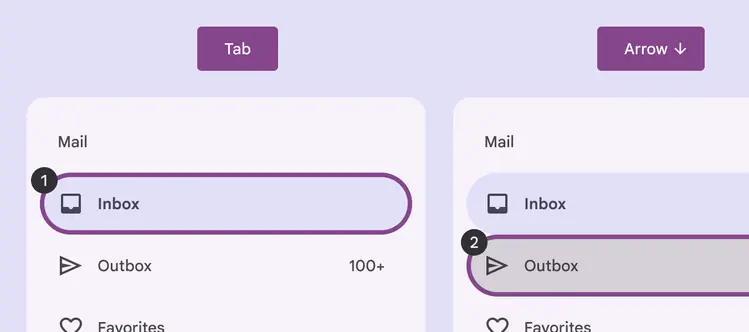
Focus lands on first navigation item
## Closing
The modal navigation drawer can be dismissed by selecting the scrim that covers the rest of the screen.
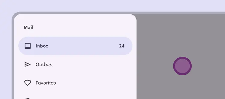
Select the scrim to close the navigation drawer
## Visual indicators
Icons are the primary focus of the navigation and such give the dominant cue of its [state](../../foundations/interaction/states/overview.md "States show the interaction status of a component or UI element."). Use a filled icon for the selected destination to differentiate from the outlined icons of non-selected destinations.
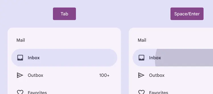
The navigation item is selected via **Space**/**Enter**
::: tip Do
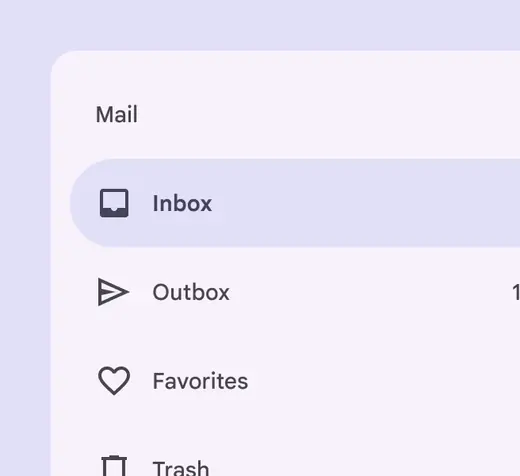
Use a filled icon for the selected navigation destination to differentiate from the other destinations
:::
::: danger Don't
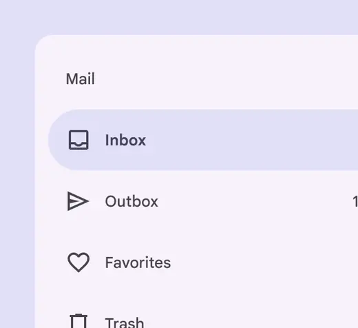
Avoid keeping the icon style for the selected navigation destination the same as unselected destination's icons. This removes an important visual indicator of which destination is active.
:::
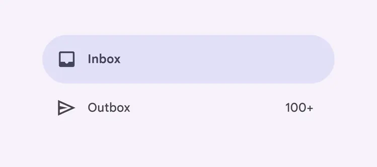
When selected, the icon fills, darkens in light theme (or lightens in dark theme), and is backed by an active indicator shape
## Keyboard navigation
| **Keys** | **Actions** |
| -------------- | --------------------------------------------------------------------------------------------------------------------------------------------------------------------------------------------------------------------------------------------------------------------------------------------------------------------------------- |
| Tab | Focus lands on the first navigation destination |
| Space or Enter | Selects the [focused](../../foundations/interaction/states/applying-states.md#bfc1624f-6bcc-4306-b0c1-425e2d8a1bf9 "A focused state communicates when a user has highlighted an element, using an input method such as a keyboard or voice.") navigation destination, and focus moves to the newly opened section (if applicable) |
| Arrow | Navigate between destinations within the navigation drawer |
## Labeling elements
The [accessibility](../../foundations/overview/principles.md "Accessible design makes products usable for people with all kinds of abilities.") label for a navigation item is typically the same as the destination name.
If the UI text is correctly linked, assistive tech (such as a screenreader) will read the UI text followed by the component’s role.
For Android Views (MDC-Android), a more descriptive accessibility label is not available to be set and the role is not announced.
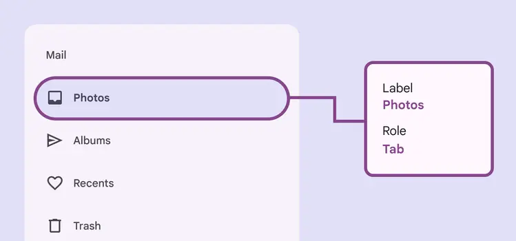
A navigation drawer’s accessibility label can incorporate its adjacent UI text
When the visible UI text is ambiguous, accessibility labels need to be more descriptive. For example, a navigation destination visibly labeled **Recents** would benefit from additional information in its accessibility label to clarify the destination’s intent.
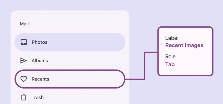
While the visible label text reads **Recents,** the accessibility label for this destination clarifies its function: **Recent images**