---
url: /components/floating-action-button/accessibility.md
description: >-
Floating action buttons (FABs) help people take primary actions. They’re used
to represent the most important action on a screen, such as Create or Reply.
---
# FABs
Floating action buttons (FABs) help people take primary actions. They’re used to represent the most important action on a screen, such as Create or Reply.
[Overview](overview.md) · [Specs](specs.md) · [Guidelines](guidelines.md) · **Accessibility**
## Use cases
People should be able to do the following using assistive technology:
* Navigate to and activate the FAB
* Perform an action with the FAB
* Expand and minimize an [extended FAB](../extended-fab/overview.md "Extended floating action buttons (extended FABs) help people take primary actions.")
## Interaction & style
Don't disable the FAB. If the action represented in the FAB is unavailable, the FAB shouldn't appear.
Ensure the icon has a minimum 3:1 contrast ratio with the container.
::: tip Do
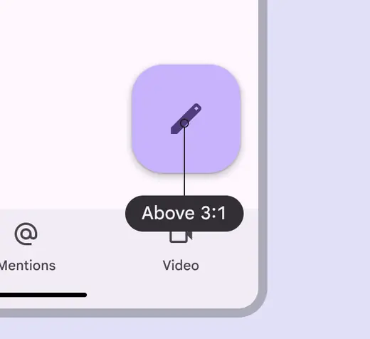
FAB icons are above the 3:1 contrast ratio
:::
::: danger Don't
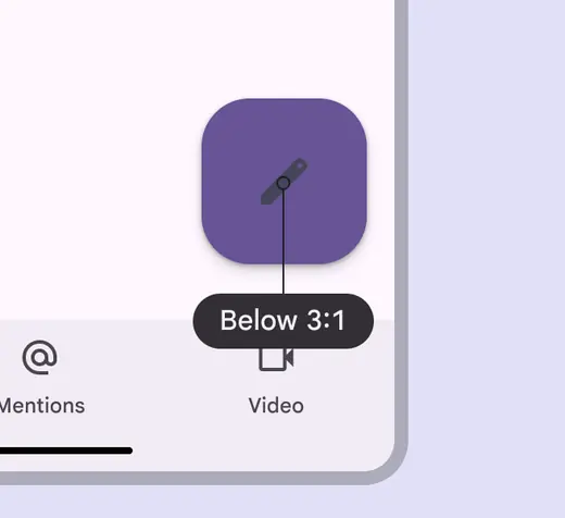
Avoid using colors with a contrast below 3:1
:::
## Focus
Ensure the FAB is prioritized in the overall focus order to create an efficient experience for people who navigate UIs with assistive tech.
On mobile, the focus order may start with the [app bar](../app-bars/overview.md "App bars contain page navigation and information at the top of a screen"), move to the [navigation bar](../navigation-bar/overview.md "Navigation bars let people switch between UI views on smaller devices."), and then skip past any other content on the page to land on the FAB.
Consider displaying a tooltip when the FAB is focused. This is supported on web.
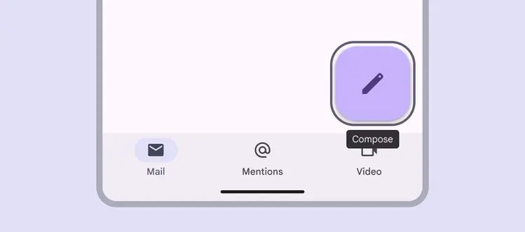
Tooltips surface the FAB’s label when focused
## Layout & position
To make it easier for users of screen readers to reach a primary action such as a FAB on [expanded breakpoints](../../foundations/layout/breakpoints/expanded.md "Window widths 840dp to 1199dp, such as a tablet or foldable in landscape orientation, or desktop."), consider placing the FAB in the upper left region.
However, it’s critical to test placement options with users to see if the upper left region is the best position in all browser windows. For [compact](../../foundations/layout/breakpoints/compact.md "Window widths smaller than 600dp, such as a phone in portrait orientation.") and [medium breakpoints](../../foundations/layout/breakpoints/medium.md "Window widths from 600dp to 839dp, such as a tablet or foldable in portrait orientation."), the best place for the FAB is the lower right corner of a screen.
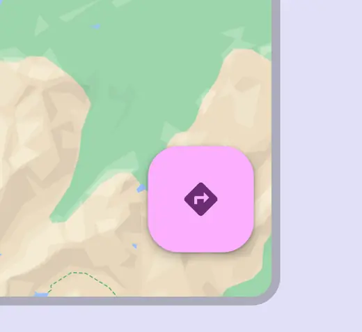
In compact windows, place the FAB in the bottom trailing edge
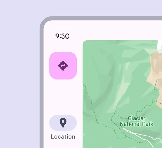
In expanded windows, place the FAB in the navigation rail
To ensure accessibility for keyboard users on the web, avoid positioning the FAB in a way that completely obscures the focus indicator of an actionable element.
It’s okay to partially cover the desired element, as long as the focus indicators are still visible.
::: tip Do
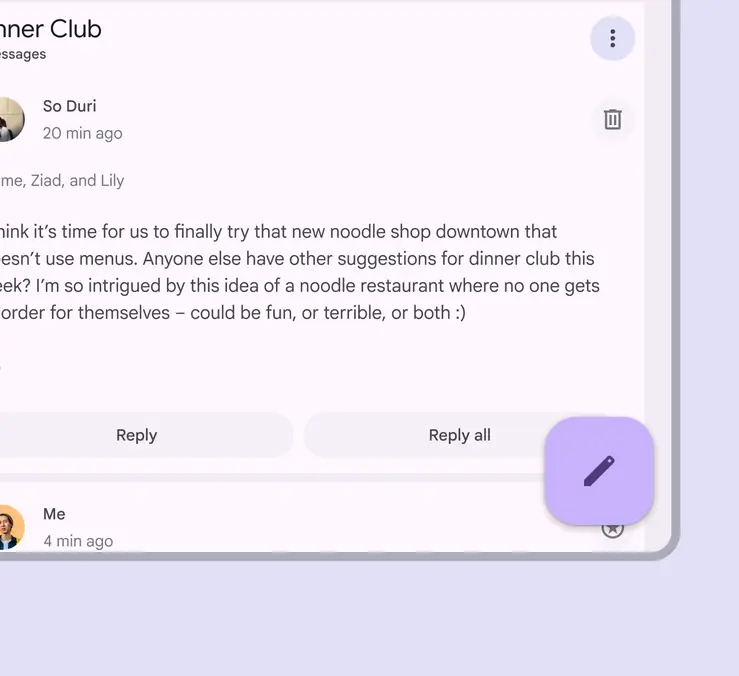
The FAB can partially cover an actionable element, as long as the focus indicator is still clearly visible
:::
::: danger Don't
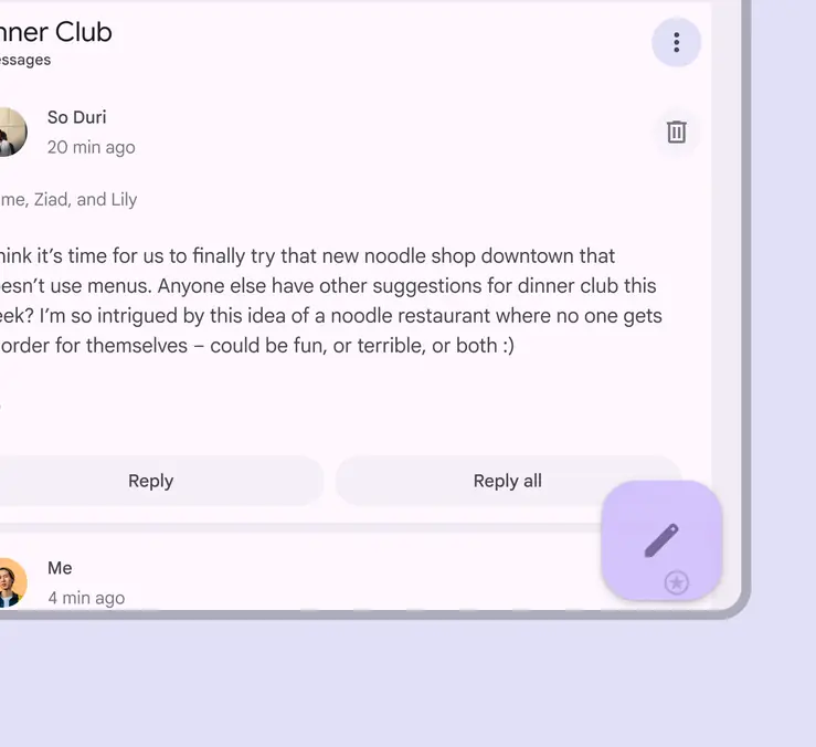
Don’t completely obscure an actionable element and its focus indicator
:::
## Keyboard navigation
| **Keys** | **Actions** |
| ---------------------- | ------------------------------------- |
| **Tab** | Focus lands on the FAB |
| **Space** or **Enter** | Perform the default action on an item |
## Labeling elements
The accessibility label should describe the action that the button is performing, such as **Compose a new message**.
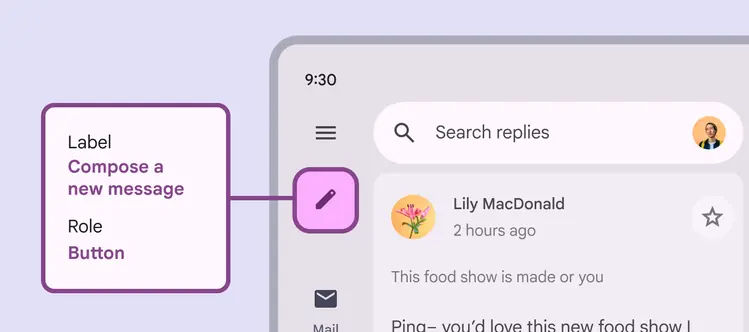
The accessibility label of the FAB with a pencil icon describes the action of composing a new message