---
url: /components/dialogs/specs.md
description: >-
Dialogs provide important prompts in a user flow. Use dialogs to make sure
users act on information
---
# Dialogs
Dialogs provide important prompts in a user flow. Use dialogs to make sure users act on information
[Overview](overview.md) · **Specs** · [Guidelines](guidelines.md) · [Accessibility](accessibility.md)
## Tokens & specs
Select a component variant below to see its elements, attributes, [tokens](../../foundations/design-tokens/overview.md "Design tokens are the building blocks of all UI elements. The same tokens are used in designs, tools, and code."), and their values.
::: token-table token-table-0b1e39a67d5bafdc-13667ab0
**Dialogs tokens** · 2 token sets · 101 tokens · [live token table](https://m3.material.io/components/dialogs/specs) · DSDB `TOKEN_TABLE.0b1e39a67d5bafdc`
* Default context: Theme: Light · Platform: Android · Audience: 3P · Font: Static · Contrast: Default · iOS dark theme elevation: None · iOS weight setting: Default
* Not configurable here (group default used): Motion scheme: Standard · Language height: Small
* Other contexts: Theme: Dark · Contrast: Medium contrast, High contrast. "Other contexts" lists values that differ from the default when only that one context changes.
* Reference chain: aliases from the token to its source value (`token → alias → … → value`). "—" means the token holds a literal value.
**Dialog - Basic** · `md.comp.dialog` · 45 tokens
For basic dialogs.
| Group | Token | Type | Reference chain | Resolved value | Other contexts |
| --- | --- | --- | --- | --- | --- |
| Enabled › Container | `md.comp.dialog.container.color` | Color | `md.sys.color.surface-container-high` → `md.ref.palette.neutral92` | `#ECE6F0` | Dark: `#2B2930` via `md.ref.palette.neutral17` |
| Enabled › Container | `md.comp.dialog.container.elevation` | Elevation | `md.sys.elevation.level3` | `6dp` | — |
| Enabled › Container | `md.comp.dialog.container.surface-tint-layer.color` (deprecated) | Color | `md.sys.color.surface-tint` → `md.sys.color.primary` → `md.ref.palette.primary40` | `#6750A4` | Dark: `#D0BCFF` via `md.ref.palette.primary80`
Medium contrast: `#4F378B` via `md.ref.palette.primary30`
High contrast: `#381E72` via `md.ref.palette.primary20` |
| Enabled › Container | `md.comp.dialog.container.shape` | Shape | `md.sys.shape.corner.extra-large` | `Rounded corners 28dp` | — |
| Enabled › Label text | `md.comp.dialog.action.label-text.font` | Font names | `md.sys.typescale.label-large.font` → `md.ref.typeface.plain` | `Roboto` | — |
| Enabled › Label text | `md.comp.dialog.action.label-text.line-height` | Line height | `md.sys.typescale.label-large.line-height` | `20pt` | — |
| Enabled › Label text | `md.comp.dialog.action.label-text.size` | Font size | `md.sys.typescale.label-large.size` | `14pt` | — |
| Enabled › Label text | `md.comp.dialog.action.label-text.weight` | Font weight | `md.sys.typescale.label-large.weight` → `md.ref.typeface.weight-medium` | `500` | — |
| Enabled › Label text | `md.comp.dialog.action.label-text.tracking` | Font tracking | `md.sys.typescale.label-large.tracking` | `0.1pt` | — |
| Enabled › Label text | `md.comp.dialog.action.label-text.type` | Typography | composite
font names: `md.comp.dialog.action.label-text.font` → `md.sys.typescale.label-large.font` → `md.ref.typeface.plain`
font weight: `md.comp.dialog.action.label-text.weight` → `md.sys.typescale.label-large.weight` → `md.ref.typeface.weight-medium`
font size: `md.comp.dialog.action.label-text.size` → `md.sys.typescale.label-large.size`
line height: `md.comp.dialog.action.label-text.line-height` → `md.sys.typescale.label-large.line-height`
font tracking: `md.comp.dialog.action.label-text.tracking` → `md.sys.typescale.label-large.tracking` | `Roboto · weight 500 · size 14pt · line height 20pt · tracking 0.1pt` | — |
| Enabled › Label text | `md.comp.dialog.action.label-text.color` | Color | `md.sys.color.primary` → `md.ref.palette.primary40` | `#6750A4` | Dark: `#D0BCFF` via `md.ref.palette.primary80`
Medium contrast: `#4F378B` via `md.ref.palette.primary30`
High contrast: `#381E72` via `md.ref.palette.primary20` |
| Enabled › Icon | `md.comp.dialog.with-icon.icon.size` | Length | — | `24dp` | — |
| Enabled › Icon | `md.comp.dialog.with-icon.icon.color` | Color | `md.sys.color.secondary` → `md.ref.palette.secondary40` | `#625B71` | Dark: `#CCC2DC` via `md.ref.palette.secondary80`
Medium contrast: `#4A4458` via `md.ref.palette.secondary30`
High contrast: `#332D41` via `md.ref.palette.secondary20` |
| Enabled › Subhead | `md.comp.dialog.subhead.font` (deprecated) | Font names | `md.sys.typescale.headline-small.font` → `md.ref.typeface.brand` | `Roboto` | — |
| Enabled › Subhead | `md.comp.dialog.subhead.line-height` (deprecated) | Line height | `md.sys.typescale.headline-small.line-height` | `32pt` | — |
| Enabled › Subhead | `md.comp.dialog.subhead.size` (deprecated) | Font size | `md.sys.typescale.headline-small.size` | `24pt` | — |
| Enabled › Subhead | `md.comp.dialog.subhead.weight` (deprecated) | Font weight | `md.sys.typescale.headline-small.weight` → `md.ref.typeface.weight-regular` | `400` | — |
| Enabled › Subhead | `md.comp.dialog.subhead.tracking` (deprecated) | Font tracking | `md.sys.typescale.headline-small.tracking` | `0pt` | — |
| Enabled › Subhead | `md.comp.dialog.subhead.type` (deprecated) | Typography | composite
font names: `md.comp.dialog.subhead.font` → `md.sys.typescale.headline-small.font` → `md.ref.typeface.brand`
font weight: `md.comp.dialog.subhead.weight` → `md.sys.typescale.headline-small.weight` → `md.ref.typeface.weight-regular`
font size: `md.comp.dialog.subhead.size` → `md.sys.typescale.headline-small.size`
line height: `md.comp.dialog.subhead.line-height` → `md.sys.typescale.headline-small.line-height`
font tracking: `md.comp.dialog.subhead.tracking` → `md.sys.typescale.headline-small.tracking` | `Roboto · weight 400 · size 24pt · line height 32pt · tracking 0pt` | — |
| Enabled › Subhead | `md.comp.dialog.subhead.color` (deprecated) | Color | `md.sys.color.on-surface` → `md.ref.palette.neutral10` | `#1D1B20` | Dark: `#E6E0E9` via `md.ref.palette.neutral90`
Medium contrast: `#000000` via `md.ref.palette.neutral0`
High contrast: `#000000` via `md.ref.palette.neutral0` |
| Enabled › Headline | `md.comp.dialog.headline.font` | Font names | `md.sys.typescale.headline-small.font` → `md.ref.typeface.brand` | `Roboto` | — |
| Enabled › Headline | `md.comp.dialog.headline.line-height` | Line height | `md.sys.typescale.headline-small.line-height` | `32pt` | — |
| Enabled › Headline | `md.comp.dialog.headline.size` | Font size | `md.sys.typescale.headline-small.size` | `24pt` | — |
| Enabled › Headline | `md.comp.dialog.headline.weight` | Font weight | `md.sys.typescale.headline-small.weight` → `md.ref.typeface.weight-regular` | `400` | — |
| Enabled › Headline | `md.comp.dialog.headline.tracking` | Font tracking | `md.sys.typescale.headline-small.tracking` | `0pt` | — |
| Enabled › Headline | `md.comp.dialog.headline.type` | Typography | composite
font names: `md.comp.dialog.headline.font` → `md.sys.typescale.headline-small.font` → `md.ref.typeface.brand`
font weight: `md.comp.dialog.headline.weight` → `md.sys.typescale.headline-small.weight` → `md.ref.typeface.weight-regular`
font size: `md.comp.dialog.headline.size` → `md.sys.typescale.headline-small.size`
line height: `md.comp.dialog.headline.line-height` → `md.sys.typescale.headline-small.line-height`
font tracking: `md.comp.dialog.headline.tracking` → `md.sys.typescale.headline-small.tracking` | `Roboto · weight 400 · size 24pt · line height 32pt · tracking 0pt` | — |
| Enabled › Headline | `md.comp.dialog.headline.color` | Color | `md.sys.color.on-surface` → `md.ref.palette.neutral10` | `#1D1B20` | Dark: `#E6E0E9` via `md.ref.palette.neutral90`
Medium contrast: `#000000` via `md.ref.palette.neutral0`
High contrast: `#000000` via `md.ref.palette.neutral0` |
| Enabled › Divider | `md.comp.dialog.with-divider.divider.color` (deprecated) | Color | `md.sys.color.outline` → `md.ref.palette.neutral-variant50` | `#79747E` | Dark: `#938F99` via `md.ref.palette.neutral-variant60`
Medium contrast: `#49454F` via `md.ref.palette.neutral-variant30`
High contrast: `#322F37` via `md.ref.palette.neutral-variant20` |
| Enabled › Divider | `md.comp.dialog.with-divider.divider.height` (deprecated) | Length | — | `1dp` | — |
| Enabled › Supporting text | `md.comp.dialog.supporting-text.font` | Font names | `md.sys.typescale.body-medium.font` → `md.ref.typeface.plain` | `Roboto` | — |
| Enabled › Supporting text | `md.comp.dialog.supporting-text.line-height` | Line height | `md.sys.typescale.body-medium.line-height` | `20pt` | — |
| Enabled › Supporting text | `md.comp.dialog.supporting-text.size` | Font size | `md.sys.typescale.body-medium.size` | `14pt` | — |
| Enabled › Supporting text | `md.comp.dialog.supporting-text.weight` | Font weight | `md.sys.typescale.body-medium.weight` → `md.ref.typeface.weight-regular` | `400` | — |
| Enabled › Supporting text | `md.comp.dialog.supporting-text.tracking` | Font tracking | `md.sys.typescale.body-medium.tracking` | `0.25pt` | — |
| Enabled › Supporting text | `md.comp.dialog.supporting-text.type` | Typography | composite
font names: `md.comp.dialog.supporting-text.font` → `md.sys.typescale.body-medium.font` → `md.ref.typeface.plain`
font weight: `md.comp.dialog.supporting-text.weight` → `md.sys.typescale.body-medium.weight` → `md.ref.typeface.weight-regular`
font size: `md.comp.dialog.supporting-text.size` → `md.sys.typescale.body-medium.size`
line height: `md.comp.dialog.supporting-text.line-height` → `md.sys.typescale.body-medium.line-height`
font tracking: `md.comp.dialog.supporting-text.tracking` → `md.sys.typescale.body-medium.tracking` | `Roboto · weight 400 · size 14pt · line height 20pt · tracking 0.25pt` | — |
| Enabled › Supporting text | `md.comp.dialog.supporting-text.color` | Color | `md.sys.color.on-surface-variant` → `md.ref.palette.neutral-variant30` | `#49454F` | Dark: `#CAC4D0` via `md.ref.palette.neutral-variant80`
Medium contrast: `#322F37` via `md.ref.palette.neutral-variant20`
High contrast: `#000000` via `md.ref.palette.neutral-variant0` |
| Hovered › Label text | `md.comp.dialog.action.hover.label-text.color` | Color | `md.sys.color.primary` → `md.ref.palette.primary40` | `#6750A4` | Dark: `#D0BCFF` via `md.ref.palette.primary80`
Medium contrast: `#4F378B` via `md.ref.palette.primary30`
High contrast: `#381E72` via `md.ref.palette.primary20` |
| Hovered › State layer | `md.comp.dialog.action.hover.state-layer.color` | Color | `md.sys.color.primary` → `md.ref.palette.primary40` | `#6750A4` | Dark: `#D0BCFF` via `md.ref.palette.primary80`
Medium contrast: `#4F378B` via `md.ref.palette.primary30`
High contrast: `#381E72` via `md.ref.palette.primary20` |
| Hovered › State layer | `md.comp.dialog.action.hover.state-layer.opacity` | Opacity | `md.sys.state.hover.state-layer-opacity` | `0.08` | — |
| Focused › Label text | `md.comp.dialog.action.focus.label-text.color` | Color | `md.sys.color.primary` → `md.ref.palette.primary40` | `#6750A4` | Dark: `#D0BCFF` via `md.ref.palette.primary80`
Medium contrast: `#4F378B` via `md.ref.palette.primary30`
High contrast: `#381E72` via `md.ref.palette.primary20` |
| Focused › State layer | `md.comp.dialog.action.focus.state-layer.color` | Color | `md.sys.color.primary` → `md.ref.palette.primary40` | `#6750A4` | Dark: `#D0BCFF` via `md.ref.palette.primary80`
Medium contrast: `#4F378B` via `md.ref.palette.primary30`
High contrast: `#381E72` via `md.ref.palette.primary20` |
| Focused › State layer | `md.comp.dialog.action.focus.state-layer.opacity` | Opacity | `md.sys.state.focus.state-layer-opacity` | `0.1` | — |
| Pressed (ripple) › Label text | `md.comp.dialog.action.pressed.label-text.color` | Color | `md.sys.color.primary` → `md.ref.palette.primary40` | `#6750A4` | Dark: `#D0BCFF` via `md.ref.palette.primary80`
Medium contrast: `#4F378B` via `md.ref.palette.primary30`
High contrast: `#381E72` via `md.ref.palette.primary20` |
| Pressed (ripple) › State layer | `md.comp.dialog.action.pressed.state-layer.color` | Color | `md.sys.color.primary` → `md.ref.palette.primary40` | `#6750A4` | Dark: `#D0BCFF` via `md.ref.palette.primary80`
Medium contrast: `#4F378B` via `md.ref.palette.primary30`
High contrast: `#381E72` via `md.ref.palette.primary20` |
| Pressed (ripple) › State layer | `md.comp.dialog.action.pressed.state-layer.opacity` | Opacity | `md.sys.state.pressed.state-layer-opacity` | `0.1` | — |
**Dialog - Full screen** · `md.comp.full-screen-dialog` · 56 tokens
For full-screen dialogs.
| Group | Token | Type | Reference chain | Resolved value | Other contexts |
| --- | --- | --- | --- | --- | --- |
| Enabled › Container | `md.comp.full-screen-dialog.container.color` | Color | `md.sys.color.surface` → `md.ref.palette.neutral98` | `#FEF7FF` | Dark: `#141218` via `md.ref.palette.neutral6` |
| Enabled › Container | `md.comp.full-screen-dialog.container.elevation` | Elevation | `md.sys.elevation.level0` | `0dp` | — |
| Enabled › Container | `md.comp.full-screen-dialog.container.shape` | Shape | `md.sys.shape.corner.none` | `Rounded corners 0dp` | — |
| Enabled › Container | `md.comp.full-screen-dialog.header.container.height` | Length | — | `56dp` | — |
| Enabled › Container | `md.comp.full-screen-dialog.header.container.color` | Color | `md.sys.color.surface` → `md.ref.palette.neutral98` | `#FEF7FF` | Dark: `#141218` via `md.ref.palette.neutral6` |
| Enabled › Container | `md.comp.full-screen-dialog.header.container.elevation` | Elevation | `md.sys.elevation.level0` | `0dp` | — |
| Enabled › Container | `md.comp.full-screen-dialog.header.container.surface-tint-layer.color` (deprecated) | Color | `md.sys.color.surface-tint` → `md.sys.color.primary` → `md.ref.palette.primary40` | `#6750A4` | Dark: `#D0BCFF` via `md.ref.palette.primary80`
Medium contrast: `#4F378B` via `md.ref.palette.primary30`
High contrast: `#381E72` via `md.ref.palette.primary20` |
| Enabled › Container | `md.comp.full-screen-dialog.header.on-scroll.container.elevation` | Elevation | `md.sys.elevation.level2` | `3dp` | — |
| Enabled › Container | `md.comp.full-screen-dialog.action-bar.container.height` (deprecated) | Length | — | `56dp` | — |
| Enabled › Container | `md.comp.full-screen-dialog.action-bar.container.color` (deprecated) | Color | `md.sys.color.surface` → `md.ref.palette.neutral98` | `#FEF7FF` | Dark: `#141218` via `md.ref.palette.neutral6` |
| Enabled › Container | `md.comp.full-screen-dialog.action-bar.container.elevation` (deprecated) | Elevation | `md.sys.elevation.level0` | `0dp` | — |
| Enabled › Container | `md.comp.full-screen-dialog.action-bar.on-scroll.container.elevation` (deprecated) | Elevation | `md.sys.elevation.level2` | `3dp` | — |
| Enabled › Container | `md.comp.full-screen-dialog.header.on-scroll.container.color` | Color | `md.sys.color.surface-container` → `md.ref.palette.neutral94` | `#F3EDF7` | Dark: `#211F26` via `md.ref.palette.neutral12` |
| Enabled › Label text | `md.comp.full-screen-dialog.header.action.label-text.font` | Font names | `md.sys.typescale.label-large.font` → `md.ref.typeface.plain` | `Roboto` | — |
| Enabled › Label text | `md.comp.full-screen-dialog.header.action.label-text.line-height` | Line height | `md.sys.typescale.label-large.line-height` | `20pt` | — |
| Enabled › Label text | `md.comp.full-screen-dialog.header.action.label-text.size` | Font size | `md.sys.typescale.label-large.size` | `14pt` | — |
| Enabled › Label text | `md.comp.full-screen-dialog.header.action.label-text.weight` | Font weight | `md.sys.typescale.label-large.weight` → `md.ref.typeface.weight-medium` | `500` | — |
| Enabled › Label text | `md.comp.full-screen-dialog.header.action.label-text.tracking` | Font tracking | `md.sys.typescale.label-large.tracking` | `0.1pt` | — |
| Enabled › Label text | `md.comp.full-screen-dialog.header.action.label-text.type` | Typography | composite
font names: `md.comp.full-screen-dialog.header.action.label-text.font` → `md.sys.typescale.label-large.font` → `md.ref.typeface.plain`
font weight: `md.comp.full-screen-dialog.header.action.label-text.weight` → `md.sys.typescale.label-large.weight` → `md.ref.typeface.weight-medium`
font size: `md.comp.full-screen-dialog.header.action.label-text.size` → `md.sys.typescale.label-large.size`
line height: `md.comp.full-screen-dialog.header.action.label-text.line-height` → `md.sys.typescale.label-large.line-height`
font tracking: `md.comp.full-screen-dialog.header.action.label-text.tracking` → `md.sys.typescale.label-large.tracking` | `Roboto · weight 500 · size 14pt · line height 20pt · tracking 0.1pt` | — |
| Enabled › Label text | `md.comp.full-screen-dialog.header.action.label-text.color` | Color | `md.sys.color.primary` → `md.ref.palette.primary40` | `#6750A4` | Dark: `#D0BCFF` via `md.ref.palette.primary80`
Medium contrast: `#4F378B` via `md.ref.palette.primary30`
High contrast: `#381E72` via `md.ref.palette.primary20` |
| Enabled › Label text | `md.comp.full-screen-dialog.action-bar.label-text.font` (deprecated) | Font names | `md.sys.typescale.label-large.font` → `md.ref.typeface.plain` | `Roboto` | — |
| Enabled › Label text | `md.comp.full-screen-dialog.action-bar.label-text.line-height` (deprecated) | Line height | `md.sys.typescale.label-large.line-height` | `20pt` | — |
| Enabled › Label text | `md.comp.full-screen-dialog.action-bar.label-text.size` (deprecated) | Font size | `md.sys.typescale.label-large.size` | `14pt` | — |
| Enabled › Label text | `md.comp.full-screen-dialog.action-bar.label-text.weight` (deprecated) | Font weight | `md.sys.typescale.label-large.weight` → `md.ref.typeface.weight-medium` | `500` | — |
| Enabled › Label text | `md.comp.full-screen-dialog.action-bar.label-text.tracking` (deprecated) | Font tracking | `md.sys.typescale.label-large.tracking` | `0.1pt` | — |
| Enabled › Label text | `md.comp.full-screen-dialog.action-bar.label-text.type` (deprecated) | Typography | composite
font names: `md.comp.full-screen-dialog.action-bar.label-text.font` → `md.sys.typescale.label-large.font` → `md.ref.typeface.plain`
font weight: `md.comp.full-screen-dialog.action-bar.label-text.weight` → `md.sys.typescale.label-large.weight` → `md.ref.typeface.weight-medium`
font size: `md.comp.full-screen-dialog.action-bar.label-text.size` → `md.sys.typescale.label-large.size`
line height: `md.comp.full-screen-dialog.action-bar.label-text.line-height` → `md.sys.typescale.label-large.line-height`
font tracking: `md.comp.full-screen-dialog.action-bar.label-text.tracking` → `md.sys.typescale.label-large.tracking` | `Roboto · weight 500 · size 14pt · line height 20pt · tracking 0.1pt` | — |
| Enabled › Label text | `md.comp.full-screen-dialog.action-bar.label-text.color` (deprecated) | Color | `md.sys.color.primary` → `md.ref.palette.primary40` | `#6750A4` | Dark: `#D0BCFF` via `md.ref.palette.primary80`
Medium contrast: `#4F378B` via `md.ref.palette.primary30`
High contrast: `#381E72` via `md.ref.palette.primary20` |
| Enabled › Icon | `md.comp.full-screen-dialog.header.icon.color` | Color | `md.sys.color.on-surface` → `md.ref.palette.neutral10` | `#1D1B20` | Dark: `#E6E0E9` via `md.ref.palette.neutral90`
Medium contrast: `#000000` via `md.ref.palette.neutral0`
High contrast: `#000000` via `md.ref.palette.neutral0` |
| Enabled › Icon | `md.comp.full-screen-dialog.header.icon.size` | Length | — | `24dp` | — |
| Enabled › Headline | `md.comp.full-screen-dialog.header.headline.color` | Color | `md.sys.color.on-surface` → `md.ref.palette.neutral10` | `#1D1B20` | Dark: `#E6E0E9` via `md.ref.palette.neutral90`
Medium contrast: `#000000` via `md.ref.palette.neutral0`
High contrast: `#000000` via `md.ref.palette.neutral0` |
| Enabled › Headline | `md.comp.full-screen-dialog.header.headline.font` | Font names | `md.sys.typescale.title-large.font` → `md.ref.typeface.brand` | `Roboto` | — |
| Enabled › Headline | `md.comp.full-screen-dialog.header.headline.line-height` | Line height | `md.sys.typescale.title-large.line-height` | `28pt` | — |
| Enabled › Headline | `md.comp.full-screen-dialog.header.headline.size` | Font size | `md.sys.typescale.title-large.size` | `22pt` | — |
| Enabled › Headline | `md.comp.full-screen-dialog.header.headline.weight` | Font weight | `md.sys.typescale.title-large.weight` → `md.ref.typeface.weight-regular` | `400` | — |
| Enabled › Headline | `md.comp.full-screen-dialog.header.headline.tracking` | Font tracking | `md.sys.typescale.title-large.tracking` | `0pt` | — |
| Enabled › Headline | `md.comp.full-screen-dialog.header.headline.type` | Typography | composite
font names: `md.comp.full-screen-dialog.header.headline.font` → `md.sys.typescale.title-large.font` → `md.ref.typeface.brand`
font weight: `md.comp.full-screen-dialog.header.headline.weight` → `md.sys.typescale.title-large.weight` → `md.ref.typeface.weight-regular`
font size: `md.comp.full-screen-dialog.header.headline.size` → `md.sys.typescale.title-large.size`
line height: `md.comp.full-screen-dialog.header.headline.line-height` → `md.sys.typescale.title-large.line-height`
font tracking: `md.comp.full-screen-dialog.header.headline.tracking` → `md.sys.typescale.title-large.tracking` | `Roboto · weight 400 · size 22pt · line height 28pt · tracking 0pt` | — |
| Enabled › Divider | `md.comp.full-screen-dialog.with-divider.divider.color` (deprecated) | Color | `md.sys.color.surface-variant` → `md.ref.palette.neutral-variant90` | `#E7E0EC` | Dark: `#49454F` via `md.ref.palette.neutral-variant30` |
| Enabled › Divider | `md.comp.full-screen-dialog.with-divider.divider.height` (deprecated) | Length | — | `1dp` | — |
| Hovered › Label text | `md.comp.full-screen-dialog.header.action.hover.label-text.color` | Color | `md.sys.color.primary` → `md.ref.palette.primary40` | `#6750A4` | Dark: `#D0BCFF` via `md.ref.palette.primary80`
Medium contrast: `#4F378B` via `md.ref.palette.primary30`
High contrast: `#381E72` via `md.ref.palette.primary20` |
| Hovered › Label text | `md.comp.full-screen-dialog.action-bar.hover.label-text.color` (deprecated) | Color | `md.sys.color.primary` → `md.ref.palette.primary40` | `#6750A4` | Dark: `#D0BCFF` via `md.ref.palette.primary80`
Medium contrast: `#4F378B` via `md.ref.palette.primary30`
High contrast: `#381E72` via `md.ref.palette.primary20` |
| Hovered › State layer | `md.comp.full-screen-dialog.header.action.hover.state-layer.color` | Color | `md.sys.color.primary` → `md.ref.palette.primary40` | `#6750A4` | Dark: `#D0BCFF` via `md.ref.palette.primary80`
Medium contrast: `#4F378B` via `md.ref.palette.primary30`
High contrast: `#381E72` via `md.ref.palette.primary20` |
| Hovered › State layer | `md.comp.full-screen-dialog.header.action.hover.state-layer.opacity` | Opacity | `md.sys.state.hover.state-layer-opacity` | `0.08` | — |
| Hovered › State layer | `md.comp.full-screen-dialog.action-bar.hover.state-layer.color` (deprecated) | Color | `md.sys.color.primary` → `md.ref.palette.primary40` | `#6750A4` | Dark: `#D0BCFF` via `md.ref.palette.primary80`
Medium contrast: `#4F378B` via `md.ref.palette.primary30`
High contrast: `#381E72` via `md.ref.palette.primary20` |
| Hovered › State layer | `md.comp.full-screen-dialog.action-bar.hover.state-layer.opacity` (deprecated) | Opacity | `md.sys.state.hover.state-layer-opacity` | `0.08` | — |
| Focused › Label text | `md.comp.full-screen-dialog.header.action.focus.label-text.color` | Color | `md.sys.color.primary` → `md.ref.palette.primary40` | `#6750A4` | Dark: `#D0BCFF` via `md.ref.palette.primary80`
Medium contrast: `#4F378B` via `md.ref.palette.primary30`
High contrast: `#381E72` via `md.ref.palette.primary20` |
| Focused › Label text | `md.comp.full-screen-dialog.action-bar.focus.label-text.color` (deprecated) | Color | `md.sys.color.primary` → `md.ref.palette.primary40` | `#6750A4` | Dark: `#D0BCFF` via `md.ref.palette.primary80`
Medium contrast: `#4F378B` via `md.ref.palette.primary30`
High contrast: `#381E72` via `md.ref.palette.primary20` |
| Focused › State layer | `md.comp.full-screen-dialog.header.action.focus.state-layer.color` | Color | `md.sys.color.primary` → `md.ref.palette.primary40` | `#6750A4` | Dark: `#D0BCFF` via `md.ref.palette.primary80`
Medium contrast: `#4F378B` via `md.ref.palette.primary30`
High contrast: `#381E72` via `md.ref.palette.primary20` |
| Focused › State layer | `md.comp.full-screen-dialog.header.action.focus.state-layer.opacity` | Opacity | `md.sys.state.focus.state-layer-opacity` | `0.1` | — |
| Focused › State layer | `md.comp.full-screen-dialog.action-bar.focus.state-layer.color` (deprecated) | Color | `md.sys.color.primary` → `md.ref.palette.primary40` | `#6750A4` | Dark: `#D0BCFF` via `md.ref.palette.primary80`
Medium contrast: `#4F378B` via `md.ref.palette.primary30`
High contrast: `#381E72` via `md.ref.palette.primary20` |
| Focused › State layer | `md.comp.full-screen-dialog.action-bar.focus.state-layer.opacity` (deprecated) | Opacity | `md.sys.state.focus.state-layer-opacity` | `0.1` | — |
| Pressed (ripple) › Label text | `md.comp.full-screen-dialog.header.action.pressed.label-text.color` | Color | `md.sys.color.primary` → `md.ref.palette.primary40` | `#6750A4` | Dark: `#D0BCFF` via `md.ref.palette.primary80`
Medium contrast: `#4F378B` via `md.ref.palette.primary30`
High contrast: `#381E72` via `md.ref.palette.primary20` |
| Pressed (ripple) › Label text | `md.comp.full-screen-dialog.action-bar.pressed.label-text.color` (deprecated) | Color | `md.sys.color.primary` → `md.ref.palette.primary40` | `#6750A4` | Dark: `#D0BCFF` via `md.ref.palette.primary80`
Medium contrast: `#4F378B` via `md.ref.palette.primary30`
High contrast: `#381E72` via `md.ref.palette.primary20` |
| Pressed (ripple) › State layer | `md.comp.full-screen-dialog.header.action.pressed.state-layer.color` | Color | `md.sys.color.primary` → `md.ref.palette.primary40` | `#6750A4` | Dark: `#D0BCFF` via `md.ref.palette.primary80`
Medium contrast: `#4F378B` via `md.ref.palette.primary30`
High contrast: `#381E72` via `md.ref.palette.primary20` |
| Pressed (ripple) › State layer | `md.comp.full-screen-dialog.header.action.pressed.state-layer.opacity` | Opacity | `md.sys.state.pressed.state-layer-opacity` | `0.1` | — |
| Pressed (ripple) › State layer | `md.comp.full-screen-dialog.action-bar.pressed.state-layer.color` (deprecated) | Color | `md.sys.color.primary` → `md.ref.palette.primary40` | `#6750A4` | Dark: `#D0BCFF` via `md.ref.palette.primary80`
Medium contrast: `#4F378B` via `md.ref.palette.primary30`
High contrast: `#381E72` via `md.ref.palette.primary20` |
| Pressed (ripple) › State layer | `md.comp.full-screen-dialog.action-bar.pressed.state-layer.opacity` (deprecated) | Opacity | `md.sys.state.pressed.state-layer-opacity` | `0.1` | — |
:::
## Basic dialogs
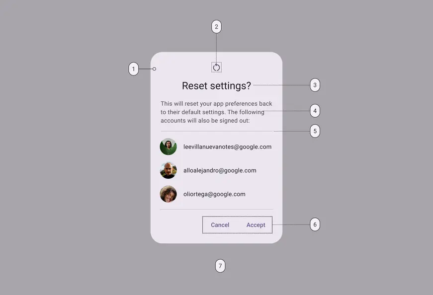
1. Container
2. Icon (optional)
3. Headline (optional)
4. Supporting text
5. Divider (optional)
6. Button label text
7. Scrim
### Basic dialog color
Color values are implemented through [design tokens](../../foundations/design-tokens/overview.md "Design tokens are the building blocks of all UI elements. The same tokens are used in designs, tools, and code."). For design, this means working with color values that correspond with tokens. For implementation, a color value will be a token that references a value. [Learn more about design tokens](../../foundations/design-tokens/overview.md)
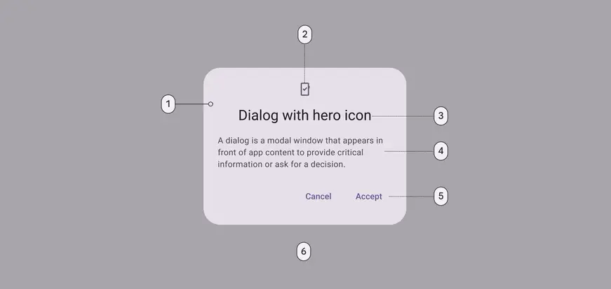
Basic dialog color roles used for light and dark themes:
1. Surface container high
2. Secondary
3. On surface
4. On surface variant
5. Primary
6. Scrim
### Basic dialog measurements
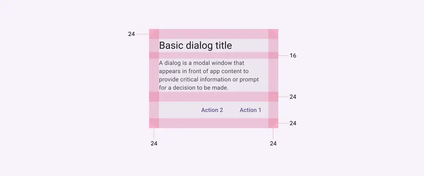
Basic dialog padding and size measurements
| Attribute | Value |
| :------------------------------: | :------------------: |
| Container shape | 28dp corner radius |
| Container height | Dynamic |
| Container width | Min 280dp; Max 560dp |
| Divider height | 1dp |
| Icon size | 24dp |
| Minimum width | 280dp |
| Maximum width | 560dp |
| Alignment with icon | Center-aligned |
| Alignment without icon | Start-aligned |
| Top/Left/right/bottom padding | 24dp |
| Padding between buttons | 8dp |
| Padding between title and body | 16dp |
| Padding between icon and title | 16dp |
| Padding between body and actions | 24dp |
## Full-screen dialogs
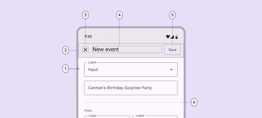
1. Container
2. Header
3. Icon (close affordance)
4. Headline (optional)
5. Text button
6. Divider (optional)
### Full-screen dialog color
Color values are implemented through [design tokens](../../foundations/design-tokens/overview.md "Design tokens are the building blocks of all UI elements. The same tokens are used in designs, tools, and code."). For design, this means working with color values that correspond with tokens. For implementation, a color value will be a token that references a value.
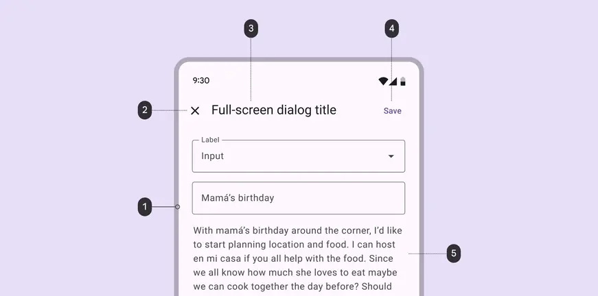
Full-screen dialog color roles used for light and dark themes:
1. Surface container high
2. On surface
3. On surface
4. Primary
5. On surface variant
### Full-screen dialog measurements
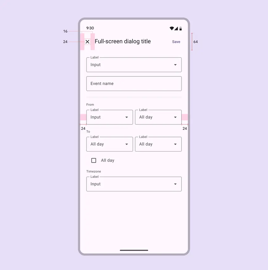
Full-screen dialog padding and size measurements
| Attribute | Value |
| :--------------------------: | :------------------------: |
| Container shape | 0dp corner radius |
| Container height | Dynamic |
| Container width | Container width; Max 560dp |
| Header height | 56dp |
| Header width | Container width |
| Headline text alignment | Start-aligned |
| Divider height | 1dp |
| Icon (close affordance) size | 24dp |
| Bottom action bar height | 56dp |
| Bottom action bar width | Container width |
| Top/left/right padding | 24dp |
| Padding between elements | 8dp |