---
url: /components/date-pickers/specs.md
description: >-
Date pickers let people select a date, or a range of dates. Date pickers can
display past, present, or future dates.
---
# Date pickers
Date pickers let people select a date, or a range of dates. Date pickers can display past, present, or future dates.
[Overview](overview.md) · **Specs** · [Guidelines](guidelines.md) · [Accessibility](accessibility.md)
## Tokens & specs
Select a component variant below to see its elements, attributes, [tokens](../../foundations/design-tokens/overview.md "Design tokens are the building blocks of all UI elements. The same tokens are used in designs, tools, and code."), and their values.
::: token-table token-table-01c5310367774eb8-f54ee4ab
**Date pickers tokens** · 3 token sets · 229 tokens · [live token table](https://m3.material.io/components/date-pickers/specs) · DSDB `TOKEN_TABLE.01c5310367774eb8`
* Default context: Theme: Light · Platform: Android · Audience: 3P · Font: Static · Contrast: Default · iOS dark theme elevation: None · iOS weight setting: Default
* Not configurable here (group default used): Motion scheme: Standard · Language height: Small
* Other contexts: Theme: Dark · Contrast: Medium contrast, High contrast. "Other contexts" lists values that differ from the default when only that one context changes.
* Reference chain: aliases from the token to its source value (`token → alias → … → value`). "—" means the token holds a literal value.
**Date picker - Docked** · `md.comp.date-picker.docked` · 96 tokens
For docked date pickers.
| Group | Token | Type | Reference chain | Resolved value | Other contexts |
| --- | --- | --- | --- | --- | --- |
| Enabled › Container | `md.comp.date-picker.docked.container.color` | Color | `md.sys.color.surface-container-high` → `md.ref.palette.neutral92` | `#ECE6F0` | Dark: `#2B2930` via `md.ref.palette.neutral17` |
| Enabled › Container | `md.comp.date-picker.docked.container.elevation` | Elevation | `md.sys.elevation.level3` | `6dp` | — |
| Enabled › Container | `md.comp.date-picker.docked.container.surface-tint-layer.color` (deprecated) | Color | `md.sys.color.surface-tint` → `md.sys.color.primary` → `md.ref.palette.primary40` | `#6750A4` | Dark: `#D0BCFF` via `md.ref.palette.primary80`
Medium contrast: `#4F378B` via `md.ref.palette.primary30`
High contrast: `#381E72` via `md.ref.palette.primary20` |
| Enabled › Container | `md.comp.date-picker.docked.container.shape` | Shape | `md.sys.shape.corner.large` | `Rounded corners 16dp` | — |
| Enabled › Container | `md.comp.date-picker.docked.date.container.shape` | Shape | `md.sys.shape.corner.full` | `Circular (fully rounded)` | — |
| Enabled › Container | `md.comp.date-picker.docked.date.today.container.outline.color` | Color | `md.sys.color.primary` → `md.ref.palette.primary40` | `#6750A4` | Dark: `#D0BCFF` via `md.ref.palette.primary80`
Medium contrast: `#4F378B` via `md.ref.palette.primary30`
High contrast: `#381E72` via `md.ref.palette.primary20` |
| Enabled › Container | `md.comp.date-picker.docked.date.today.container.outline.width` | Length | — | `1dp` | — |
| Enabled › Container | `md.comp.date-picker.docked.date.selected.container.color` | Color | `md.sys.color.primary` → `md.ref.palette.primary40` | `#6750A4` | Dark: `#D0BCFF` via `md.ref.palette.primary80`
Medium contrast: `#4F378B` via `md.ref.palette.primary30`
High contrast: `#381E72` via `md.ref.palette.primary20` |
| Enabled › Container | `md.comp.date-picker.docked.menu-button.container.shape` | Shape | `md.sys.shape.corner.full` | `Circular (fully rounded)` | — |
| Enabled › Container | `md.comp.date-picker.docked.menu.list-item.selected.container.color` | Color | `md.sys.color.surface-variant` → `md.ref.palette.neutral-variant90` | `#E7E0EC` | Dark: `#49454F` via `md.ref.palette.neutral-variant30` |
| Enabled › Container | `md.comp.date-picker.docked.container.width` | Length | — | `360dp` | — |
| Enabled › Container | `md.comp.date-picker.docked.container.height` | Length | — | `456dp` | — |
| Enabled › Container | `md.comp.date-picker.docked.date.container.width` | Length | — | `48dp` | — |
| Enabled › Container | `md.comp.date-picker.docked.date.container.height` | Length | — | `48dp` | — |
| Enabled › Container | `md.comp.date-picker.docked.menu-button.container.height` | Length | — | `40dp` | — |
| Enabled › Container | `md.comp.date-picker.docked.menu.list-item.container.height` | Length | — | `48dp` | — |
| Enabled › Label text | `md.comp.date-picker.docked.weekdays.label-text.color` | Color | `md.sys.color.on-surface` → `md.ref.palette.neutral10` | `#1D1B20` | Dark: `#E6E0E9` via `md.ref.palette.neutral90`
Medium contrast: `#000000` via `md.ref.palette.neutral0`
High contrast: `#000000` via `md.ref.palette.neutral0` |
| Enabled › Label text | `md.comp.date-picker.docked.weekdays.label-text.font` | Font names | `md.sys.typescale.body-large.font` → `md.ref.typeface.plain` | `Roboto` | — |
| Enabled › Label text | `md.comp.date-picker.docked.weekdays.label-text.line-height` | Line height | `md.sys.typescale.body-large.line-height` | `24pt` | — |
| Enabled › Label text | `md.comp.date-picker.docked.weekdays.label-text.size` | Font size | `md.sys.typescale.body-large.size` | `16pt` | — |
| Enabled › Label text | `md.comp.date-picker.docked.weekdays.label-text.weight` | Font weight | `md.sys.typescale.body-large.weight` → `md.ref.typeface.weight-regular` | `400` | — |
| Enabled › Label text | `md.comp.date-picker.docked.weekdays.label-text.tracking` | Font tracking | `md.sys.typescale.body-large.tracking` | `0.5pt` | — |
| Enabled › Label text | `md.comp.date-picker.docked.weekdays.label-text.type` | Typography | composite
font names: `md.comp.date-picker.docked.weekdays.label-text.font` → `md.sys.typescale.body-large.font` → `md.ref.typeface.plain`
font weight: `md.comp.date-picker.docked.weekdays.label-text.weight` → `md.sys.typescale.body-large.weight` → `md.ref.typeface.weight-regular`
font size: `md.comp.date-picker.docked.weekdays.label-text.size` → `md.sys.typescale.body-large.size`
line height: `md.comp.date-picker.docked.weekdays.label-text.line-height` → `md.sys.typescale.body-large.line-height`
font tracking: `md.comp.date-picker.docked.weekdays.label-text.tracking` → `md.sys.typescale.body-large.tracking` | `Roboto · weight 400 · size 16pt · line height 24pt · tracking 0.5pt` | — |
| Enabled › Label text | `md.comp.date-picker.docked.date.label-text.font` | Font names | `md.sys.typescale.body-large.font` → `md.ref.typeface.plain` | `Roboto` | — |
| Enabled › Label text | `md.comp.date-picker.docked.date.label-text.line-height` | Line height | `md.sys.typescale.body-large.line-height` | `24pt` | — |
| Enabled › Label text | `md.comp.date-picker.docked.date.label-text.size` | Font size | `md.sys.typescale.body-large.size` | `16pt` | — |
| Enabled › Label text | `md.comp.date-picker.docked.date.label-text.weight` | Font weight | `md.sys.typescale.body-large.weight` → `md.ref.typeface.weight-regular` | `400` | — |
| Enabled › Label text | `md.comp.date-picker.docked.date.label-text.tracking` | Font tracking | `md.sys.typescale.body-large.tracking` | `0.5pt` | — |
| Enabled › Label text | `md.comp.date-picker.docked.date.label-text.type` | Typography | composite
font names: `md.comp.date-picker.docked.date.label-text.font` → `md.sys.typescale.body-large.font` → `md.ref.typeface.plain`
font weight: `md.comp.date-picker.docked.date.label-text.weight` → `md.sys.typescale.body-large.weight` → `md.ref.typeface.weight-regular`
font size: `md.comp.date-picker.docked.date.label-text.size` → `md.sys.typescale.body-large.size`
line height: `md.comp.date-picker.docked.date.label-text.line-height` → `md.sys.typescale.body-large.line-height`
font tracking: `md.comp.date-picker.docked.date.label-text.tracking` → `md.sys.typescale.body-large.tracking` | `Roboto · weight 400 · size 16pt · line height 24pt · tracking 0.5pt` | — |
| Enabled › Label text | `md.comp.date-picker.docked.date.unselected.label-text.color` | Color | `md.sys.color.on-surface` → `md.ref.palette.neutral10` | `#1D1B20` | Dark: `#E6E0E9` via `md.ref.palette.neutral90`
Medium contrast: `#000000` via `md.ref.palette.neutral0`
High contrast: `#000000` via `md.ref.palette.neutral0` |
| Enabled › Label text | `md.comp.date-picker.docked.date.unselected.outside-month.label-text.color` | Color | `md.sys.color.on-surface` → `md.ref.palette.neutral10` | `#1D1B20` | Dark: `#E6E0E9` via `md.ref.palette.neutral90`
Medium contrast: `#000000` via `md.ref.palette.neutral0`
High contrast: `#000000` via `md.ref.palette.neutral0` |
| Enabled › Label text | `md.comp.date-picker.docked.date.unselected.outside-month.label-text.opacity` | Opacity | — | `0.38` | — |
| Enabled › Label text | `md.comp.date-picker.docked.date.today.label-text.color` | Color | `md.sys.color.primary` → `md.ref.palette.primary40` | `#6750A4` | Dark: `#D0BCFF` via `md.ref.palette.primary80`
Medium contrast: `#4F378B` via `md.ref.palette.primary30`
High contrast: `#381E72` via `md.ref.palette.primary20` |
| Enabled › Label text | `md.comp.date-picker.docked.date.selected.label-text.color` | Color | `md.sys.color.on-primary` → `md.ref.palette.primary100` | `#FFFFFF` | Dark: `#381E72` via `md.ref.palette.primary20` |
| Enabled › Label text | `md.comp.date-picker.docked.menu-button.label-text.color` | Color | `md.sys.color.on-surface-variant` → `md.ref.palette.neutral-variant30` | `#49454F` | Dark: `#CAC4D0` via `md.ref.palette.neutral-variant80`
Medium contrast: `#322F37` via `md.ref.palette.neutral-variant20`
High contrast: `#000000` via `md.ref.palette.neutral-variant0` |
| Enabled › Label text | `md.comp.date-picker.docked.menu-button.label-text.font` | Font names | `md.sys.typescale.label-large.font` → `md.ref.typeface.plain` | `Roboto` | — |
| Enabled › Label text | `md.comp.date-picker.docked.menu-button.label-text.line-height` | Line height | `md.sys.typescale.label-large.line-height` | `20pt` | — |
| Enabled › Label text | `md.comp.date-picker.docked.menu-button.label-text.size` | Font size | `md.sys.typescale.label-large.size` | `14pt` | — |
| Enabled › Label text | `md.comp.date-picker.docked.menu-button.label-text.weight` | Font weight | `md.sys.typescale.label-large.weight` → `md.ref.typeface.weight-medium` | `500` | — |
| Enabled › Label text | `md.comp.date-picker.docked.menu-button.label-text.tracking` | Font tracking | `md.sys.typescale.label-large.tracking` | `0.1pt` | — |
| Enabled › Label text | `md.comp.date-picker.docked.menu-button.label-text.type` | Typography | composite
font names: `md.comp.date-picker.docked.menu-button.label-text.font` → `md.sys.typescale.label-large.font` → `md.ref.typeface.plain`
font weight: `md.comp.date-picker.docked.menu-button.label-text.weight` → `md.sys.typescale.label-large.weight` → `md.ref.typeface.weight-medium`
font size: `md.comp.date-picker.docked.menu-button.label-text.size` → `md.sys.typescale.label-large.size`
line height: `md.comp.date-picker.docked.menu-button.label-text.line-height` → `md.sys.typescale.label-large.line-height`
font tracking: `md.comp.date-picker.docked.menu-button.label-text.tracking` → `md.sys.typescale.label-large.tracking` | `Roboto · weight 500 · size 14pt · line height 20pt · tracking 0.1pt` | — |
| Enabled › Label text | `md.comp.date-picker.docked.menu.list-item.label-text.color` | Color | `md.sys.color.on-surface` → `md.ref.palette.neutral10` | `#1D1B20` | Dark: `#E6E0E9` via `md.ref.palette.neutral90`
Medium contrast: `#000000` via `md.ref.palette.neutral0`
High contrast: `#000000` via `md.ref.palette.neutral0` |
| Enabled › Label text | `md.comp.date-picker.docked.menu.list-item.label-text.font` | Font names | `md.sys.typescale.body-large.font` → `md.ref.typeface.plain` | `Roboto` | — |
| Enabled › Label text | `md.comp.date-picker.docked.menu.list-item.label-text.line-height` | Line height | `md.sys.typescale.body-large.line-height` | `24pt` | — |
| Enabled › Label text | `md.comp.date-picker.docked.menu.list-item.label-text.size` | Font size | `md.sys.typescale.body-large.size` | `16pt` | — |
| Enabled › Label text | `md.comp.date-picker.docked.menu.list-item.label-text.tracking` | Font tracking | `md.sys.typescale.body-large.tracking` | `0.5pt` | — |
| Enabled › Label text | `md.comp.date-picker.docked.menu.list-item.label-text.weight` | Font weight | `md.sys.typescale.body-large.weight` → `md.ref.typeface.weight-regular` | `400` | — |
| Enabled › Label text | `md.comp.date-picker.docked.menu.list-item.label-text.type` | Typography | composite
font names: `md.comp.date-picker.docked.menu.list-item.label-text.font` → `md.sys.typescale.body-large.font` → `md.ref.typeface.plain`
font weight: `md.comp.date-picker.docked.menu.list-item.label-text.weight` → `md.sys.typescale.body-large.weight` → `md.ref.typeface.weight-regular`
font size: `md.comp.date-picker.docked.menu.list-item.label-text.size` → `md.sys.typescale.body-large.size`
line height: `md.comp.date-picker.docked.menu.list-item.label-text.line-height` → `md.sys.typescale.body-large.line-height`
font tracking: `md.comp.date-picker.docked.menu.list-item.label-text.tracking` → `md.sys.typescale.body-large.tracking` | `Roboto · weight 400 · size 16pt · line height 24pt · tracking 0.5pt` | — |
| Enabled › Icon | `md.comp.date-picker.docked.menu-button.icon.color` | Color | `md.sys.color.on-surface-variant` → `md.ref.palette.neutral-variant30` | `#49454F` | Dark: `#CAC4D0` via `md.ref.palette.neutral-variant80`
Medium contrast: `#322F37` via `md.ref.palette.neutral-variant20`
High contrast: `#000000` via `md.ref.palette.neutral-variant0` |
| Enabled › Icon | `md.comp.date-picker.docked.menu-button.icon.size` | Length | — | `18dp` | — |
| Enabled › Leading icon | `md.comp.date-picker.docked.menu.list-item.selected.leading-icon.color` | Color | `md.sys.color.on-surface` → `md.ref.palette.neutral10` | `#1D1B20` | Dark: `#E6E0E9` via `md.ref.palette.neutral90`
Medium contrast: `#000000` via `md.ref.palette.neutral0`
High contrast: `#000000` via `md.ref.palette.neutral0` |
| Enabled › Leading icon | `md.comp.date-picker.docked.menu.list-item.selected.leading-icon.size` | Length | — | `24dp` | — |
| Enabled › State layer | `md.comp.date-picker.docked.date.state-layer.shape` | Shape | `md.sys.shape.corner.full` | `Circular (fully rounded)` | — |
| Enabled › State layer | `md.comp.date-picker.docked.date.state-layer.width` | Length | — | `40dp` | — |
| Enabled › State layer | `md.comp.date-picker.docked.date.state-layer.height` | Length | — | `40dp` | — |
| Enabled › Header | `md.comp.date-picker.docked.header.height` | Length | — | `64dp` | — |
| Disabled › Label text | `md.comp.date-picker.docked.menu-button.disabled.label-text.color` | Color | `md.sys.color.on-surface` → `md.ref.palette.neutral10` | `#1D1B20` | Dark: `#E6E0E9` via `md.ref.palette.neutral90`
Medium contrast: `#000000` via `md.ref.palette.neutral0`
High contrast: `#000000` via `md.ref.palette.neutral0` |
| Disabled › Label text | `md.comp.date-picker.docked.menu-button.disabled.label-text.opacity` | Opacity | — | `0.38` | — |
| Disabled › Icon | `md.comp.date-picker.docked.menu-button.disabled.icon.color` | Color | `md.sys.color.on-surface` → `md.ref.palette.neutral10` | `#1D1B20` | Dark: `#E6E0E9` via `md.ref.palette.neutral90`
Medium contrast: `#000000` via `md.ref.palette.neutral0`
High contrast: `#000000` via `md.ref.palette.neutral0` |
| Disabled › Icon | `md.comp.date-picker.docked.menu-button.disabled.icon.opacity` | Opacity | — | `0.38` | — |
| Hovered › Label text | `md.comp.date-picker.docked.menu-button.hover.label-text.color` | Color | `md.sys.color.on-surface-variant` → `md.ref.palette.neutral-variant30` | `#49454F` | Dark: `#CAC4D0` via `md.ref.palette.neutral-variant80`
Medium contrast: `#322F37` via `md.ref.palette.neutral-variant20`
High contrast: `#000000` via `md.ref.palette.neutral-variant0` |
| Hovered › Label text | `md.comp.date-picker.docked.menu.list-item.hover.label-text.color` | Color | `md.sys.color.on-surface` → `md.ref.palette.neutral10` | `#1D1B20` | Dark: `#E6E0E9` via `md.ref.palette.neutral90`
Medium contrast: `#000000` via `md.ref.palette.neutral0`
High contrast: `#000000` via `md.ref.palette.neutral0` |
| Hovered › State layer | `md.comp.date-picker.docked.date.unselected.hover.state-layer.color` | Color | `md.sys.color.on-surface-variant` → `md.ref.palette.neutral-variant30` | `#49454F` | Dark: `#CAC4D0` via `md.ref.palette.neutral-variant80`
Medium contrast: `#322F37` via `md.ref.palette.neutral-variant20`
High contrast: `#000000` via `md.ref.palette.neutral-variant0` |
| Hovered › State layer | `md.comp.date-picker.docked.date.selected.hover.state-layer.color` | Color | `md.sys.color.on-primary` → `md.ref.palette.primary100` | `#FFFFFF` | Dark: `#381E72` via `md.ref.palette.primary20` |
| Hovered › State layer | `md.comp.date-picker.docked.date.today.hover.state-layer.color` | Color | `md.sys.color.primary` → `md.ref.palette.primary40` | `#6750A4` | Dark: `#D0BCFF` via `md.ref.palette.primary80`
Medium contrast: `#4F378B` via `md.ref.palette.primary30`
High contrast: `#381E72` via `md.ref.palette.primary20` |
| Hovered › State layer | `md.comp.date-picker.docked.date.hover.state-layer.opacity` | Opacity | `md.sys.state.hover.state-layer-opacity` | `0.08` | — |
| Hovered › State layer | `md.comp.date-picker.docked.menu-button.hover.state-layer.color` | Color | `md.sys.color.on-surface-variant` → `md.ref.palette.neutral-variant30` | `#49454F` | Dark: `#CAC4D0` via `md.ref.palette.neutral-variant80`
Medium contrast: `#322F37` via `md.ref.palette.neutral-variant20`
High contrast: `#000000` via `md.ref.palette.neutral-variant0` |
| Hovered › State layer | `md.comp.date-picker.docked.menu-button.hover.state-layer.opacity` | Opacity | `md.sys.state.hover.state-layer-opacity` | `0.08` | — |
| Hovered › State layer | `md.comp.date-picker.docked.menu.list-item.hover.state-layer.color` | Color | `md.sys.color.on-surface` → `md.ref.palette.neutral10` | `#1D1B20` | Dark: `#E6E0E9` via `md.ref.palette.neutral90`
Medium contrast: `#000000` via `md.ref.palette.neutral0`
High contrast: `#000000` via `md.ref.palette.neutral0` |
| Hovered › State layer | `md.comp.date-picker.docked.menu.list-item.hover.state-layer.opacity` | Opacity | `md.sys.state.hover.state-layer-opacity` | `0.08` | — |
| Hovered › Icon | `md.comp.date-picker.docked.menu-button.hover.icon.color` | Color | `md.sys.color.on-surface-variant` → `md.ref.palette.neutral-variant30` | `#49454F` | Dark: `#CAC4D0` via `md.ref.palette.neutral-variant80`
Medium contrast: `#322F37` via `md.ref.palette.neutral-variant20`
High contrast: `#000000` via `md.ref.palette.neutral-variant0` |
| Hovered › Leading icon | `md.comp.date-picker.docked.menu.list-item.selected.hover.leading-icon.color` | Color | `md.sys.color.on-surface-variant` → `md.ref.palette.neutral-variant30` | `#49454F` | Dark: `#CAC4D0` via `md.ref.palette.neutral-variant80`
Medium contrast: `#322F37` via `md.ref.palette.neutral-variant20`
High contrast: `#000000` via `md.ref.palette.neutral-variant0` |
| Focused › Label text | `md.comp.date-picker.docked.menu-button.focus.label-text.color` | Color | `md.sys.color.on-surface-variant` → `md.ref.palette.neutral-variant30` | `#49454F` | Dark: `#CAC4D0` via `md.ref.palette.neutral-variant80`
Medium contrast: `#322F37` via `md.ref.palette.neutral-variant20`
High contrast: `#000000` via `md.ref.palette.neutral-variant0` |
| Focused › Label text | `md.comp.date-picker.docked.menu.list-item.focus.label-text.color` | Color | `md.sys.color.on-surface` → `md.ref.palette.neutral10` | `#1D1B20` | Dark: `#E6E0E9` via `md.ref.palette.neutral90`
Medium contrast: `#000000` via `md.ref.palette.neutral0`
High contrast: `#000000` via `md.ref.palette.neutral0` |
| Focused › State layer | `md.comp.date-picker.docked.date.unselected.focus.state-layer.color` | Color | `md.sys.color.on-surface-variant` → `md.ref.palette.neutral-variant30` | `#49454F` | Dark: `#CAC4D0` via `md.ref.palette.neutral-variant80`
Medium contrast: `#322F37` via `md.ref.palette.neutral-variant20`
High contrast: `#000000` via `md.ref.palette.neutral-variant0` |
| Focused › State layer | `md.comp.date-picker.docked.date.selected.focus.state-layer.color` | Color | `md.sys.color.on-primary` → `md.ref.palette.primary100` | `#FFFFFF` | Dark: `#381E72` via `md.ref.palette.primary20` |
| Focused › State layer | `md.comp.date-picker.docked.date.today.focus.state-layer.color` | Color | `md.sys.color.primary` → `md.ref.palette.primary40` | `#6750A4` | Dark: `#D0BCFF` via `md.ref.palette.primary80`
Medium contrast: `#4F378B` via `md.ref.palette.primary30`
High contrast: `#381E72` via `md.ref.palette.primary20` |
| Focused › State layer | `md.comp.date-picker.docked.date.focus.state-layer.opacity` | Opacity | `md.sys.state.focus.state-layer-opacity` | `0.1` | — |
| Focused › State layer | `md.comp.date-picker.docked.menu-button.focus.state-layer.color` | Color | `md.sys.color.on-surface-variant` → `md.ref.palette.neutral-variant30` | `#49454F` | Dark: `#CAC4D0` via `md.ref.palette.neutral-variant80`
Medium contrast: `#322F37` via `md.ref.palette.neutral-variant20`
High contrast: `#000000` via `md.ref.palette.neutral-variant0` |
| Focused › State layer | `md.comp.date-picker.docked.menu-button.focus.state-layer.opacity` | Opacity | `md.sys.state.focus.state-layer-opacity` | `0.1` | — |
| Focused › State layer | `md.comp.date-picker.docked.menu.list-item.focus.state-layer.color` | Color | `md.sys.color.on-surface` → `md.ref.palette.neutral10` | `#1D1B20` | Dark: `#E6E0E9` via `md.ref.palette.neutral90`
Medium contrast: `#000000` via `md.ref.palette.neutral0`
High contrast: `#000000` via `md.ref.palette.neutral0` |
| Focused › State layer | `md.comp.date-picker.docked.menu.list-item.focus.state-layer.opacity` | Opacity | `md.sys.state.focus.state-layer-opacity` | `0.1` | — |
| Focused › Icon | `md.comp.date-picker.docked.menu-button.focus.icon.color` | Color | `md.sys.color.on-surface-variant` → `md.ref.palette.neutral-variant30` | `#49454F` | Dark: `#CAC4D0` via `md.ref.palette.neutral-variant80`
Medium contrast: `#322F37` via `md.ref.palette.neutral-variant20`
High contrast: `#000000` via `md.ref.palette.neutral-variant0` |
| Focused › Leading icon | `md.comp.date-picker.docked.menu.list-item.selected.focus.leading-icon.color` | Color | `md.sys.color.on-surface-variant` → `md.ref.palette.neutral-variant30` | `#49454F` | Dark: `#CAC4D0` via `md.ref.palette.neutral-variant80`
Medium contrast: `#322F37` via `md.ref.palette.neutral-variant20`
High contrast: `#000000` via `md.ref.palette.neutral-variant0` |
| Pressed (ripple) › Label text | `md.comp.date-picker.docked.menu-button.pressed.label-text.color` | Color | `md.sys.color.on-surface-variant` → `md.ref.palette.neutral-variant30` | `#49454F` | Dark: `#CAC4D0` via `md.ref.palette.neutral-variant80`
Medium contrast: `#322F37` via `md.ref.palette.neutral-variant20`
High contrast: `#000000` via `md.ref.palette.neutral-variant0` |
| Pressed (ripple) › Label text | `md.comp.date-picker.docked.menu.list-item.pressed.label-text.color` | Color | `md.sys.color.on-surface` → `md.ref.palette.neutral10` | `#1D1B20` | Dark: `#E6E0E9` via `md.ref.palette.neutral90`
Medium contrast: `#000000` via `md.ref.palette.neutral0`
High contrast: `#000000` via `md.ref.palette.neutral0` |
| Pressed (ripple) › State layer | `md.comp.date-picker.docked.date.unselected.pressed.state-layer.color` | Color | `md.sys.color.on-surface-variant` → `md.ref.palette.neutral-variant30` | `#49454F` | Dark: `#CAC4D0` via `md.ref.palette.neutral-variant80`
Medium contrast: `#322F37` via `md.ref.palette.neutral-variant20`
High contrast: `#000000` via `md.ref.palette.neutral-variant0` |
| Pressed (ripple) › State layer | `md.comp.date-picker.docked.date.selected.pressed.state-layer.color` | Color | `md.sys.color.on-primary` → `md.ref.palette.primary100` | `#FFFFFF` | Dark: `#381E72` via `md.ref.palette.primary20` |
| Pressed (ripple) › State layer | `md.comp.date-picker.docked.date.today.pressed.state-layer.color` | Color | `md.sys.color.primary` → `md.ref.palette.primary40` | `#6750A4` | Dark: `#D0BCFF` via `md.ref.palette.primary80`
Medium contrast: `#4F378B` via `md.ref.palette.primary30`
High contrast: `#381E72` via `md.ref.palette.primary20` |
| Pressed (ripple) › State layer | `md.comp.date-picker.docked.date.pressed.state-layer.opacity` | Opacity | `md.sys.state.pressed.state-layer-opacity` | `0.1` | — |
| Pressed (ripple) › State layer | `md.comp.date-picker.docked.menu-button.pressed.state-layer.color` | Color | `md.sys.color.on-surface-variant` → `md.ref.palette.neutral-variant30` | `#49454F` | Dark: `#CAC4D0` via `md.ref.palette.neutral-variant80`
Medium contrast: `#322F37` via `md.ref.palette.neutral-variant20`
High contrast: `#000000` via `md.ref.palette.neutral-variant0` |
| Pressed (ripple) › State layer | `md.comp.date-picker.docked.menu-button.pressed.state-layer.opacity` | Opacity | `md.sys.state.pressed.state-layer-opacity` | `0.1` | — |
| Pressed (ripple) › State layer | `md.comp.date-picker.docked.menu.list-item.pressed.state-layer.color` | Color | `md.sys.color.on-surface` → `md.ref.palette.neutral10` | `#1D1B20` | Dark: `#E6E0E9` via `md.ref.palette.neutral90`
Medium contrast: `#000000` via `md.ref.palette.neutral0`
High contrast: `#000000` via `md.ref.palette.neutral0` |
| Pressed (ripple) › State layer | `md.comp.date-picker.docked.menu.list-item.pressed.state-layer.opacity` | Opacity | `md.sys.state.pressed.state-layer-opacity` | `0.1` | — |
| Pressed (ripple) › Icon | `md.comp.date-picker.docked.menu-button.pressed.icon.color` | Color | `md.sys.color.on-surface-variant` → `md.ref.palette.neutral-variant30` | `#49454F` | Dark: `#CAC4D0` via `md.ref.palette.neutral-variant80`
Medium contrast: `#322F37` via `md.ref.palette.neutral-variant20`
High contrast: `#000000` via `md.ref.palette.neutral-variant0` |
| Pressed (ripple) › Leading icon | `md.comp.date-picker.docked.menu.list-item.selected.pressed.leading-icon.color` | Color | `md.sys.color.on-surface-variant` → `md.ref.palette.neutral-variant30` | `#49454F` | Dark: `#CAC4D0` via `md.ref.palette.neutral-variant80`
Medium contrast: `#322F37` via `md.ref.palette.neutral-variant20`
High contrast: `#000000` via `md.ref.palette.neutral-variant0` |
**Date picker - Modal** · `md.comp.date-picker.modal` · 111 tokens
For modal calendar date pickers.
| Group | Token | Type | Reference chain | Resolved value | Other contexts |
| --- | --- | --- | --- | --- | --- |
| Enabled › Container | `md.comp.date-picker.modal.container.color` | Color | `md.sys.color.surface-container-high` → `md.ref.palette.neutral92` | `#ECE6F0` | Dark: `#2B2930` via `md.ref.palette.neutral17` |
| Enabled › Container | `md.comp.date-picker.modal.container.elevation` | Elevation | `md.sys.elevation.level3` | `6dp` | — |
| Enabled › Container | `md.comp.date-picker.modal.container.surface-tint-layer.color` (deprecated) | Color | `md.sys.color.surface-tint` → `md.sys.color.primary` → `md.ref.palette.primary40` | `#6750A4` | Dark: `#D0BCFF` via `md.ref.palette.primary80`
Medium contrast: `#4F378B` via `md.ref.palette.primary30`
High contrast: `#381E72` via `md.ref.palette.primary20` |
| Enabled › Container | `md.comp.date-picker.modal.container.shape` | Shape | `md.sys.shape.corner.extra-large` | `Rounded corners 28dp` | — |
| Enabled › Container | `md.comp.date-picker.modal.range-selection.container.elevation` | Elevation | `md.sys.elevation.level0` | `0dp` | — |
| Enabled › Container | `md.comp.date-picker.modal.range-selection.container.shape` | Shape | `md.sys.shape.corner.none` | `Rounded corners 0dp` | — |
| Enabled › Container | `md.comp.date-picker.modal.date.container.shape` | Shape | `md.sys.shape.corner.full` | `Circular (fully rounded)` | — |
| Enabled › Container | `md.comp.date-picker.modal.date.today.container.outline.color` | Color | `md.sys.color.primary` → `md.ref.palette.primary40` | `#6750A4` | Dark: `#D0BCFF` via `md.ref.palette.primary80`
Medium contrast: `#4F378B` via `md.ref.palette.primary30`
High contrast: `#381E72` via `md.ref.palette.primary20` |
| Enabled › Container | `md.comp.date-picker.modal.date.today.container.outline.width` | Length | — | `1dp` | — |
| Enabled › Container | `md.comp.date-picker.modal.date.selected.container.color` | Color | `md.sys.color.primary` → `md.ref.palette.primary40` | `#6750A4` | Dark: `#D0BCFF` via `md.ref.palette.primary80`
Medium contrast: `#4F378B` via `md.ref.palette.primary30`
High contrast: `#381E72` via `md.ref.palette.primary20` |
| Enabled › Container | `md.comp.date-picker.modal.range-selection.active-indicator.container.color` | Color | `md.sys.color.secondary-container` → `md.ref.palette.secondary90` | `#E8DEF8` | Dark: `#4A4458` via `md.ref.palette.secondary30`
Medium contrast: `#625B71` via `md.ref.palette.secondary40`
High contrast: `#4A4458` via `md.ref.palette.secondary30` |
| Enabled › Container | `md.comp.date-picker.modal.range-selection.active-indicator.container.shape` | Shape | `md.sys.shape.corner.full` | `Circular (fully rounded)` | — |
| Enabled › Container | `md.comp.date-picker.modal.year-selection.year.selected.container.color` | Color | `md.sys.color.primary` → `md.ref.palette.primary40` | `#6750A4` | Dark: `#D0BCFF` via `md.ref.palette.primary80`
Medium contrast: `#4F378B` via `md.ref.palette.primary30`
High contrast: `#381E72` via `md.ref.palette.primary20` |
| Enabled › Container | `md.comp.date-picker.modal.container.width` | Length | — | `360dp` | — |
| Enabled › Container | `md.comp.date-picker.modal.container.height` | Length | — | `524dp` | — |
| Enabled › Container | `md.comp.date-picker.modal.header.container.width` | Length | — | `360dp` | — |
| Enabled › Container | `md.comp.date-picker.modal.header.container.height` | Length | — | `120dp` | — |
| Enabled › Container | `md.comp.date-picker.modal.range-selection.header.container.height` | Length | — | `128dp` | — |
| Enabled › Container | `md.comp.date-picker.modal.date.container.width` | Length | — | `40dp` | — |
| Enabled › Container | `md.comp.date-picker.modal.date.container.height` | Length | — | `40dp` | — |
| Enabled › Container | `md.comp.date-picker.modal.year-selection.year.container.width` | Length | — | `72dp` | — |
| Enabled › Container | `md.comp.date-picker.modal.year-selection.year.container.height` | Length | — | `36dp` | — |
| Enabled › Container | `md.comp.date-picker.modal.range-selection.active-indicator.container.height` | Length | — | `40dp` | — |
| Enabled › Label text | `md.comp.date-picker.modal.weekdays.label-text.color` | Color | `md.sys.color.on-surface` → `md.ref.palette.neutral10` | `#1D1B20` | Dark: `#E6E0E9` via `md.ref.palette.neutral90`
Medium contrast: `#000000` via `md.ref.palette.neutral0`
High contrast: `#000000` via `md.ref.palette.neutral0` |
| Enabled › Label text | `md.comp.date-picker.modal.weekdays.label-text.font` | Font names | `md.sys.typescale.body-large.font` → `md.ref.typeface.plain` | `Roboto` | — |
| Enabled › Label text | `md.comp.date-picker.modal.weekdays.label-text.line-height` | Line height | `md.sys.typescale.body-large.line-height` | `24pt` | — |
| Enabled › Label text | `md.comp.date-picker.modal.weekdays.label-text.size` | Font size | `md.sys.typescale.body-large.size` | `16pt` | — |
| Enabled › Label text | `md.comp.date-picker.modal.weekdays.label-text.weight` | Font weight | `md.sys.typescale.body-large.weight` → `md.ref.typeface.weight-regular` | `400` | — |
| Enabled › Label text | `md.comp.date-picker.modal.weekdays.label-text.tracking` | Font tracking | `md.sys.typescale.body-large.tracking` | `0.5pt` | — |
| Enabled › Label text | `md.comp.date-picker.modal.weekdays.label-text.type` | Typography | composite
font names: `md.comp.date-picker.modal.weekdays.label-text.font` → `md.sys.typescale.body-large.font` → `md.ref.typeface.plain`
font weight: `md.comp.date-picker.modal.weekdays.label-text.weight` → `md.sys.typescale.body-large.weight` → `md.ref.typeface.weight-regular`
font size: `md.comp.date-picker.modal.weekdays.label-text.size` → `md.sys.typescale.body-large.size`
line height: `md.comp.date-picker.modal.weekdays.label-text.line-height` → `md.sys.typescale.body-large.line-height`
font tracking: `md.comp.date-picker.modal.weekdays.label-text.tracking` → `md.sys.typescale.body-large.tracking` | `Roboto · weight 400 · size 16pt · line height 24pt · tracking 0.5pt` | — |
| Enabled › Label text | `md.comp.date-picker.modal.date.label-text.font` | Font names | `md.sys.typescale.body-large.font` → `md.ref.typeface.plain` | `Roboto` | — |
| Enabled › Label text | `md.comp.date-picker.modal.date.label-text.line-height` | Line height | `md.sys.typescale.body-large.line-height` | `24pt` | — |
| Enabled › Label text | `md.comp.date-picker.modal.date.label-text.size` | Font size | `md.sys.typescale.body-large.size` | `16pt` | — |
| Enabled › Label text | `md.comp.date-picker.modal.date.label-text.weight` | Font weight | `md.sys.typescale.body-large.weight` → `md.ref.typeface.weight-regular` | `400` | — |
| Enabled › Label text | `md.comp.date-picker.modal.date.label-text.tracking` | Font tracking | `md.sys.typescale.body-large.tracking` | `0.5pt` | — |
| Enabled › Label text | `md.comp.date-picker.modal.date.label-text.type` | Typography | composite
font names: `md.comp.date-picker.modal.date.label-text.font` → `md.sys.typescale.body-large.font` → `md.ref.typeface.plain`
font weight: `md.comp.date-picker.modal.date.label-text.weight` → `md.sys.typescale.body-large.weight` → `md.ref.typeface.weight-regular`
font size: `md.comp.date-picker.modal.date.label-text.size` → `md.sys.typescale.body-large.size`
line height: `md.comp.date-picker.modal.date.label-text.line-height` → `md.sys.typescale.body-large.line-height`
font tracking: `md.comp.date-picker.modal.date.label-text.tracking` → `md.sys.typescale.body-large.tracking` | `Roboto · weight 400 · size 16pt · line height 24pt · tracking 0.5pt` | — |
| Enabled › Label text | `md.comp.date-picker.modal.date.unselected.label-text.color` | Color | `md.sys.color.on-surface` → `md.ref.palette.neutral10` | `#1D1B20` | Dark: `#E6E0E9` via `md.ref.palette.neutral90`
Medium contrast: `#000000` via `md.ref.palette.neutral0`
High contrast: `#000000` via `md.ref.palette.neutral0` |
| Enabled › Label text | `md.comp.date-picker.modal.date.today.label-text.color` | Color | `md.sys.color.primary` → `md.ref.palette.primary40` | `#6750A4` | Dark: `#D0BCFF` via `md.ref.palette.primary80`
Medium contrast: `#4F378B` via `md.ref.palette.primary30`
High contrast: `#381E72` via `md.ref.palette.primary20` |
| Enabled › Label text | `md.comp.date-picker.modal.date.selected.label-text.color` | Color | `md.sys.color.on-primary` → `md.ref.palette.primary100` | `#FFFFFF` | Dark: `#381E72` via `md.ref.palette.primary20` |
| Enabled › Label text | `md.comp.date-picker.modal.range-selection.date.in-range.label-text.color` | Color | `md.sys.color.on-secondary-container` → `md.ref.palette.secondary30` | `#4A4458` | Dark: `#E8DEF8` via `md.ref.palette.secondary90`
Medium contrast: `#FFFFFF` via `md.ref.palette.secondary100`
High contrast: `#FFFFFF` via `md.ref.palette.secondary100` |
| Enabled › Label text | `md.comp.date-picker.modal.year-selection.year.label-text.font` | Font names | `md.sys.typescale.body-large.font` → `md.ref.typeface.plain` | `Roboto` | — |
| Enabled › Label text | `md.comp.date-picker.modal.year-selection.year.label-text.line-height` | Line height | `md.sys.typescale.body-large.line-height` | `24pt` | — |
| Enabled › Label text | `md.comp.date-picker.modal.year-selection.year.label-text.size` | Font size | `md.sys.typescale.body-large.size` | `16pt` | — |
| Enabled › Label text | `md.comp.date-picker.modal.year-selection.year.label-text.weight` | Font weight | `md.sys.typescale.body-large.weight` → `md.ref.typeface.weight-regular` | `400` | — |
| Enabled › Label text | `md.comp.date-picker.modal.year-selection.year.label-text.tracking` | Font tracking | `md.sys.typescale.body-large.tracking` | `0.5pt` | — |
| Enabled › Label text | `md.comp.date-picker.modal.year-selection.year.label-text.type` | Typography | composite
font names: `md.comp.date-picker.modal.year-selection.year.label-text.font` → `md.sys.typescale.body-large.font` → `md.ref.typeface.plain`
font weight: `md.comp.date-picker.modal.year-selection.year.label-text.weight` → `md.sys.typescale.body-large.weight` → `md.ref.typeface.weight-regular`
font size: `md.comp.date-picker.modal.year-selection.year.label-text.size` → `md.sys.typescale.body-large.size`
line height: `md.comp.date-picker.modal.year-selection.year.label-text.line-height` → `md.sys.typescale.body-large.line-height`
font tracking: `md.comp.date-picker.modal.year-selection.year.label-text.tracking` → `md.sys.typescale.body-large.tracking` | `Roboto · weight 400 · size 16pt · line height 24pt · tracking 0.5pt` | — |
| Enabled › Label text | `md.comp.date-picker.modal.year-selection.year.selected.label-text.color` | Color | `md.sys.color.on-primary` → `md.ref.palette.primary100` | `#FFFFFF` | Dark: `#381E72` via `md.ref.palette.primary20` |
| Enabled › Label text | `md.comp.date-picker.modal.year-selection.year.unselected.label-text.color` | Color | `md.sys.color.on-surface-variant` → `md.ref.palette.neutral-variant30` | `#49454F` | Dark: `#CAC4D0` via `md.ref.palette.neutral-variant80`
Medium contrast: `#322F37` via `md.ref.palette.neutral-variant20`
High contrast: `#000000` via `md.ref.palette.neutral-variant0` |
| Enabled › Subhead | `md.comp.date-picker.modal.range-selection.month.subhead.color` | Color | `md.sys.color.on-surface-variant` → `md.ref.palette.neutral-variant30` | `#49454F` | Dark: `#CAC4D0` via `md.ref.palette.neutral-variant80`
Medium contrast: `#322F37` via `md.ref.palette.neutral-variant20`
High contrast: `#000000` via `md.ref.palette.neutral-variant0` |
| Enabled › Subhead | `md.comp.date-picker.modal.range-selection.month.subhead.font` | Font names | `md.sys.typescale.title-small.font` → `md.ref.typeface.plain` | `Roboto` | — |
| Enabled › Subhead | `md.comp.date-picker.modal.range-selection.month.subhead.line-height` | Line height | `md.sys.typescale.title-small.line-height` | `20pt` | — |
| Enabled › Subhead | `md.comp.date-picker.modal.range-selection.month.subhead.size` | Font size | `md.sys.typescale.title-small.size` | `14pt` | — |
| Enabled › Subhead | `md.comp.date-picker.modal.range-selection.month.subhead.weight` | Font weight | `md.sys.typescale.title-small.weight` → `md.ref.typeface.weight-medium` | `500` | — |
| Enabled › Subhead | `md.comp.date-picker.modal.range-selection.month.subhead.tracking` | Font tracking | `md.sys.typescale.title-small.tracking` | `0.1pt` | — |
| Enabled › Subhead | `md.comp.date-picker.modal.range-selection.month.subhead.type` | Typography | composite
font names: `md.comp.date-picker.modal.range-selection.month.subhead.font` → `md.sys.typescale.title-small.font` → `md.ref.typeface.plain`
font weight: `md.comp.date-picker.modal.range-selection.month.subhead.weight` → `md.sys.typescale.title-small.weight` → `md.ref.typeface.weight-medium`
font size: `md.comp.date-picker.modal.range-selection.month.subhead.size` → `md.sys.typescale.title-small.size`
line height: `md.comp.date-picker.modal.range-selection.month.subhead.line-height` → `md.sys.typescale.title-small.line-height`
font tracking: `md.comp.date-picker.modal.range-selection.month.subhead.tracking` → `md.sys.typescale.title-small.tracking` | `Roboto · weight 500 · size 14pt · line height 20pt · tracking 0.1pt` | — |
| Enabled › Headline | `md.comp.date-picker.modal.header.headline.color` | Color | `md.sys.color.on-surface-variant` → `md.ref.palette.neutral-variant30` | `#49454F` | Dark: `#CAC4D0` via `md.ref.palette.neutral-variant80`
Medium contrast: `#322F37` via `md.ref.palette.neutral-variant20`
High contrast: `#000000` via `md.ref.palette.neutral-variant0` |
| Enabled › Headline | `md.comp.date-picker.modal.header.headline.font` | Font names | `md.sys.typescale.headline-large.font` → `md.ref.typeface.brand` | `Roboto` | — |
| Enabled › Headline | `md.comp.date-picker.modal.header.headline.line-height` | Line height | `md.sys.typescale.headline-large.line-height` | `40pt` | — |
| Enabled › Headline | `md.comp.date-picker.modal.header.headline.size` | Font size | `md.sys.typescale.headline-large.size` | `32pt` | — |
| Enabled › Headline | `md.comp.date-picker.modal.header.headline.weight` | Font weight | `md.sys.typescale.headline-large.weight` → `md.ref.typeface.weight-regular` | `400` | — |
| Enabled › Headline | `md.comp.date-picker.modal.header.headline.tracking` | Font tracking | `md.sys.typescale.headline-large.tracking` | `0pt` | — |
| Enabled › Headline | `md.comp.date-picker.modal.header.headline.type` | Typography | composite
font names: `md.comp.date-picker.modal.header.headline.font` → `md.sys.typescale.headline-large.font` → `md.ref.typeface.brand`
font weight: `md.comp.date-picker.modal.header.headline.weight` → `md.sys.typescale.headline-large.weight` → `md.ref.typeface.weight-regular`
font size: `md.comp.date-picker.modal.header.headline.size` → `md.sys.typescale.headline-large.size`
line height: `md.comp.date-picker.modal.header.headline.line-height` → `md.sys.typescale.headline-large.line-height`
font tracking: `md.comp.date-picker.modal.header.headline.tracking` → `md.sys.typescale.headline-large.tracking` | `Roboto · weight 400 · size 32pt · line height 40pt · tracking 0pt` | — |
| Enabled › Headline | `md.comp.date-picker.modal.range-selection.header.headline.font` | Font names | `md.sys.typescale.title-large.font` → `md.ref.typeface.brand` | `Roboto` | — |
| Enabled › Headline | `md.comp.date-picker.modal.range-selection.header.headline.line-height` | Line height | `md.sys.typescale.title-large.line-height` | `28pt` | — |
| Enabled › Headline | `md.comp.date-picker.modal.range-selection.header.headline.size` | Font size | `md.sys.typescale.title-large.size` | `22pt` | — |
| Enabled › Headline | `md.comp.date-picker.modal.range-selection.header.headline.weight` | Font weight | `md.sys.typescale.title-large.weight` → `md.ref.typeface.weight-regular` | `400` | — |
| Enabled › Headline | `md.comp.date-picker.modal.range-selection.header.headline.tracking` | Font tracking | `md.sys.typescale.title-large.tracking` | `0pt` | — |
| Enabled › Headline | `md.comp.date-picker.modal.range-selection.header.headline.type` | Typography | composite
font names: `md.comp.date-picker.modal.range-selection.header.headline.font` → `md.sys.typescale.title-large.font` → `md.ref.typeface.brand`
font weight: `md.comp.date-picker.modal.range-selection.header.headline.weight` → `md.sys.typescale.title-large.weight` → `md.ref.typeface.weight-regular`
font size: `md.comp.date-picker.modal.range-selection.header.headline.size` → `md.sys.typescale.title-large.size`
line height: `md.comp.date-picker.modal.range-selection.header.headline.line-height` → `md.sys.typescale.title-large.line-height`
font tracking: `md.comp.date-picker.modal.range-selection.header.headline.tracking` → `md.sys.typescale.title-large.tracking` | `Roboto · weight 400 · size 22pt · line height 28pt · tracking 0pt` | — |
| Enabled › Supporting text | `md.comp.date-picker.modal.header.supporting-text.type` | Typography | composite
font names: `md.comp.date-picker.modal.header.supporting-text.font` → `md.sys.typescale.label-large.font` → `md.ref.typeface.plain`
font weight: `md.comp.date-picker.modal.header.supporting-text.weight` → `md.sys.typescale.label-large.weight` → `md.ref.typeface.weight-medium`
font size: `md.comp.date-picker.modal.header.supporting-text.size` → `md.sys.typescale.label-large.size`
line height: `md.comp.date-picker.modal.header.supporting-text.line-height` → `md.sys.typescale.label-large.line-height`
font tracking: `md.comp.date-picker.modal.header.supporting-text.tracking` → `md.sys.typescale.label-large.tracking` | `Roboto · weight 500 · size 14pt · line height 20pt · tracking 0.1pt` | — |
| Enabled › State layer | `md.comp.date-picker.modal.date.state-layer.shape` | Shape | `md.sys.shape.corner.full` | `Circular (fully rounded)` | — |
| Enabled › State layer | `md.comp.date-picker.modal.year-selection.year.state-layer.shape` | Shape | `md.sys.shape.corner.full` | `Circular (fully rounded)` | — |
| Enabled › State layer | `md.comp.date-picker.modal.date.state-layer.width` | Length | — | `40dp` | — |
| Enabled › State layer | `md.comp.date-picker.modal.date.state-layer.height` | Length | — | `40dp` | — |
| Enabled › State layer | `md.comp.date-picker.modal.year-selection.year.state-layer.width` | Length | — | `72dp` | — |
| Enabled › State layer | `md.comp.date-picker.modal.year-selection.year.state-layer.height` | Length | — | `36dp` | — |
| Enabled › Header | `md.comp.date-picker.modal.header.supporting-text.color` | Color | `md.sys.color.on-surface-variant` → `md.ref.palette.neutral-variant30` | `#49454F` | Dark: `#CAC4D0` via `md.ref.palette.neutral-variant80`
Medium contrast: `#322F37` via `md.ref.palette.neutral-variant20`
High contrast: `#000000` via `md.ref.palette.neutral-variant0` |
| Enabled › Header | `md.comp.date-picker.modal.header.supporting-text.font` | Font names | `md.sys.typescale.label-large.font` → `md.ref.typeface.plain` | `Roboto` | — |
| Enabled › Header | `md.comp.date-picker.modal.header.supporting-text.line-height` | Line height | `md.sys.typescale.label-large.line-height` | `20pt` | — |
| Enabled › Header | `md.comp.date-picker.modal.header.supporting-text.size` | Font size | `md.sys.typescale.label-large.size` | `14pt` | — |
| Enabled › Header | `md.comp.date-picker.modal.header.supporting-text.weight` | Font weight | `md.sys.typescale.label-large.weight` → `md.ref.typeface.weight-medium` | `500` | — |
| Enabled › Header | `md.comp.date-picker.modal.header.supporting-text.tracking` | Font tracking | `md.sys.typescale.label-large.tracking` | `0.1pt` | — |
| Hovered › State layer | `md.comp.date-picker.modal.date.unselected.hover.state-layer.color` | Color | `md.sys.color.on-surface-variant` → `md.ref.palette.neutral-variant30` | `#49454F` | Dark: `#CAC4D0` via `md.ref.palette.neutral-variant80`
Medium contrast: `#322F37` via `md.ref.palette.neutral-variant20`
High contrast: `#000000` via `md.ref.palette.neutral-variant0` |
| Hovered › State layer | `md.comp.date-picker.modal.date.selected.hover.state-layer.color` | Color | `md.sys.color.on-primary` → `md.ref.palette.primary100` | `#FFFFFF` | Dark: `#381E72` via `md.ref.palette.primary20` |
| Hovered › State layer | `md.comp.date-picker.modal.date.today.hover.state-layer.color` | Color | `md.sys.color.primary` → `md.ref.palette.primary40` | `#6750A4` | Dark: `#D0BCFF` via `md.ref.palette.primary80`
Medium contrast: `#4F378B` via `md.ref.palette.primary30`
High contrast: `#381E72` via `md.ref.palette.primary20` |
| Hovered › State layer | `md.comp.date-picker.modal.date.hover.state-layer.opacity` | Opacity | `md.sys.state.hover.state-layer-opacity` | `0.08` | — |
| Hovered › State layer | `md.comp.date-picker.modal.range-selection.date.in-range.hover.state-layer.color` | Color | `md.sys.color.on-primary-container` → `md.ref.palette.primary30` | `#4F378B` | Dark: `#EADDFF` via `md.ref.palette.primary90`
Medium contrast: `#FFFFFF` via `md.ref.palette.primary100`
High contrast: `#FFFFFF` via `md.ref.palette.primary100` |
| Hovered › State layer | `md.comp.date-picker.modal.range-selection.date.in-range.hover.state-layer.opacity` | Opacity | `md.sys.state.hover.state-layer-opacity` | `0.08` | — |
| Hovered › State layer | `md.comp.date-picker.modal.range-selection.date.in-range.hover.state-layer.opcaity` (deprecated) | Opacity | `md.sys.state.hover.state-layer-opacity` | `0.08` | — |
| Hovered › State layer | `md.comp.date-picker.modal.year-selection.year.unselected.hover.state-layer.color` | Color | `md.sys.color.on-surface-variant` → `md.ref.palette.neutral-variant30` | `#49454F` | Dark: `#CAC4D0` via `md.ref.palette.neutral-variant80`
Medium contrast: `#322F37` via `md.ref.palette.neutral-variant20`
High contrast: `#000000` via `md.ref.palette.neutral-variant0` |
| Hovered › State layer | `md.comp.date-picker.modal.year-selection.year.selected.hover.state-layer.color` | Color | `md.sys.color.on-primary` → `md.ref.palette.primary100` | `#FFFFFF` | Dark: `#381E72` via `md.ref.palette.primary20` |
| Hovered › State layer | `md.comp.date-picker.modal.year-selection.year.hover.state-layer.opacity` | Opacity | `md.sys.state.hover.state-layer-opacity` | `0.08` | — |
| Focused › State layer | `md.comp.date-picker.modal.date.unselected.focus.state-layer.color` | Color | `md.sys.color.on-surface-variant` → `md.ref.palette.neutral-variant30` | `#49454F` | Dark: `#CAC4D0` via `md.ref.palette.neutral-variant80`
Medium contrast: `#322F37` via `md.ref.palette.neutral-variant20`
High contrast: `#000000` via `md.ref.palette.neutral-variant0` |
| Focused › State layer | `md.comp.date-picker.modal.date.selected.focus.state-layer.color` | Color | `md.sys.color.on-primary` → `md.ref.palette.primary100` | `#FFFFFF` | Dark: `#381E72` via `md.ref.palette.primary20` |
| Focused › State layer | `md.comp.date-picker.modal.date.today.focus.state-layer.color` | Color | `md.sys.color.primary` → `md.ref.palette.primary40` | `#6750A4` | Dark: `#D0BCFF` via `md.ref.palette.primary80`
Medium contrast: `#4F378B` via `md.ref.palette.primary30`
High contrast: `#381E72` via `md.ref.palette.primary20` |
| Focused › State layer | `md.comp.date-picker.modal.date.focus.state-layer.opacity` | Opacity | `md.sys.state.focus.state-layer-opacity` | `0.1` | — |
| Focused › State layer | `md.comp.date-picker.modal.range-selection.date.in-range.focus.state-layer.color` | Color | `md.sys.color.on-primary-container` → `md.ref.palette.primary30` | `#4F378B` | Dark: `#EADDFF` via `md.ref.palette.primary90`
Medium contrast: `#FFFFFF` via `md.ref.palette.primary100`
High contrast: `#FFFFFF` via `md.ref.palette.primary100` |
| Focused › State layer | `md.comp.date-picker.modal.range-selection.date.in-range.focus.state-layer.opcaity` (deprecated) | Opacity | `md.sys.state.focus.state-layer-opacity` | `0.1` | — |
| Focused › State layer | `md.comp.date-picker.modal.year-selection.year.unselected.focus.state-layer.color` | Color | `md.sys.color.on-surface-variant` → `md.ref.palette.neutral-variant30` | `#49454F` | Dark: `#CAC4D0` via `md.ref.palette.neutral-variant80`
Medium contrast: `#322F37` via `md.ref.palette.neutral-variant20`
High contrast: `#000000` via `md.ref.palette.neutral-variant0` |
| Focused › State layer | `md.comp.date-picker.modal.year-selection.year.selected.focus.state-layer.color` | Color | `md.sys.color.on-primary` → `md.ref.palette.primary100` | `#FFFFFF` | Dark: `#381E72` via `md.ref.palette.primary20` |
| Focused › State layer | `md.comp.date-picker.modal.year-selection.year.focus.state-layer.opacity` | Opacity | `md.sys.state.focus.state-layer-opacity` | `0.1` | — |
| Focused › State layer | `md.comp.date-picker.modal.range-selection.date.in-range.focus.state-layer.opacity` | Opacity | `md.sys.state.focus.state-layer-opacity` | `0.1` | — |
| Pressed (ripple) › State layer | `md.comp.date-picker.modal.date.unselected.pressed.state-layer.color` | Color | `md.sys.color.on-surface-variant` → `md.ref.palette.neutral-variant30` | `#49454F` | Dark: `#CAC4D0` via `md.ref.palette.neutral-variant80`
Medium contrast: `#322F37` via `md.ref.palette.neutral-variant20`
High contrast: `#000000` via `md.ref.palette.neutral-variant0` |
| Pressed (ripple) › State layer | `md.comp.date-picker.modal.date.selected.pressed.state-layer.color` | Color | `md.sys.color.on-primary` → `md.ref.palette.primary100` | `#FFFFFF` | Dark: `#381E72` via `md.ref.palette.primary20` |
| Pressed (ripple) › State layer | `md.comp.date-picker.modal.date.today.pressed.state-layer.color` | Color | `md.sys.color.primary` → `md.ref.palette.primary40` | `#6750A4` | Dark: `#D0BCFF` via `md.ref.palette.primary80`
Medium contrast: `#4F378B` via `md.ref.palette.primary30`
High contrast: `#381E72` via `md.ref.palette.primary20` |
| Pressed (ripple) › State layer | `md.comp.date-picker.modal.date.pressed.state-layer.opacity` | Opacity | `md.sys.state.pressed.state-layer-opacity` | `0.1` | — |
| Pressed (ripple) › State layer | `md.comp.date-picker.modal.range-selection.date.in-range.pressed.state-layer.color` | Color | `md.sys.color.on-primary-container` → `md.ref.palette.primary30` | `#4F378B` | Dark: `#EADDFF` via `md.ref.palette.primary90`
Medium contrast: `#FFFFFF` via `md.ref.palette.primary100`
High contrast: `#FFFFFF` via `md.ref.palette.primary100` |
| Pressed (ripple) › State layer | `md.comp.date-picker.modal.range-selection.date.in-range.pressed.state-layer.opcaity` (deprecated) | Opacity | `md.sys.state.pressed.state-layer-opacity` | `0.1` | — |
| Pressed (ripple) › State layer | `md.comp.date-picker.modal.year-selection.year.unselected.pressed.state-layer.color` | Color | `md.sys.color.on-surface-variant` → `md.ref.palette.neutral-variant30` | `#49454F` | Dark: `#CAC4D0` via `md.ref.palette.neutral-variant80`
Medium contrast: `#322F37` via `md.ref.palette.neutral-variant20`
High contrast: `#000000` via `md.ref.palette.neutral-variant0` |
| Pressed (ripple) › State layer | `md.comp.date-picker.modal.year-selection.year.selected.pressed.state-layer.color` | Color | `md.sys.color.on-primary` → `md.ref.palette.primary100` | `#FFFFFF` | Dark: `#381E72` via `md.ref.palette.primary20` |
| Pressed (ripple) › State layer | `md.comp.date-picker.modal.year-selection.year.pressed.state-layer.opacity` | Opacity | `md.sys.state.pressed.state-layer-opacity` | `0.1` | — |
| Pressed (ripple) › State layer | `md.comp.date-picker.modal.range-selection.date.in-range.pressed.state-layer.opacity` | Opacity | `md.sys.state.pressed.state-layer-opacity` | `0.1` | — |
**Date picker - Modal input** · `md.comp.date-input.modal` · 22 tokens
For modal input date pickers.
| Group | Token | Type | Reference chain | Resolved value | Other contexts |
| --- | --- | --- | --- | --- | --- |
| Enabled › Container | `md.comp.date-input.modal.container.color` | Color | `md.sys.color.surface-container-high` → `md.ref.palette.neutral92` | `#ECE6F0` | Dark: `#2B2930` via `md.ref.palette.neutral17` |
| Enabled › Container | `md.comp.date-input.modal.container.elevation` | Elevation | `md.sys.elevation.level3` | `6dp` | — |
| Enabled › Container | `md.comp.date-input.modal.container.surface-tint-layer.color` (deprecated) | Color | `md.sys.color.surface-tint` → `md.sys.color.primary` → `md.ref.palette.primary40` | `#6750A4` | Dark: `#D0BCFF` via `md.ref.palette.primary80`
Medium contrast: `#4F378B` via `md.ref.palette.primary30`
High contrast: `#381E72` via `md.ref.palette.primary20` |
| Enabled › Container | `md.comp.date-input.modal.container.shape` | Shape | `md.sys.shape.corner.extra-large` | `Rounded corners 28dp` | — |
| Enabled › Container | `md.comp.date-input.modal.container.width` | Length | — | `328dp` | — |
| Enabled › Container | `md.comp.date-input.modal.container.height` | Length | — | `512dp` | — |
| Enabled › Container | `md.comp.date-input.modal.header.container.width` | Length | — | `328dp` | — |
| Enabled › Container | `md.comp.date-input.modal.header.container.height` | Length | — | `120dp` | — |
| Enabled › Headline | `md.comp.date-input.modal.header.headline.color` | Color | `md.sys.color.on-surface-variant` → `md.ref.palette.neutral-variant30` | `#49454F` | Dark: `#CAC4D0` via `md.ref.palette.neutral-variant80`
Medium contrast: `#322F37` via `md.ref.palette.neutral-variant20`
High contrast: `#000000` via `md.ref.palette.neutral-variant0` |
| Enabled › Headline | `md.comp.date-input.modal.header.headline.font` | Font names | `md.sys.typescale.headline-large.font` → `md.ref.typeface.brand` | `Roboto` | — |
| Enabled › Headline | `md.comp.date-input.modal.header.headline.line-height` | Line height | `md.sys.typescale.headline-large.line-height` | `40pt` | — |
| Enabled › Headline | `md.comp.date-input.modal.header.headline.size` | Font size | `md.sys.typescale.headline-large.size` | `32pt` | — |
| Enabled › Headline | `md.comp.date-input.modal.header.headline.weight` | Font weight | `md.sys.typescale.headline-large.weight` → `md.ref.typeface.weight-regular` | `400` | — |
| Enabled › Headline | `md.comp.date-input.modal.header.headline.tracking` | Font tracking | `md.sys.typescale.headline-large.tracking` | `0pt` | — |
| Enabled › Headline | `md.comp.date-input.modal.header.headline.type` | Typography | composite
font names: `md.comp.date-input.modal.header.headline.font` → `md.sys.typescale.headline-large.font` → `md.ref.typeface.brand`
font weight: `md.comp.date-input.modal.header.headline.weight` → `md.sys.typescale.headline-large.weight` → `md.ref.typeface.weight-regular`
font size: `md.comp.date-input.modal.header.headline.size` → `md.sys.typescale.headline-large.size`
line height: `md.comp.date-input.modal.header.headline.line-height` → `md.sys.typescale.headline-large.line-height`
font tracking: `md.comp.date-input.modal.header.headline.tracking` → `md.sys.typescale.headline-large.tracking` | `Roboto · weight 400 · size 32pt · line height 40pt · tracking 0pt` | — |
| Enabled › Supporting text | `md.comp.date-input.modal.header.supporting-text.color` | Color | `md.sys.color.on-surface-variant` → `md.ref.palette.neutral-variant30` | `#49454F` | Dark: `#CAC4D0` via `md.ref.palette.neutral-variant80`
Medium contrast: `#322F37` via `md.ref.palette.neutral-variant20`
High contrast: `#000000` via `md.ref.palette.neutral-variant0` |
| Enabled › Supporting text | `md.comp.date-input.modal.header.supporting-text.font` | Font names | `md.sys.typescale.label-large.font` → `md.ref.typeface.plain` | `Roboto` | — |
| Enabled › Supporting text | `md.comp.date-input.modal.header.supporting-text.line-height` | Line height | `md.sys.typescale.label-large.line-height` | `20pt` | — |
| Enabled › Supporting text | `md.comp.date-input.modal.header.supporting-text.size` | Font size | `md.sys.typescale.label-large.size` | `14pt` | — |
| Enabled › Supporting text | `md.comp.date-input.modal.header.supporting-text.weight` | Font weight | `md.sys.typescale.label-large.weight` → `md.ref.typeface.weight-medium` | `500` | — |
| Enabled › Supporting text | `md.comp.date-input.modal.header.supporting-text.tracking` | Font tracking | `md.sys.typescale.label-large.tracking` | `0.1pt` | — |
| Enabled › Supporting text | `md.comp.date-input.modal.header.supporting-text.type` | Typography | composite
font names: `md.comp.date-input.modal.header.supporting-text.font` → `md.sys.typescale.label-large.font` → `md.ref.typeface.plain`
font weight: `md.comp.date-input.modal.header.supporting-text.weight` → `md.sys.typescale.label-large.weight` → `md.ref.typeface.weight-medium`
font size: `md.comp.date-input.modal.header.supporting-text.size` → `md.sys.typescale.label-large.size`
line height: `md.comp.date-input.modal.header.supporting-text.line-height` → `md.sys.typescale.label-large.line-height`
font tracking: `md.comp.date-input.modal.header.supporting-text.tracking` → `md.sys.typescale.label-large.tracking` | `Roboto · weight 500 · size 14pt · line height 20pt · tracking 0.1pt` | — |
:::
## Docked date picker
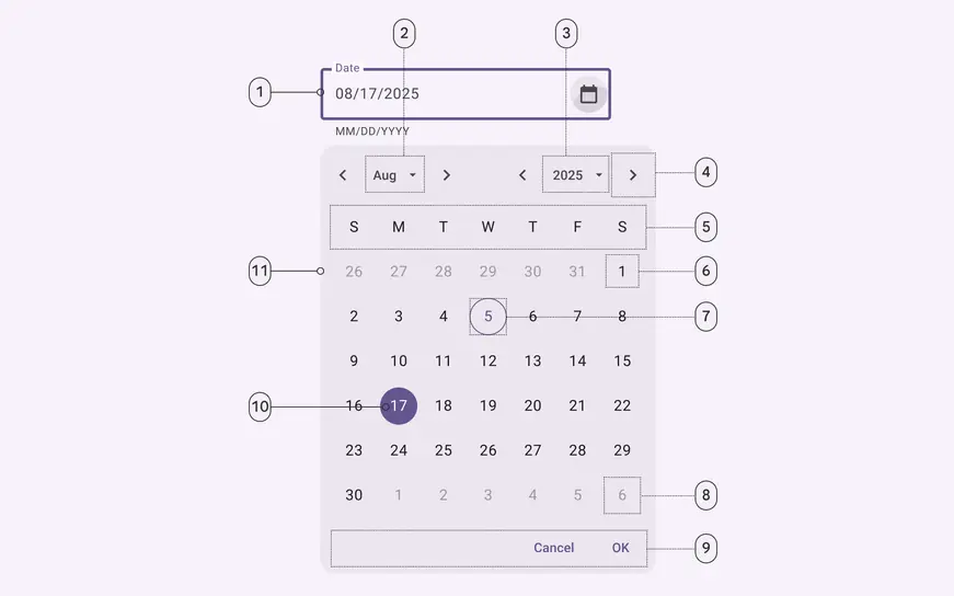
1. Outlined text field
2. Menu button: Month selection
3. Menu button: Year selection
4. Icon button
5. Weekdays label text
6. Unselected date
7. Today’s date
8. Outside month date
9. Text buttons
10. Selected date
11. Container
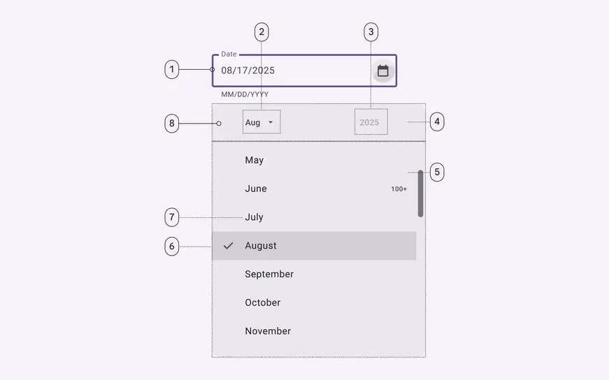
1. Outlined text field
2. Menu button: Month selection (pressed)
3. Menu button: Year selection (disabled)
4. Header
5. Menu
6. Selected list item
7. Unselected menu list item
8. Container
### Docked date picker color
Color values are implemented through design tokens. For design, this means working with color values that correspond with tokens. For implementation, a color value will be a token that references a value. [Learn more about design tokens](../../foundations/design-tokens/overview.md)
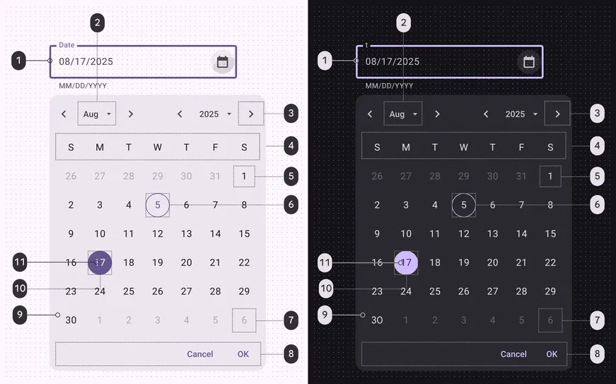
Docked date picker color roles used for light and dark themes:
1. Primary
2. On surface variant
3. On surface variant
4. On surface
5. On surface
6. Primary
7. On surface variant
8. Primary
9. Surface container high
10. Primary
11. On primary
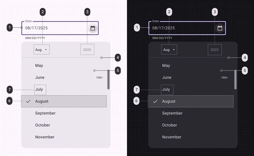
Docked date picker menu color roles used for light and dark themes:
1. Primary
2. On surface variant
3. On surface
4. Outline variant
5. Surface container high
6. Surface variant
7. On surface
### Docked date picker measurements
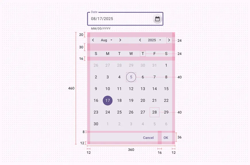
Docked date picker padding and size measurements
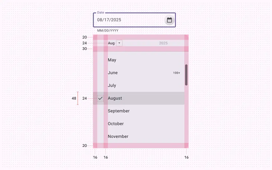
Docked date picker month menu padding and size measurements
### Docked date picker configurations
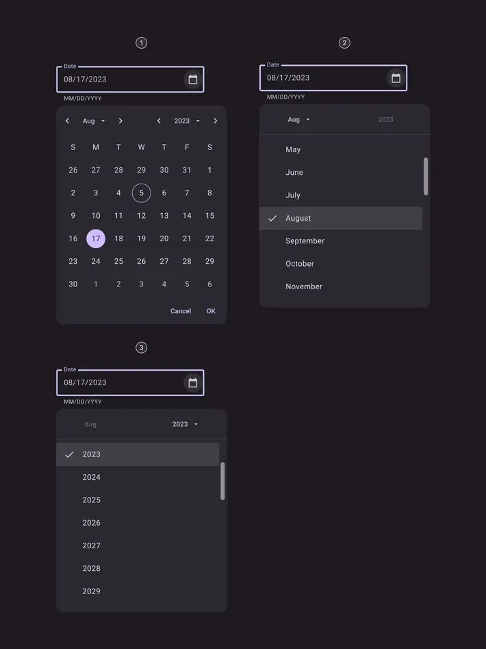
1. Day selection
2. Month selection
3. Year selection
## Modal date picker
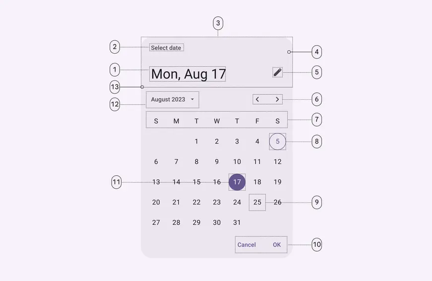
1. Headline
2. Supporting text
3. Header
4. Container
5. Icon button
6. Icon buttons
7. Weekdays
8. Today’s date
9. Unselected date
10. Text buttons
11. Selected date
12. Menu button
13. Divider
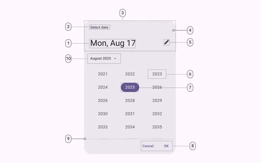
1. Headline
2. Supporting text
3. Header
4. Container
5. Icon button
6. Unselected year
7. Selected year
8. Text buttons
9. Divider
10. Menu button
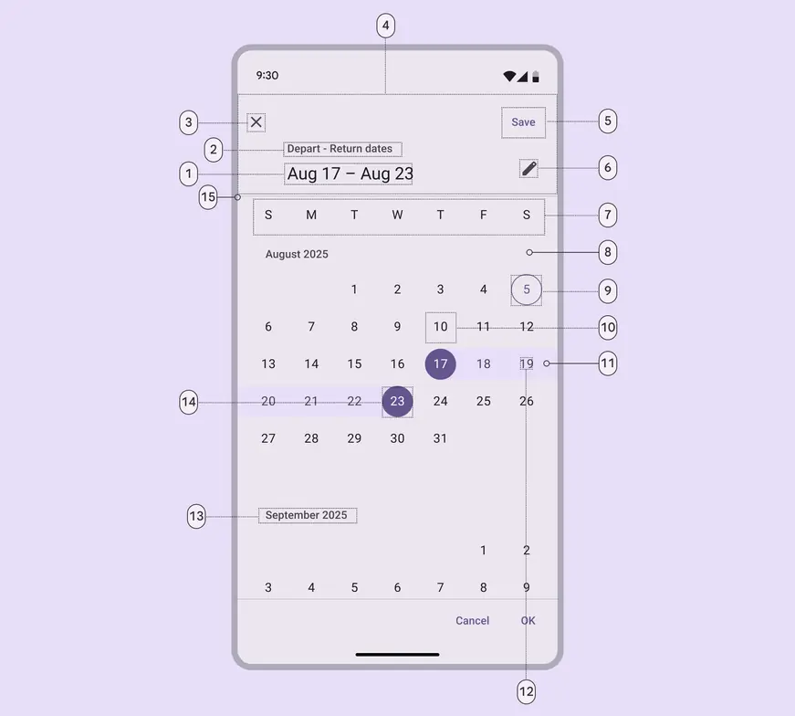
1. Headline
2. Supporting text
3. Icon button
4. Header
5. Text button
6. Icon button
7. Weekdays label text
8. Container
9. Today’s date
10. Unselected date
11. In-range active indicator
12. In-range date
13. Month subhead
14. Selected date
15. Divider
### Modal date picker color
Color values are implemented through design tokens. For design, this means working with color values that correspond with tokens. For implementation, a color value will be a token that references a value. [Learn more about design tokens](../../foundations/design-tokens/overview.md)
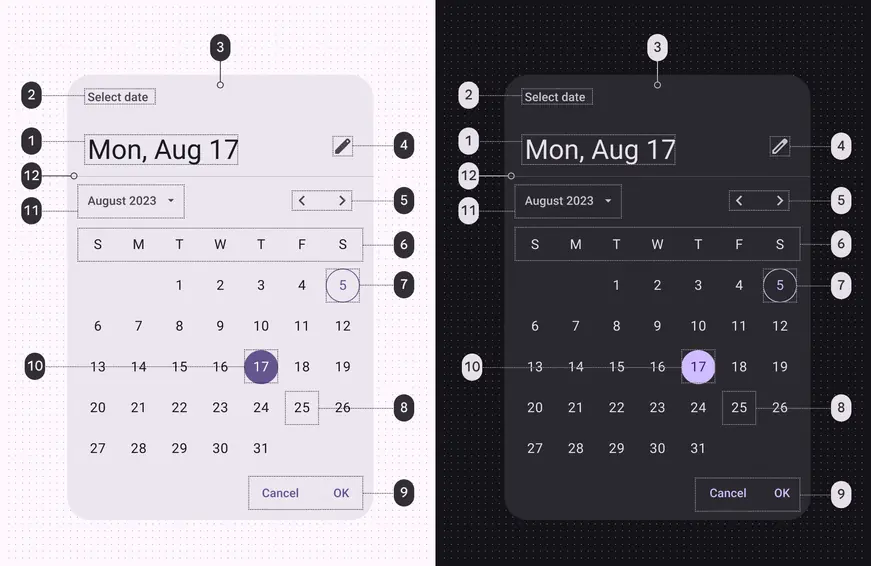
Modal date picker color roles used for light and dark themes in a day selection menu:
1. On surface
2. On surface variant
3. Surface container high
4. On surface variant
5. On surface variant
6. On surface
7. Primary
8. On surface
9. Primary
10. Primary
11. On surface variant
12. Outline variant
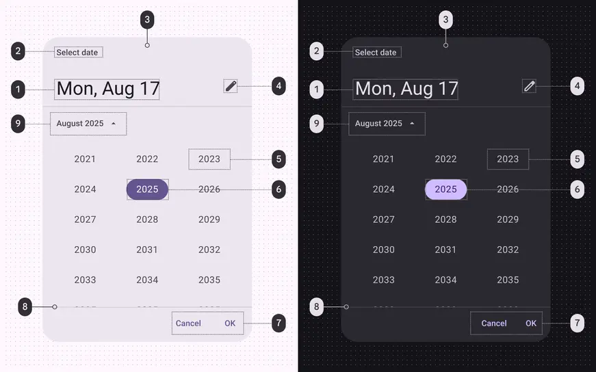
Modal date picker color roles used for light and dark themes in a year selection menu:
1. On surface
2. On surface variant
3. Surface container high
4. On surface variant
5. On surface variant
6. Primary
7. Primary
8. Outline variant
9. On surface variant
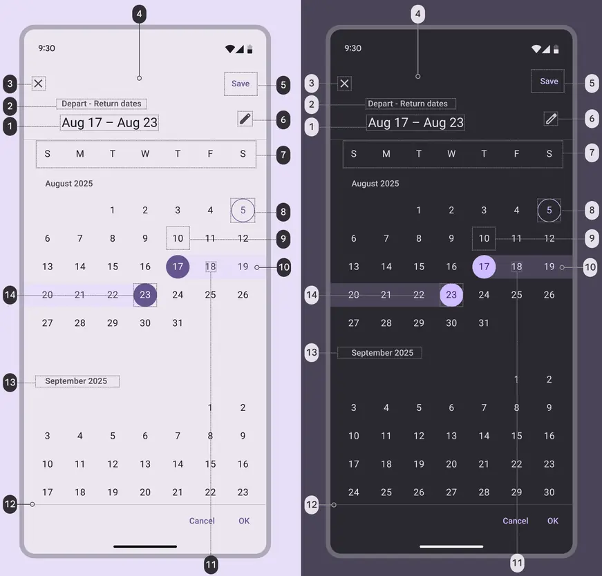
Modal date picker range selector color roles used for light and dark themes:
1. On surface
2. On surface variant
3. On surface variant
4. Surface container high
5. Primary
6. On surface variant
7. On surface
8. Primary
9. On surface
10. Secondary container
11. On secondary container
12. Outline variant
13. On surface variant
14. Primary
### Modal date picker measurements
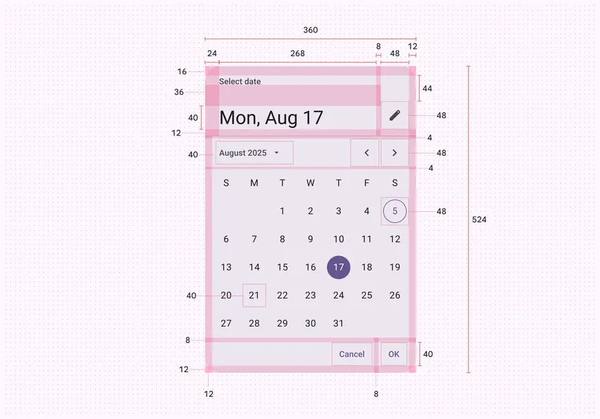
Modal date picker padding and size measurements
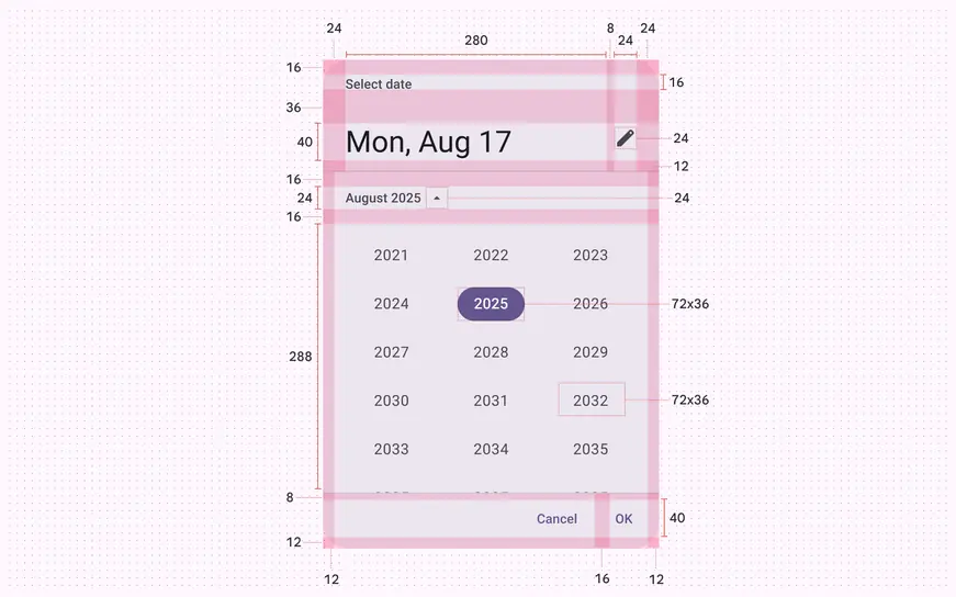
Modal date picker year selector padding and size measurements
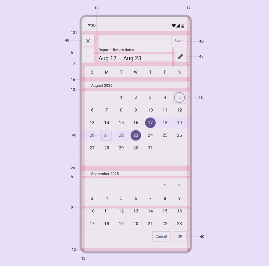
Modal date picker date range selector padding and size measurements
### Modal date picker configurations
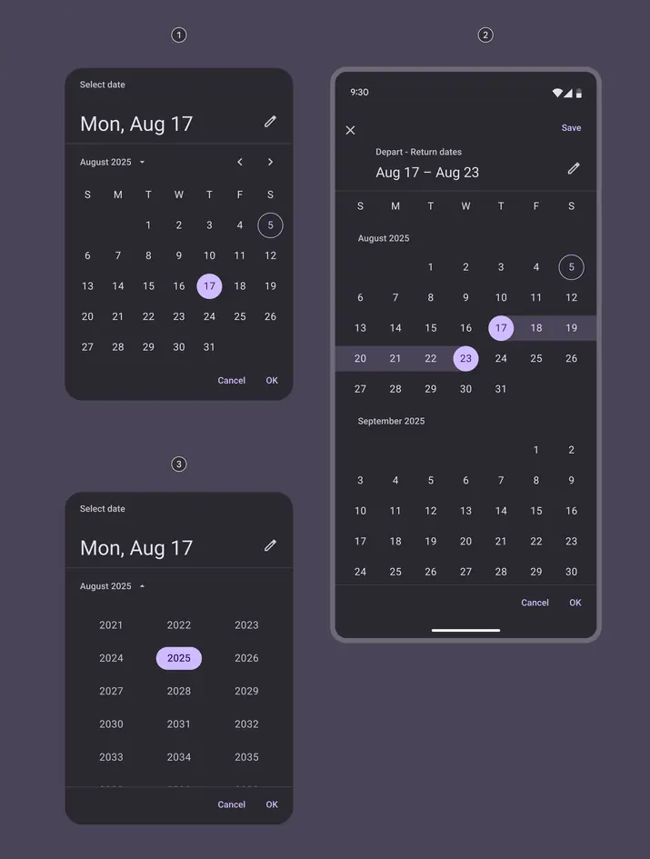
1. Single date selection
2. Date range selection
3. Year selection
## Modal date input
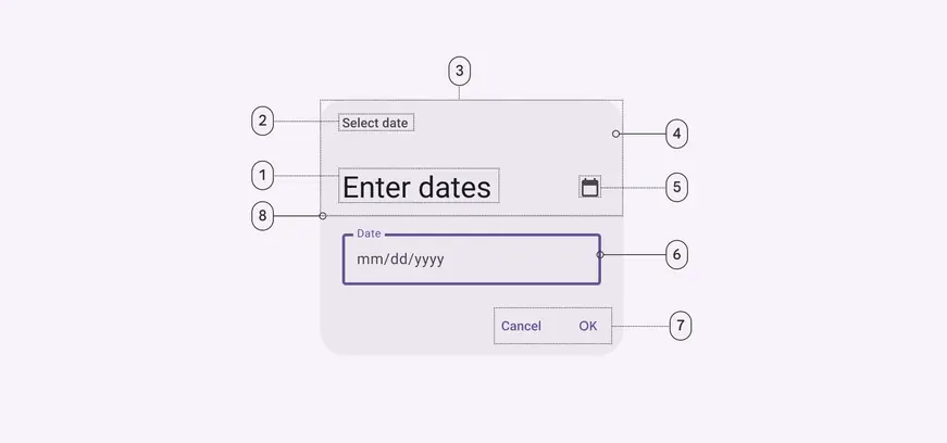
1. Headline
2. Supporting text
3. Header
4. Container
5. Icon button
6. Outlined text field
7. Text buttons
8. Divider
### Modal date input color
Color values are implemented through design tokens. For design, this means working with color values that correspond with tokens. For implementation, a color value will be a token that references a value. [Learn more about design tokens](../../foundations/design-tokens/overview.md)
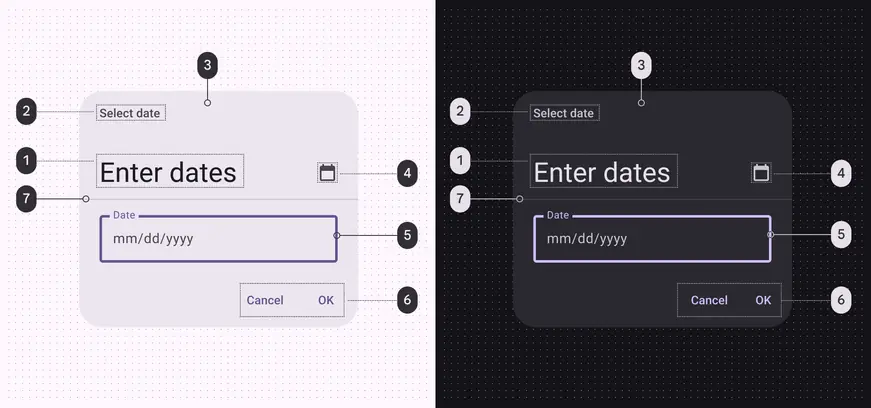
Modal date input color roles used for light and dark themes:
1. On surface
2. On surface variant
3. Surface container high
4. On surface variant
5. Primary
6. Primary
7. Outline variant
### Modal date input measurements
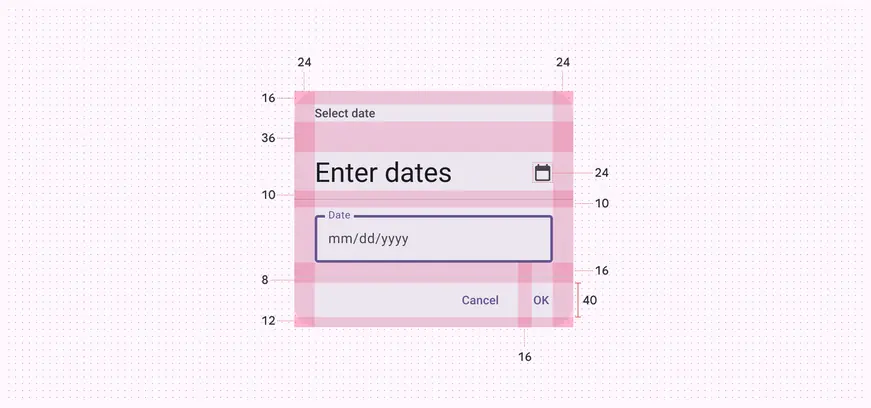
Modal date input padding and size measurements
### Modal date input configurations
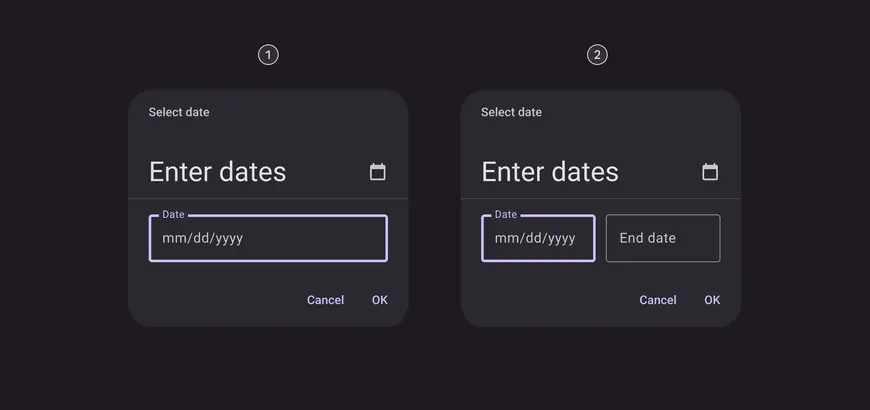
1. Single date input
2. Date range input
## Element states
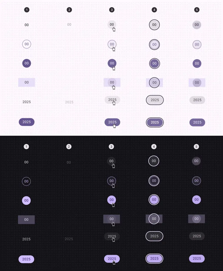
States for date and year selection:
1. Default (enabled)
2. Disabled
3. Hovered
4. Focused
5. Pressed (ripple)