---
url: /components/date-pickers/guidelines.md
description: >-
Date pickers let people select a date, or a range of dates. Date pickers can
display past, present, or future dates.
---
# Date pickers
Date pickers let people select a date, or a range of dates. Date pickers can display past, present, or future dates.
[Overview](overview.md) · [Specs](specs.md) · **Guidelines** · [Accessibility](accessibility.md)
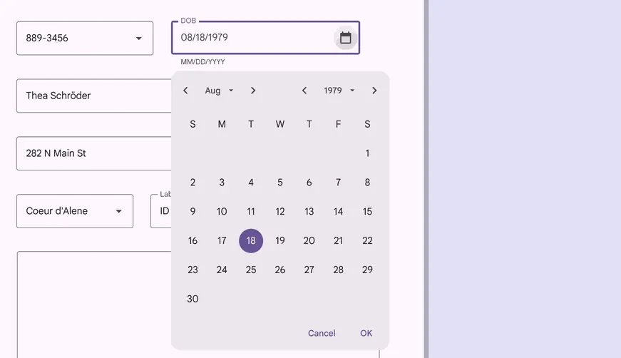
Docked date picker on desktop
## Usage
Date pickers let people select a date or range of dates. They should be suitable for the context in which they appear.
Date pickers can be embedded into:
1. [Dialogs](../dialogs/overview.md "Dialogs provide important prompts in a user flow.") on compact [breakpoints](../../foundations/layout/breakpoints/overview.md) like mobile
2. [Text field](../text-fields/overview.md "Text fields let users enter text into a UI.") drop-downs on medium and [expanded breakpoints](../../foundations/layout/breakpoints/expanded.md "Window widths 840dp to 1199dp, such as a tablet or foldable in landscape orientation, or desktop.") like tablet and desktop
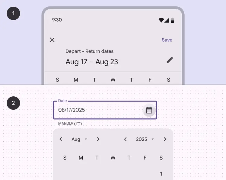
1. Date picker dialog on mobile
2. Date picker text field dropdown on desktop
There are three variants of date pickers:
1. Docked date picker
2. Modal date picker
3. Modal date input
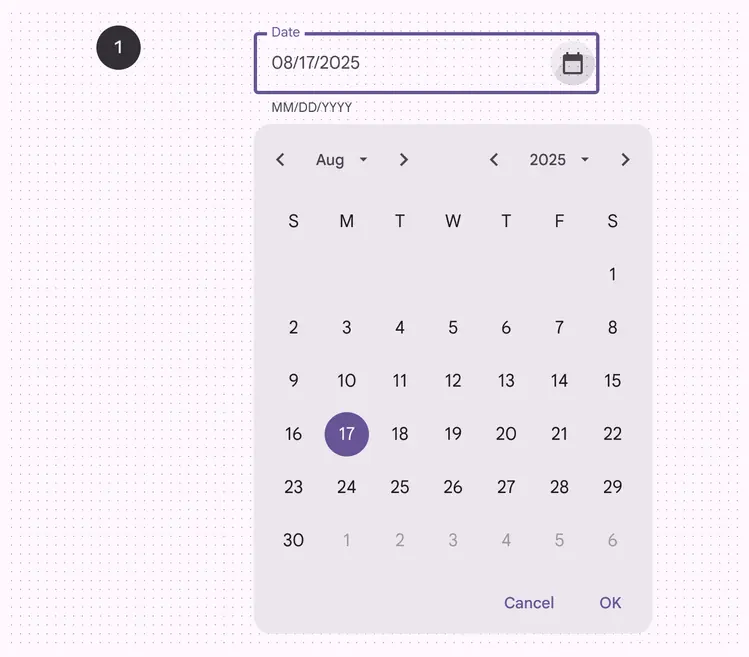
1\. Docked date picker
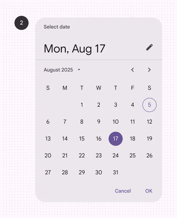
2\. Modal date picker
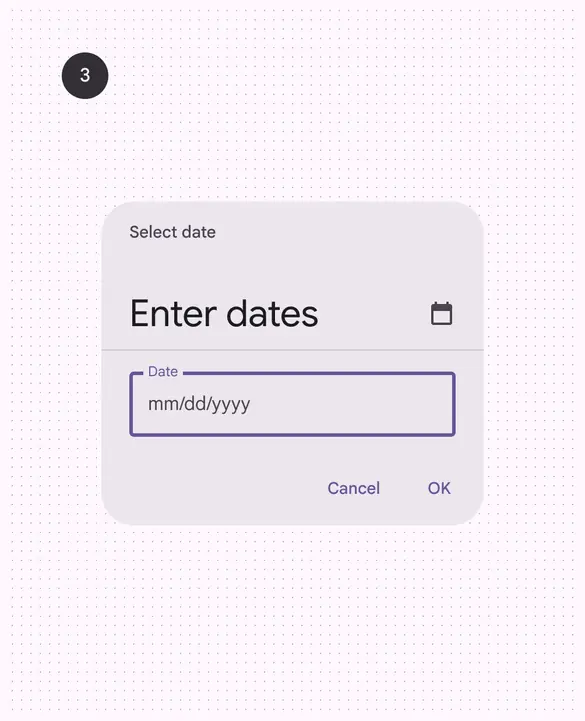
3\. Modal date input
## Anatomy
### Docked date picker
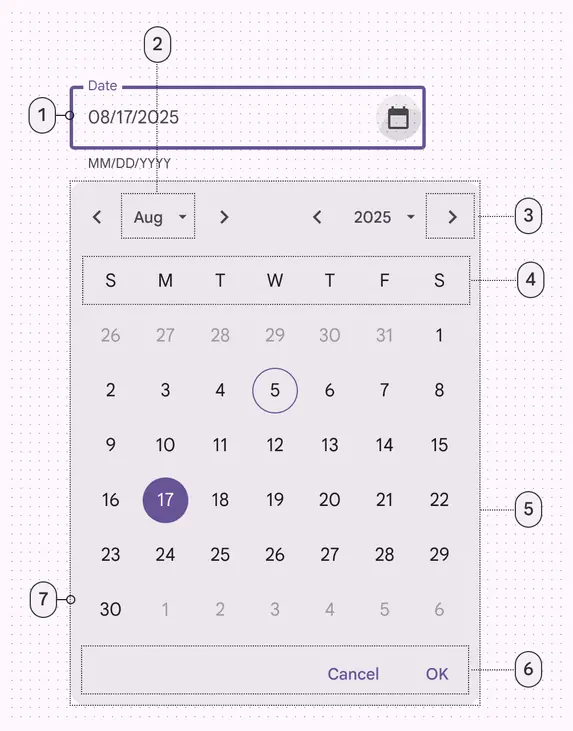
1. Text field
2. Menu button
3. Icon button
4. Label text
5. Menu
6. Text buttons
7. Container
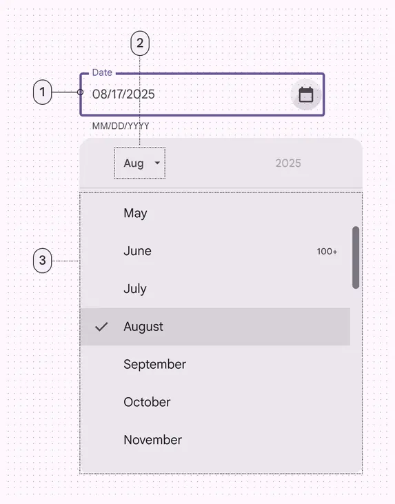
1\. Text field
2. Menu button
3. Menu
### Modal date picker
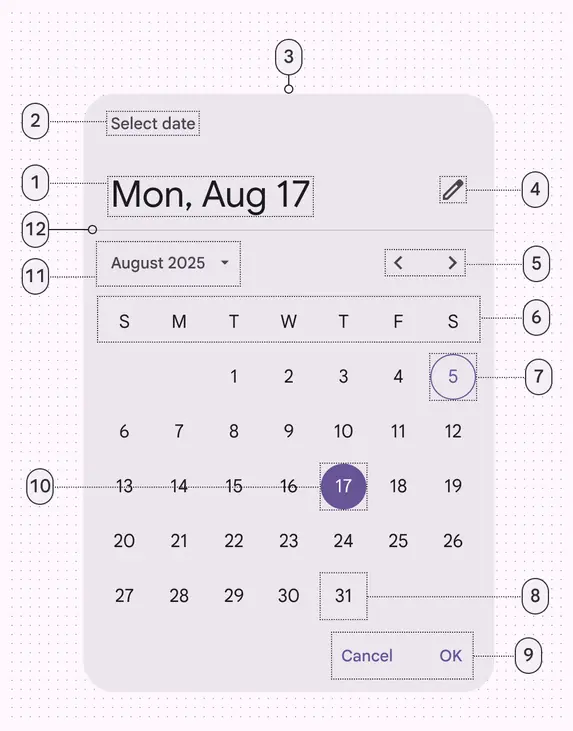
1. Headline
2. Supporting text
3. Container
4. Icon button
5. Previous/next month buttons
6. Day of week labels
7. Today’s date
8. Unselected date
9. Text buttons
10. Selected date
11. Menu button
12. Divider
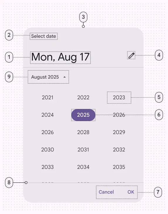
1. Headline
2. Supporting text
3. Container
4. Icon button
5. Unselected year
6. Selected year
7. Text buttons
8. Divider
9. Menu button
### Modal date input
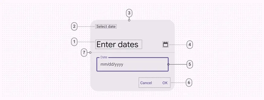
1\. Headline
2. Supporting text
3. Container
4. Icon button
5. Date input
6. Text buttons
7. Divider
### Full-screen date picker
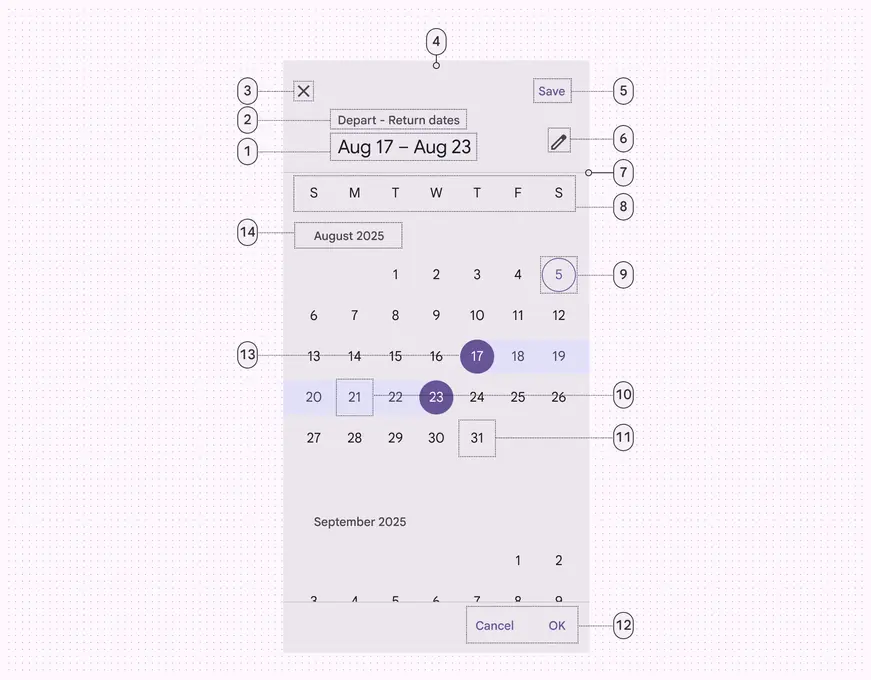
1\. Headline
2. Supporting text
3. Icon button
4. Container
5. Text button
6. Icon button
7. Divider
8. Day of week labels
9. Today’s date
10. Selected date range
11. Unselected date
12. Text buttons
13. Selected date range start date
14. Month label
## Docked date picker
### Usage
Docked date pickers allow the [selection](../../foundations/interaction/selection.md "Selection lets users choose specific items to act on.") of a specific date and year. The docked date picker displays a date input field by default, and a dropdown calendar appears when the user taps on the input field. Either form of date entry can be interacted with.
Docked date pickers are ideal for navigating dates in both the near future or past and the distant future or past, as they provide multiple ways to select dates.
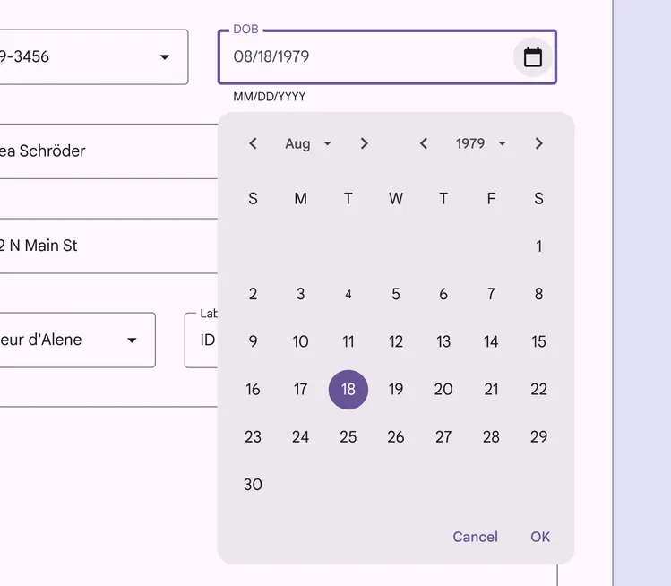
Docked date picker on desktop
### Behavior
Dates can be added by using a keyboard or by navigating the calendar UI; both options are immediately available when the docked date picker is accessed.
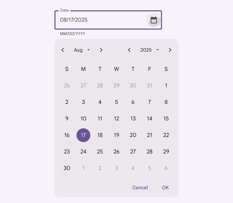
Docked date picker
Docked date pickers adjust size dynamically
The year selection menu replaces the calendar view
### Month selection
Month [selection](../../foundations/interaction/selection.md "Selection lets users choose specific items to act on.") can be navigated with the corresponding back and next arrows or by tapping the dropdown menu.
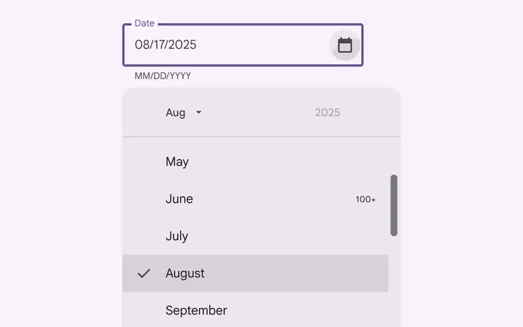
Docked date picker month selection
### Year selection
Year selection can be navigated with the corresponding back and next arrows or by tapping the dropdown menu.
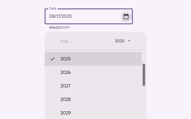
Docked date picker year selection
## Modal date picker
### Behavior
Modal date pickers navigate across dates in several ways:
* To navigate across months, swipe horizontally
* To navigate across years, scroll vertically
* To access the year picker, tap the year
Don’t use a modal date picker to prompt for dates in the distant past or future, such as a date of birth. In these cases, use a modal input picker or a docked date picker instead.
To navigate across months, swipe horizontally
To navigate across years, tap the year picker and scroll vertically
### Date range selection
Date range selection provides a start and end date. Common use cases include:
* Booking a flight
* Reserving a hotel
Modal date pickers navigate across date ranges in several ways:
* To select a range of dates, tap the start and end dates on the calendar
* To navigate across months, scroll vertically
Modal date range picker
Modal date range picker with vertical scroll
## Modal date input
### Usage
Modal date inputs allow the manual entry of dates using the numbers on a keyboard. People can input a date or a range of dates in a dialog.
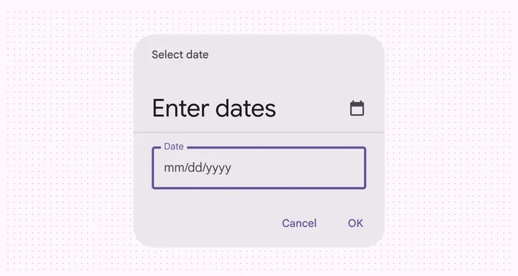
Modal date with manual input
::: tip Do
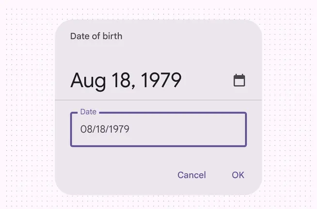
For dates that don’t require a calendar view, the modal date input can be the default view
:::
::: tip Do
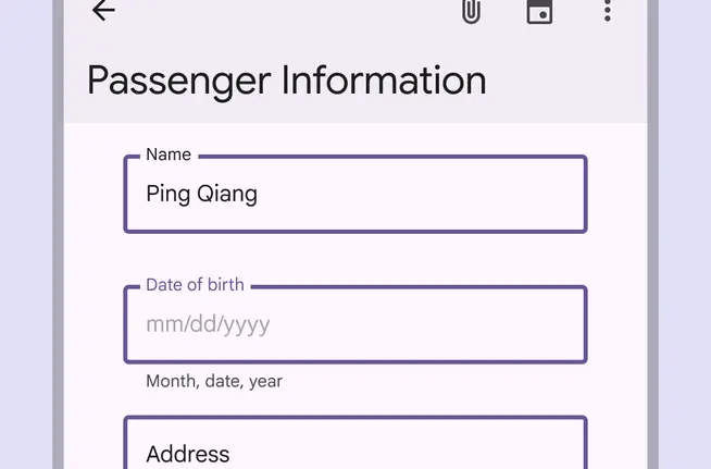
Alternatively, a text field with appropriate hint text can prompt for dates, such as in a form
:::
### Behavior
You can swap between the [modal date picker](overview.md "Modal date pickers extend full-screen. They're often used for selecting a date range.") and [modal date input](overview.md "Modal date inputs allow the manual entry of dates using the numbers on a keyboard. They're often used in compact layouts.") using the edit or calendar icon.
Switching from a modal date picker to a mobile date input for selecting ranges
Switching from a modal date picker to a modal date input for selecting a single date
### Compact breakpoint
On compact [breakpoints](../../foundations/layout/breakpoints/overview.md), such as mobile, a full-screen [modal date picker](overview.md "Modal date pickers extend full-screen. They're often used for selecting a date range.") is recommended to increase readability and touch target size. It can cover the entire screen.
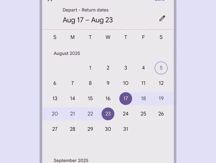
A full-screen modal date picker on mobile
### Medium and expanded breakpoints
The docked date picker works best for medium and expanded breakpoints. It displays a date input field by default, and a dropdown calendar appears when a person taps on the input field. A person can interact with either form of date entry.
Docked date pickers are ideal for navigating dates in both the near future or past, and in the distant future or past, as they provide multiple ways to select dates.
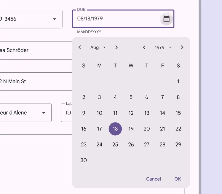
A docked date picker with a full calendar view is best used on larger devices
### Selection
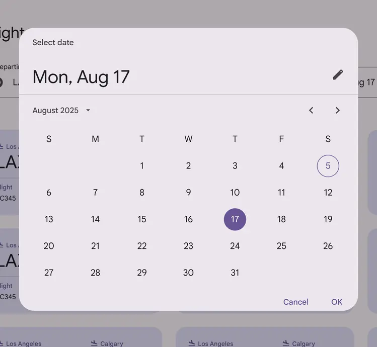
Selection is indicated through color, drawing visual attention. In date ranges, start and end dates are selected, while dates in-between appear connected with a subtle highlight.
Differences between selected the selected date range (August 17–23) and today's date (August 5) are shown through color and fill
### Appearing and disappearing
Like other kinds of dialogs, modal date pickers use an enter and exit transition pattern to appear on the screen.
To exit a date picker, the input can either be confirmed (**OK**) or dismissed (**Cancel**). Interacting outside of the dialog will also dismiss the [time picker](../time-pickers/overview.md "Time pickers help users select and set a specific time."). Unless one of these actions is taken, a time picker will continue to retain focus. Mobile full-screen pickers also have an additional close affordance (x) icon button and **Save** confirmation.
Docked date pickers appear just below the input field.
Modal date pickers can be dismissed through interacting with content outside the dialog, or with the action buttons in the lower right
Interacting with the input for a docked date picker makes the calendar view appear below
### Responsive layout
The sizing of the docked and modal date picker components don’t scale responsively to different breakpoints.
::: danger Don't
Don’t scale the date picker responsively to a larger size
:::