---
url: /components/buttons/guidelines.md
description: >-
Buttons help people take action, such as sending an email, sharing a document,
or liking a comment. Common buttons prompt most actions in a UI.
---
# Buttons
Buttons help people take action, such as sending an email, sharing a document, or liking a comment. Common buttons prompt most actions in a UI.
[Overview](overview.md) · [Specs](specs.md) · **Guidelines** · [Accessibility](accessibility.md)
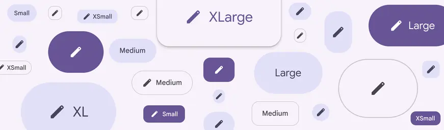
Buttons and icon buttons come in many shapes, styles, and sizes
## Usage
Buttons communicate actions that people can take. They are typically placed throughout the UI, in places like:
* [Dialogs](../dialogs/overview.md "Dialogs provide important prompts in a user flow.")
* Modal windows
* Forms
* [Cards](../cards/overview.md "Cards display content and actions about a single subject.")
* [Toolbars](../toolbars/overview.md "Toolbars display frequently used actions relevant to the current page.")
They can also be placed within [standard button groups](../button-groups/overview.md "Standard button groups add interactions between adjacent buttons when they're pressed.").
Use visually-prominent filled buttons for the most important actions
Buttons are just one option for representing actions in a product and shouldn’t be overused. Too many buttons on a screen can disrupt the visual hierarchy.
Consider placing additional actions in a [navigation rail](../navigation-rail/overview.md "Navigation rails let people switch between UI views on mid-sized devices."), set of [chips](../chips/overview.md "Chips help people enter information, make selections, filter content, or trigger actions."), text links, or [icon buttons](../icon-buttons/overview.md "Icon buttons help people take minor actions with one tap.").
::: tip Do
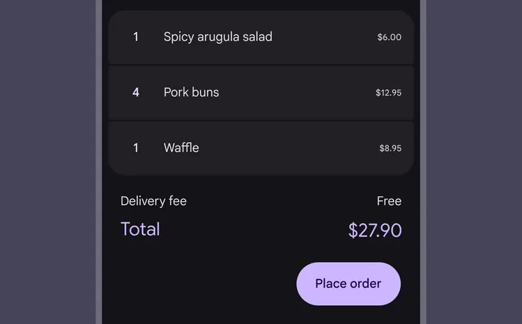
Use buttons for discrete actions
:::
::: danger Don't
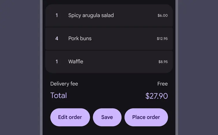
Don’t clutter your UI with too many buttons. Consider presenting low-priority actions in overflow menus or as icon buttons.
:::
::: tip Do
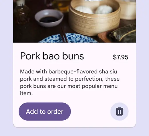
A button container’s width is dynamically set to fit its label text
:::
::: tip Do
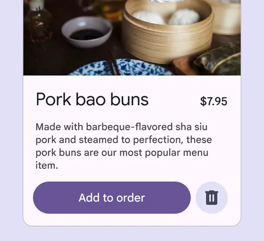
Button container width can be responsive, which allows it to stretch horizontally
:::
::: danger Don't
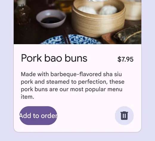
A button container’s width shouldn’t be narrower than its label text
:::
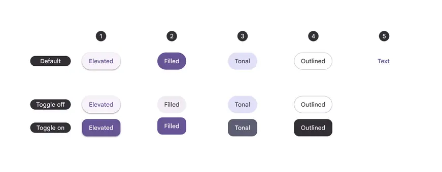
A: Default button; B: Toggle (unselected); C: Toggle (selected) for five button styles, in order of emphasis:
1. Elevated button
2. Filled button
3. Filled tonal button
4. Outlined button
5. Text button
A [button group](../button-groups/overview.md "Button groups organize buttons and add interactions between them") is a collection of buttons that relate to each other and can respond to one another. Both buttons and icon buttons can be used inside a button group.
In some cases, there are primary and secondary actions within a button group. Buttons with primary actions should have a higher visual emphasis through size, color, or shape.
[More on button groups](../button-groups/overview.md)
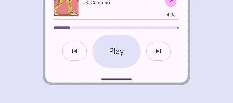
Different sized buttons in a button group help emphasize the main action from secondary actions
## Toggle buttons
Toggle buttons should be used for binary selections, such as **Save** or **Favorite**. When toggle buttons are pressed, they can change color, shape, and labels.
Toggle buttons should use an outlined icon when unselected, and a filled version of the icon when selected. If a filled version doesn’t exist, increase the weight instead.
By default, toggle buttons change from round to square when selected.
Use toggle buttons for binary actions
If the label changes on selected or unselected states, be mindful of the character count. Changing the label significantly is disruptive to the user and the page layout.
::: tip Do
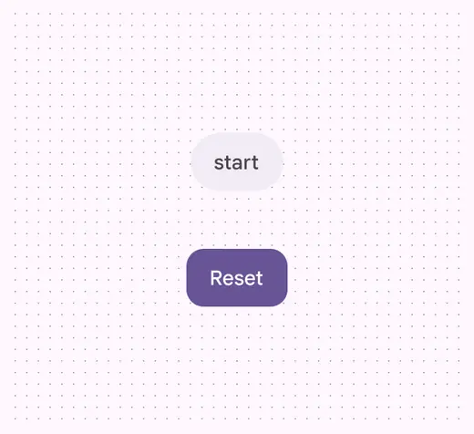
When using toggleable buttons, keep the label character count a similar length for both states
:::
::: danger Don't
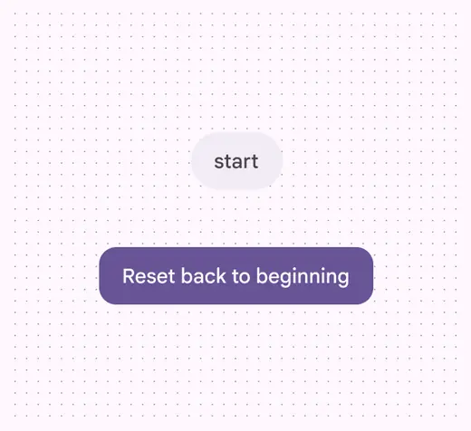
The label length shouldn’t change dramatically to be longer or shorter
:::
## Anatomy
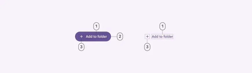
1. Label text
2. Container
3. Icon (optional)
### Label text
Label text is the most important element of a button. It describes the action that will occur if someone taps a button. It should be very brief, ideally 1–3 words.
Use sentence case, which only capitalizes the first word and proper nouns. This allows the text to distinguish proper nouns, for example: **Book with Flights**, not **BOOK WITH FLIGHTS**.
Don’t truncate or wrap label text. It should always be fully visible on a single line.
::: tip Do
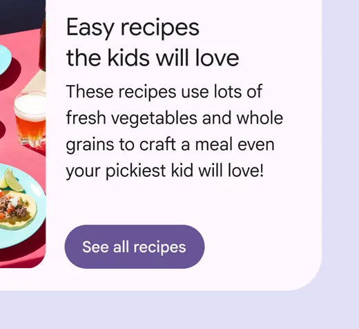
Use sentence case for button label text, capitalizing the first word and proper nouns
:::
::: danger Don't
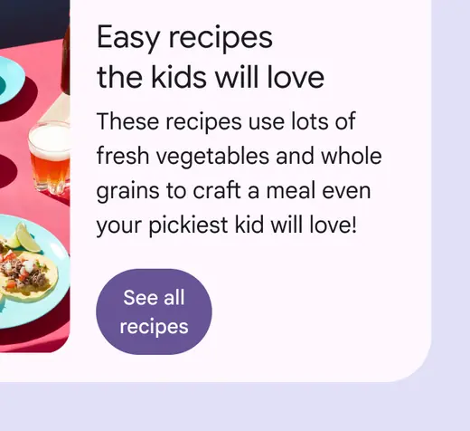
Don’t wrap text. For maximum legibility, label text should remain on a single line.
:::
Buttons with the **outlined** and **text** color style depend on the colors to be recognizable from other text and elements. Use caution when putting these buttons next to visually similar elements, such as chips or large text.
::: warning Caution
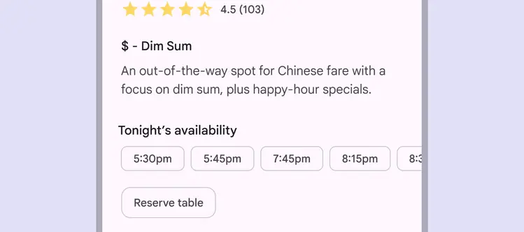
The outlined button style is very similar to chips. Consider using a filled or tonal button instead.
:::
### Container
Button containers hold the label text and optional icon. Buttons with the **text** color style have a visible container only when hovered, focused, or pressed.
Buttons with a round shape have containers with fully rounded corners.
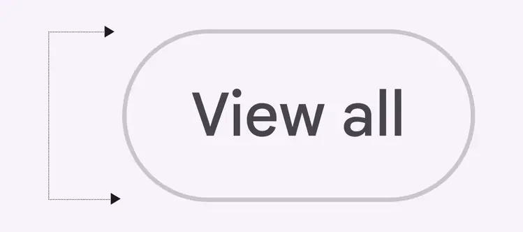
Round buttons have containers with fully rounded corners
Buttons with a square shape have containers with more subtle rounding that changes based on button size.
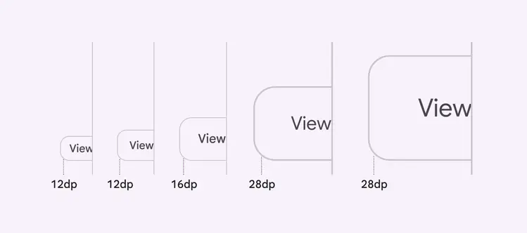
Square buttons have square containers and change radius as the button size changes
::: tip Do
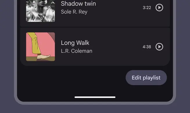
A button’s width dynamically adjusts to the label text
:::
::: danger Don't
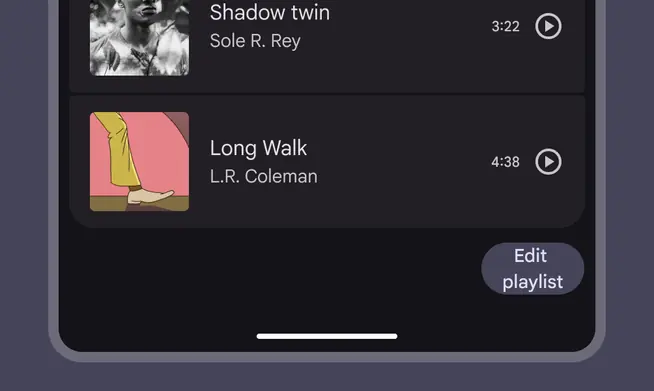
Avoid setting a fixed width smaller than the label text
:::
### Icon (optional)
Icons visually communicate the button’s action and help draw attention. They should be placed on the leading side of the button, before the label text.
::: tip Do
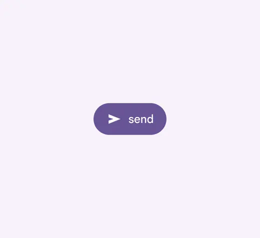
Place the icon to the left of the label in buttons with text in left-to-right languages
:::
::: tip Do
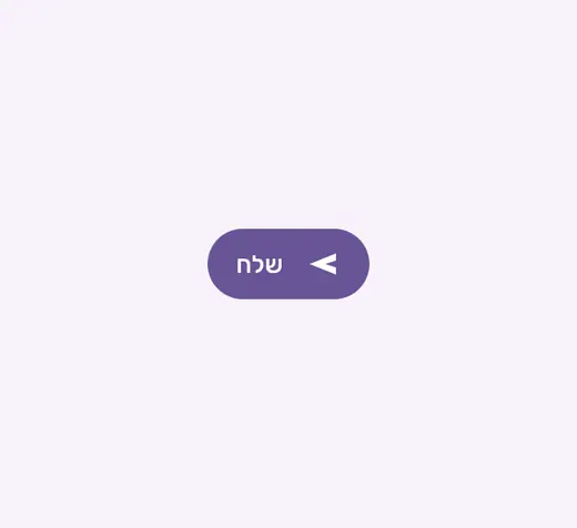
Place the icon to the right of the label in buttons with text in right-to-left languages
:::
::: tip Do
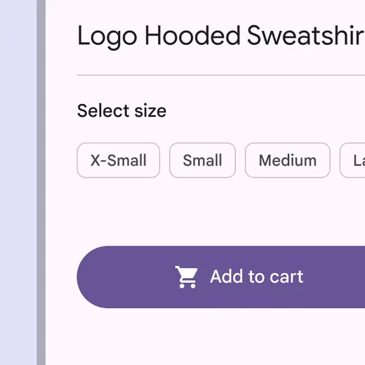
Use icons that clearly communicate their meaning
:::
::: danger Don't
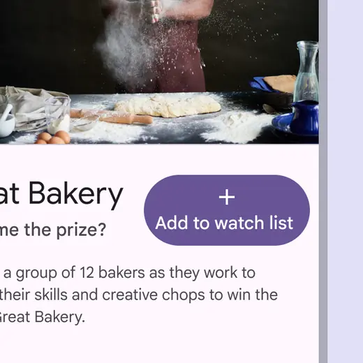
Don’t vertically align an icon and text in the center of a button
:::
::: danger Don't
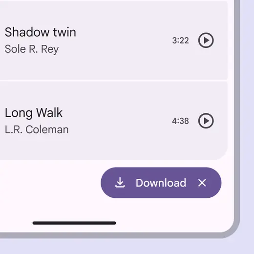
Don’t use two icons in the same button
:::
## Color styles
### Elevated style
The **elevated** button style is the same as the tonal button, but with a shadow.
To avoid overusing shadows, use the elevated style only when absolutely necessary, such as when the button requires visual separation from a visually prominent background.
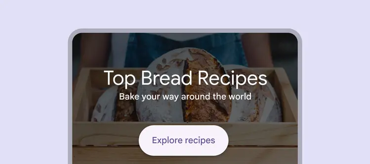
Elevated buttons provide separation from a visually prominent background
Buttons at higher elevations typically have more emphasis in a design, and should be used sparingly. For high emphasis, consider the filled style instead.
::: warning Caution
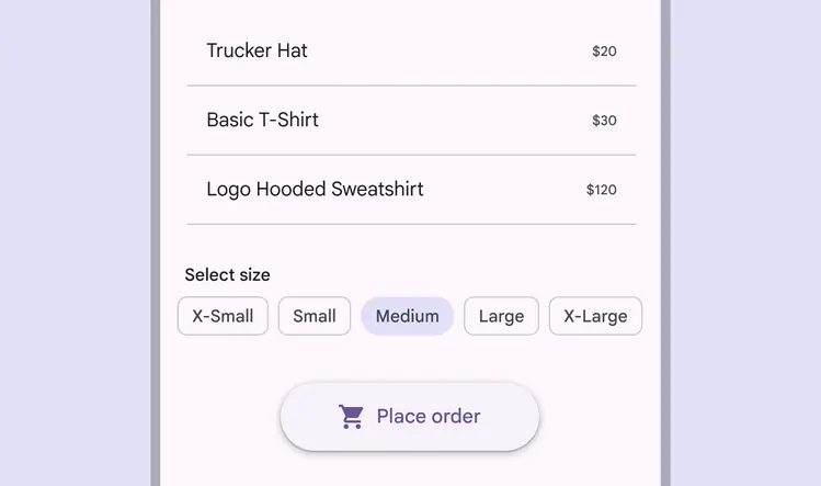
Higher elevation increases the emphasis of a button
:::
### Filled style
The **filled** button style has the most visual impact after the [FAB](../floating-action-button/overview.md "Floating action buttons (FABs) help people take primary actions."), and should be used for important, final actions that complete a flow, like **Save**, **Join now**, or **Confirm**.
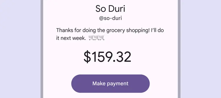
Filled buttons have high visual impact when used for important actions
Since they have such strong emphasis, the filled style should be used sparingly, ideally for only one action on a page.
In some cases, filled buttons can use tertiary colors.
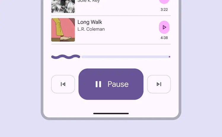
Filled buttons can be responsive to the layout grid and help emphasize main actions
### Tonal style
The **tonal** button style is useful in contexts where a lower-priority button requires slightly more emphasis than an outline would give, such as **Next** in an onboarding flow. Tonal buttons use the secondary color mapping.
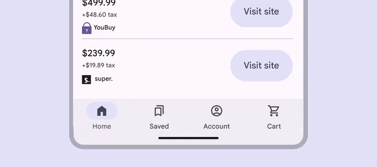
The tonal style has less emphasis than filled or emphasis
### Outlined style
The **outlined** style is ideal for medium-emphasis buttons which contain actions that are important, but aren’t the primary action in a product.
Outlined buttons pair well with filled buttons to indicate alternative, secondary actions.
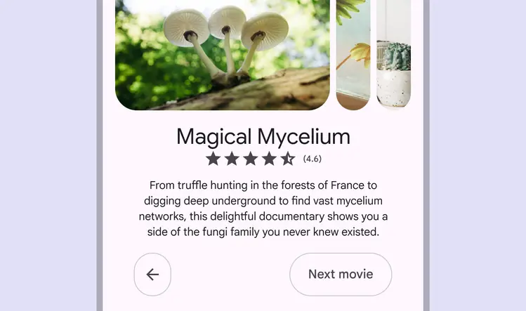
Outlined buttons contain less important supporting actions
Outlined buttons display a stroke around the button container, and have no fill by default.
They should be placed on simple backgrounds, not visually prominent backgrounds such as images or videos.
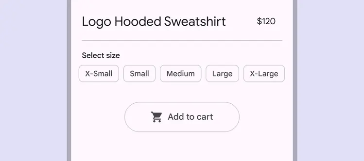
Outlined buttons display a stroke around the button container
::: tip Do
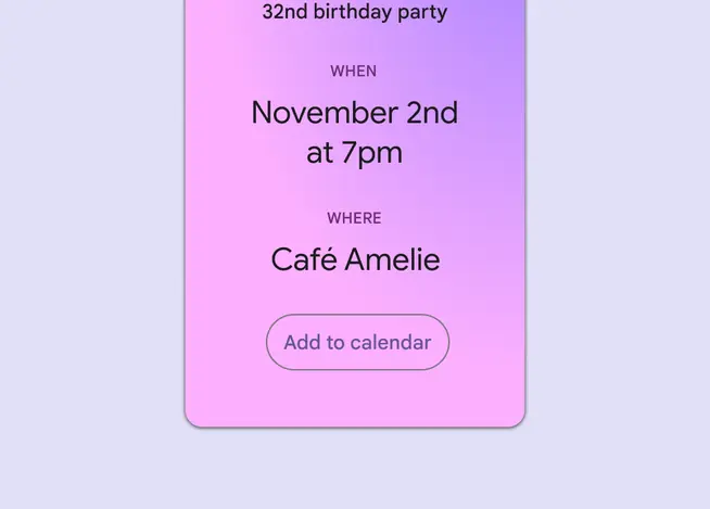
Outlined buttons can be used on backgrounds with a color gradient
:::
::: warning Caution
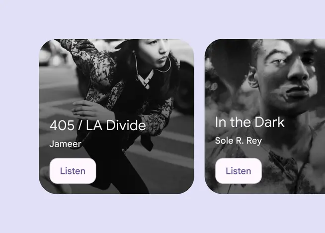
Use caution when placing outlined buttons on top of images. Customizing the button to have a contrasting container fill can help ensure legibility of label text. Or, use a filled button instead.
:::
### Text style
The text button style should be used for the lowest priority actions, especially when presenting multiple options.
They should be placed on simple backgrounds, not visually prominent backgrounds such as images or videos. The container isn’t visible until someone interacts with the button.
Don’t underline the text button. Use hyperlinked body text instead to emphasize links. [More on hyperlinks](../../styles/typography/applying-type.md#24856f70-f759-45df-a06c-92018f286083)
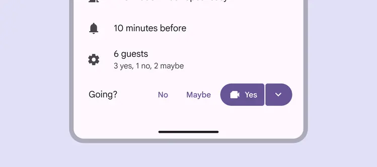
Use text buttons for the lowest priority actions
Text buttons are often placed within components such as [cards](../cards/overview.md "Cards display content and actions about a single subject."), [dialogs](../dialogs/overview.md "Dialogs provide important prompts in a user flow."), and [snackbars](../snackbar/overview.md "Snackbars show short updates about app processes at the bottom of the screen."). Since text buttons don’t have a visible container in their default [state](../../foundations/interaction/states/overview.md "States show the interaction status of a component or UI element."), they don’t distract from nearby content.
However, since there’s no container, the label text color must always be recognizable from non-button text and elements.
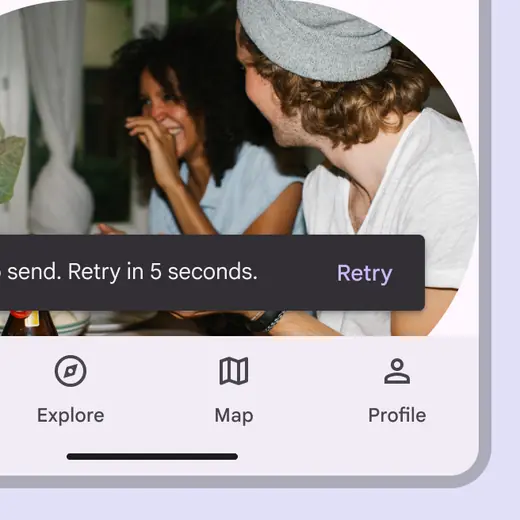
Text button in a snackbar
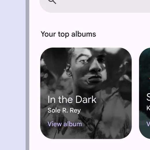
Text button against an image background
In cards, text buttons help maintain an emphasis on card content.
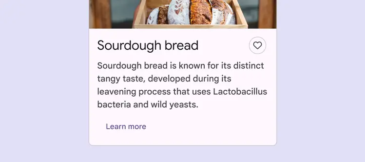
Text button in a card
Dialogs use text buttons because the absence of a container helps unify the action with the dialog text.
Align text buttons to the trailing edge of dialogs, on the right for left-to-right languages and on the left for right-to-left languages.
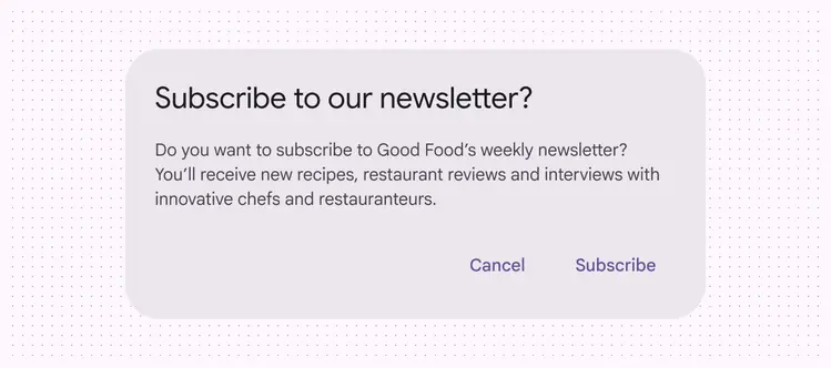
Text buttons in a dialog
## Adaptive design
### Resizing
When scaling layouts for large screen devices, buttons can adapt their visual presentation, size, alignment, and arrangement to fit different contexts and user needs.
Choose the best button position based on screen size.
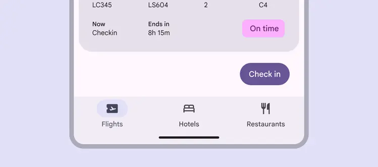
Filled buttons are end-aligned below flight information in a compact window
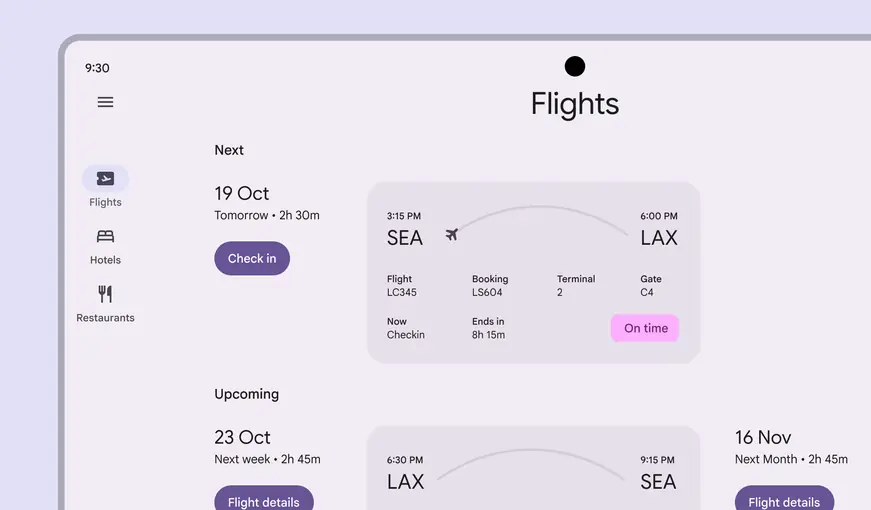
Filled buttons are start-aligned beside flight information in a large window
The icon and label text in a button stay centered and grouped as the button's width changes.
::: tip Do
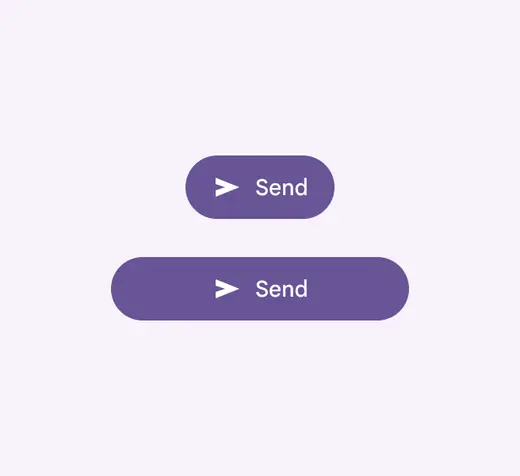
Keep the icon and label text grouped and centered
:::
::: danger Don't
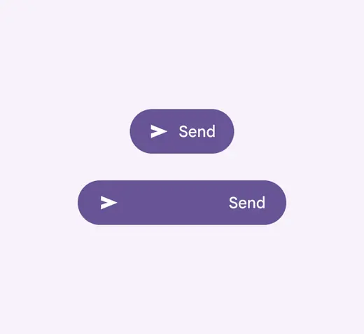
Don't ungroup the icon and label text or let them anchor to opposite sides of the button
:::
Buttons can be customized to change size and scaling behavior across different [breakpoints](../../foundations/layout/breakpoints/overview.md "Breakpoints are opinionated window sizes where a layout changes to match available space, device conventions, and ergonomics (previously window size classes).").
To avoid creating very long buttons in large windows, constrain button width or place buttons beside other elements.
::: danger Don't
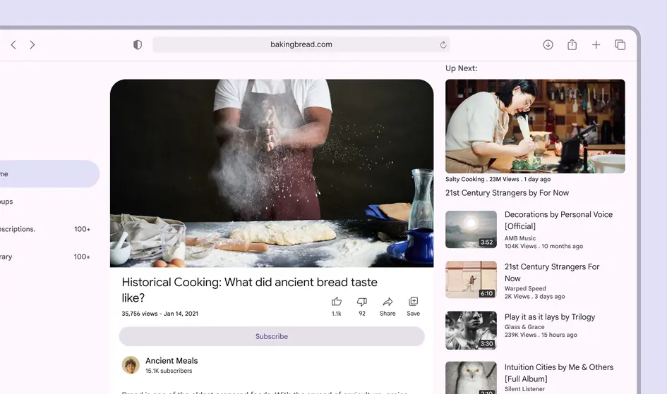
Don’t allow the button to stretch in a way that creates long, flat buttons with very little content inside
:::
### Presentation
The size and placement of buttons can change as parent containers, such as cards, adapt for larger screens.
Keep items, including buttons, in the same order between large and small screens to provide a consistent experience for screen readers and keyboard navigation.
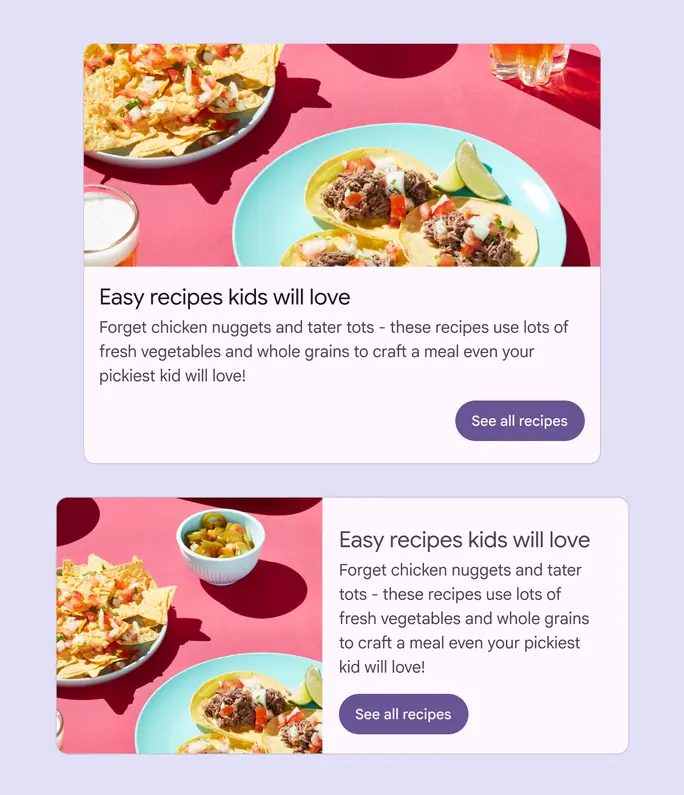
Buttons can move in the layout, but elements should remain in the same order