---
url: /components/app-bars/specs.md
description: >-
Top app bars display navigation, actions, and text at the top of a screen.
They contain a title and actions related to the current screen.
---
# App bars
Top app bars display navigation, actions, and text at the top of a screen. They contain a title and actions related to the current screen.
[Overview](overview.md) · **Specs** · [Guidelines](guidelines.md) · [Accessibility](accessibility.md)
## Variants
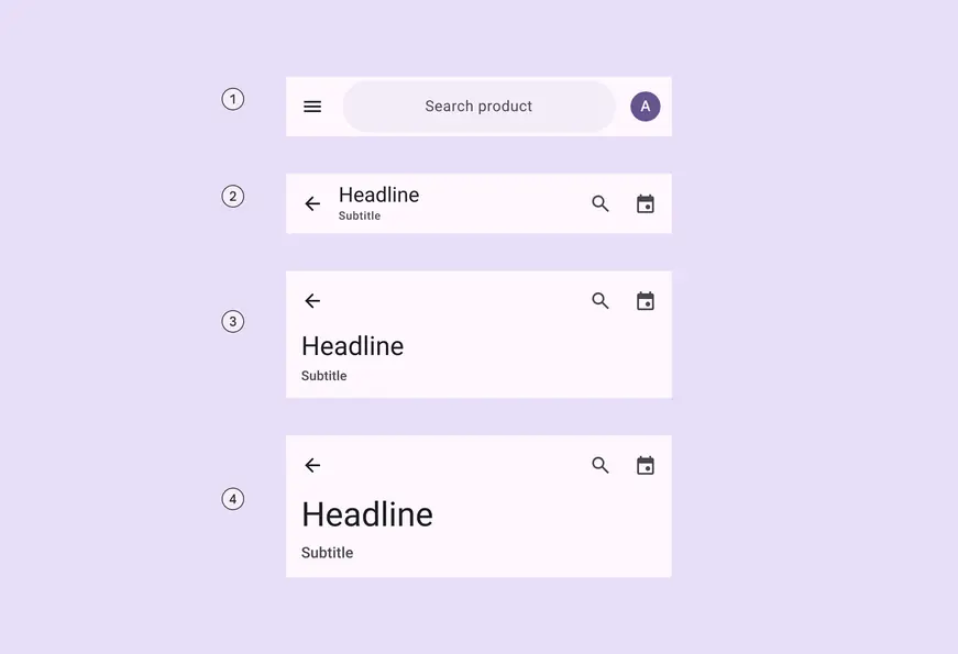
1. Search app bar
2. Small
3. Medium flexible
4. Large flexible
### Baseline variants
The baseline M3 **medium** and **large** app bars are no longer recommended in M3 Expressive, and should be replaced with **medium flexible** and **large flexible** app bars, which are similar visually, but have multi-line support, a shorter height, and can contain a wide variety of elements, like images. [Jump to baseline app bar specs](#faec9baf-140f-41dc-8b88-2792e90d9d5d)
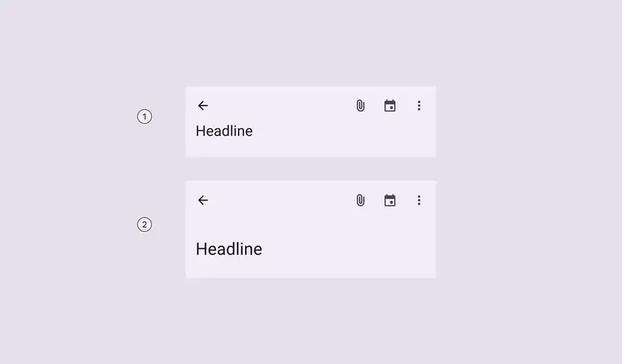
Baseline variants
1. Medium
2. Large
| Variant | M3 | M3 Expressive |
| ----------------- | :-------: | :--------------------------------------------------------: |
| Search app bar | -- | Available |
| Small | Available | Available |
| Center-aligned | Available | Merged into **small**.
Use centered-text configuration. |
| Medium (baseline) | Available | Not recommended.
Use **medium flexible** |
| Medium flexible | -- | Available |
| Large (baseline) | Available | Not recommended.
Use **large flexible** |
| Large flexible | -- | Available |
## Configurations
### Text alignment
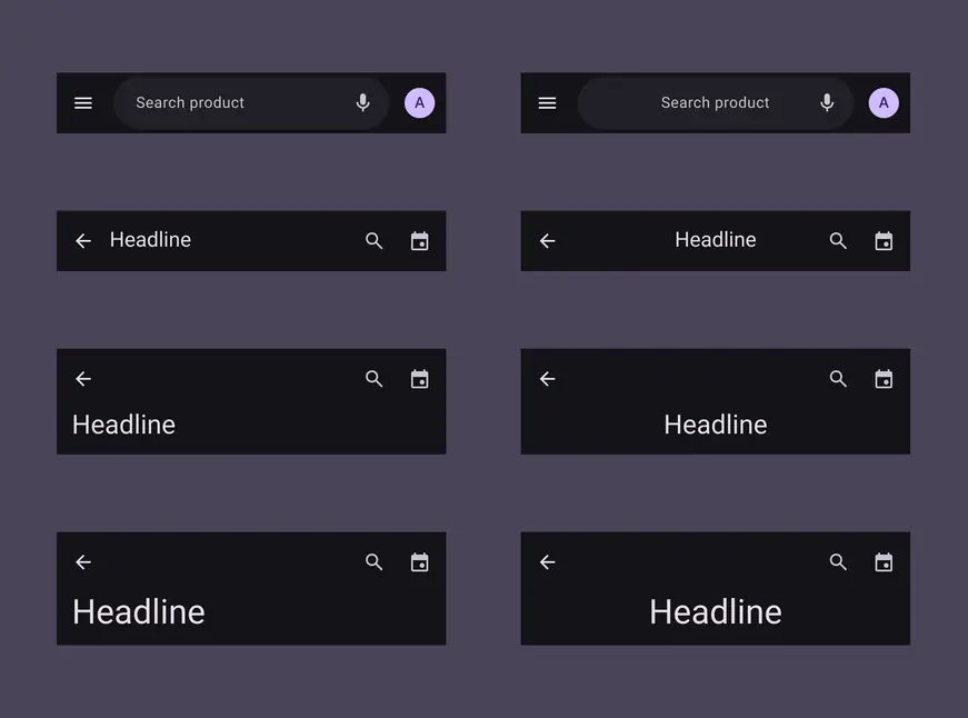
Text labels, including supporting text, can be aligned to the leading edge or centered
| Category | Configuration | M3 | M3 Expressive |
| -------------- | ---------------------- | :-------: | :-----------: |
| Text alignment | Leading edge (default) | Available | Available |
| Text alignment | Centered | -- | Available |
## Tokens & specs
Select a token set to view in the table's menu. App bar token sets are organized into a common token set, and size-specific tokens. [Learn about design tokens](../../foundations/design-tokens/overview.md)
::: token-table token-table-3ec622835c7987b5-b5807e31
**App bars tokens** · 4 token sets · 34 tokens · [live token table](https://m3.material.io/components/app-bars/specs) · DSDB `TOKEN_TABLE.3ec622835c7987b5`
* Default context: Platform: Android · Audience: 3P · Font: Static
* Not configurable here (group default used): Theme: Light · Motion scheme: Standard · Contrast: Default · iOS dark theme elevation: None · iOS weight setting: Default · Language height: Small
* Reference chain: aliases from the token to its source value (`token → alias → … → value`). "—" means the token holds a literal value.
**App bar - Common** · `md.comp.app-bar` · 19 tokens
Common tokens for all app bars.
| Group | Token | Type | Reference chain | Resolved value |
| --- | --- | --- | --- | --- |
| Color | `md.comp.app-bar.search.container.color` | Color | `md.sys.color.surface-container` → `md.ref.palette.neutral94` | `#F3EDF7` |
| Color | `md.comp.app-bar.search.label.color` | Color | `md.sys.color.on-surface-variant` → `md.ref.palette.neutral-variant30` | `#49454F` |
| Color | `md.comp.app-bar.on-scroll.container.color` | Color | `md.sys.color.surface-container` → `md.ref.palette.neutral94` | `#F3EDF7` |
| Color | `md.comp.app-bar.search.on-scroll.container.color` | Color | `md.sys.color.surface-container-highest` → `md.ref.palette.neutral90` | `#E6E0E9` |
| Color | `md.comp.app-bar.container.elevation` | Elevation | `md.sys.elevation.level0` | `0dp` |
| Color | `md.comp.app-bar.on-scroll.container.elevation` | Elevation | `md.sys.elevation.level2` | `3dp` |
| Color | `md.comp.app-bar.title.color` | Color | `md.sys.color.on-surface` → `md.ref.palette.neutral10` | `#1D1B20` |
| Color | `md.comp.app-bar.subtitle.color` | Color | `md.sys.color.on-surface-variant` → `md.ref.palette.neutral-variant30` | `#49454F` |
| Color | `md.comp.app-bar.leading-icon.color` | Color | `md.sys.color.on-surface` → `md.ref.palette.neutral10` | `#1D1B20` |
| Color | `md.comp.app-bar.trailing-icon.color` | Color | `md.sys.color.on-surface-variant` → `md.ref.palette.neutral-variant30` | `#49454F` |
| Color | `md.comp.app-bar.container.color` | Color | `md.sys.color.surface` → `md.ref.palette.neutral98` | `#FEF7FF` |
| Spacing | `md.comp.app-bar.trailing-space` | Length | `md.sys.measurement.space50` | `4dp` |
| Spacing | `md.comp.app-bar.icon-button-space` | Length | `md.sys.measurement.space0` | `0dp` |
| Spacing | `md.comp.app-bar.search.leading-space` | Length | `md.sys.measurement.space100` | `8dp` |
| Spacing | `md.comp.app-bar.search.trailing-space` | Length | `md.sys.measurement.space100` | `8dp` |
| Spacing | `md.comp.app-bar.leading-space` | Length | `md.sys.measurement.space50` | `4dp` |
| Shape | `md.comp.app-bar.container.shape` | Shape | `md.sys.shape.corner.none` | `Rounded corners 0dp` |
| Size | `md.comp.app-bar.icon.size` | Length | — | `24dp` |
| Size | `md.comp.app-bar.avatar.size` | Length | — | `32dp` |
**App bar - Size - Small** · `md.comp.app-bar.small` · 7 tokens
For the expressive small app bar and search app bar.
| Group | Token | Type | Reference chain | Resolved value |
| --- | --- | --- | --- | --- |
| All tokens | `md.comp.app-bar.small.container.height` | Length | — | `64dp` |
| All tokens | `md.comp.app-bar.small.title.font` | Typography | `md.sys.typescale.title-large` → composite
font names: `md.sys.typescale.title-large.font` → `md.ref.typeface.brand`
font weight: `md.sys.typescale.title-large.weight` → `md.ref.typeface.weight-regular`
font size: `md.sys.typescale.title-large.size`
line height: `md.sys.typescale.title-large.line-height`
font tracking: `md.sys.typescale.title-large.tracking` | `Roboto · weight 400 · size 22pt · line height 28pt · tracking 0pt` |
| All tokens | `md.comp.app-bar.small.subtitle.font` | Typography | `md.sys.typescale.label-medium` → composite
font names: `md.sys.typescale.label-medium.font` → `md.ref.typeface.plain`
font weight: `md.sys.typescale.label-medium.weight` → `md.ref.typeface.weight-medium`
font size: `md.sys.typescale.label-medium.size`
line height: `md.sys.typescale.label-medium.line-height`
font tracking: `md.sys.typescale.label-medium.tracking` | `Roboto · weight 500 · size 12pt · line height 16pt · tracking 0.5pt` |
| All tokens | `md.comp.app-bar.small.icon.size` (deprecated) | Length | — | `24dp` |
| All tokens | `md.comp.app-bar.small.search.container.height` | Length | — | `56dp` |
| All tokens | `md.comp.app-bar.small.search.container.shape` | Shape | `md.sys.shape.corner.full` | `Circular (fully rounded)` |
| All tokens | `md.comp.app-bar.small.search.label-text.font` | Font size | `md.sys.typescale.body-large` → composite
font names: `md.sys.typescale.body-large.font` → `md.ref.typeface.plain`
font weight: `md.sys.typescale.body-large.weight` → `md.ref.typeface.weight-regular`
font size: `md.sys.typescale.body-large.size`
line height: `md.sys.typescale.body-large.line-height`
font tracking: `md.sys.typescale.body-large.tracking` | `Roboto · weight 400 · size 16pt · line height 24pt · tracking 0.5pt` |
**App bar - Size - Medium Flexible** · `md.comp.app-bar.medium-flexible` · 4 tokens
For the medium flexible app bar.
| Group | Token | Type | Reference chain | Resolved value |
| --- | --- | --- | --- | --- |
| All tokens | `md.comp.app-bar.medium-flexible.container.height` | Length | — | `112dp` |
| All tokens | `md.comp.app-bar.medium-flexible.with-subtitle.container.height` | Length | — | `136dp` |
| All tokens | `md.comp.app-bar.medium-flexible.title.font` | Typography | `md.sys.typescale.headline-medium` → composite
font names: `md.sys.typescale.headline-medium.font` → `md.ref.typeface.brand`
font weight: `md.sys.typescale.headline-medium.weight` → `md.ref.typeface.weight-regular`
font size: `md.sys.typescale.headline-medium.size`
line height: `md.sys.typescale.headline-medium.line-height`
font tracking: `md.sys.typescale.headline-medium.tracking` | `Roboto · weight 400 · size 28pt · line height 36pt · tracking 0pt` |
| All tokens | `md.comp.app-bar.medium-flexible.subtitle.font` | Typography | `md.sys.typescale.label-large` → composite
font names: `md.sys.typescale.label-large.font` → `md.ref.typeface.plain`
font weight: `md.sys.typescale.label-large.weight` → `md.ref.typeface.weight-medium`
font size: `md.sys.typescale.label-large.size`
line height: `md.sys.typescale.label-large.line-height`
font tracking: `md.sys.typescale.label-large.tracking` | `Roboto · weight 500 · size 14pt · line height 20pt · tracking 0.1pt` |
**App bar - Size - Large Flexible** · `md.comp.app-bar.large-flexible` · 4 tokens
For the large flexible app bar.
| Group | Token | Type | Reference chain | Resolved value |
| --- | --- | --- | --- | --- |
| All tokens | `md.comp.app-bar.large-flexible.container.height` | Length | — | `120dp` |
| All tokens | `md.comp.app-bar.large-flexible.with-subtitle.container.height` | Length | — | `152dp` |
| All tokens | `md.comp.app-bar.large-flexible.title.font` | Typography | `md.sys.typescale.display-small` → composite
font names: `md.sys.typescale.display-small.font` → `md.ref.typeface.brand`
font weight: `md.sys.typescale.display-small.weight` → `md.ref.typeface.weight-regular`
font size: `md.sys.typescale.display-small.size`
line height: `md.sys.typescale.display-small.line-height`
font tracking: `md.sys.typescale.display-small.tracking` | `Roboto · weight 400 · size 36pt · line height 44pt · tracking 0pt` |
| All tokens | `md.comp.app-bar.large-flexible.subtitle.font` | Typography | `md.sys.typescale.title-medium` → composite
font names: `md.sys.typescale.title-medium.font` → `md.ref.typeface.plain`
font weight: `md.sys.typescale.title-medium.weight` → `md.ref.typeface.weight-medium`
font size: `md.sys.typescale.title-medium.size`
line height: `md.sys.typescale.title-medium.line-height`
font tracking: `md.sys.typescale.title-medium.tracking` | `Roboto · weight 500 · size 16pt · line height 24pt · tracking 0.15pt` |
:::
### Search component tokens & specs
The default [search](../search/overview.md "Search lets people enter a keyword or phrase to get relevant information.") component tokens are used in the search app bar.
::: token-table token-table-07341534518f78d0-3408b106
**Search tokens** · 2 token sets · 85 tokens · [live token table](https://m3.material.io/components/app-bars/specs) · DSDB `TOKEN_TABLE.07341534518f78d0`
* Default context: Theme: Light · Platform: Android · Audience: 3P · Font: Static · Contrast: Default · iOS dark theme elevation: None · iOS weight setting: Default
* Not configurable here (group default used): Motion scheme: Standard · Language height: Small
* Other contexts: Theme: Dark · Contrast: Medium contrast, High contrast. "Other contexts" lists values that differ from the default when only that one context changes.
* Reference chain: aliases from the token to its source value (`token → alias → … → value`). "—" means the token holds a literal value.
**Search - Bar** · `md.comp.search-bar` · 49 tokens
For baseline search bar and expressive search.
| Group | Token | Type | Reference chain | Resolved value | Other contexts |
| --- | --- | --- | --- | --- | --- |
| Layout and Text › Baseline | `md.comp.search-bar.trailing-space` | Length | `md.sys.measurement.space200` | `16dp` | — |
| Layout and Text › Baseline | `md.comp.search-bar.leading-icon.leading-icon-label-space` | Length | `md.sys.measurement.space200` | `16dp` | — |
| Layout and Text › Baseline | `md.comp.search-bar.trailing-icon.label-trailing-icon-space` | Length | `md.sys.measurement.space200` | `16dp` | — |
| Layout and Text › Baseline | `md.comp.search-bar.leading-space` | Length | `md.sys.measurement.space200` | `16dp` | — |
| Layout and Text › Common tokens | `md.comp.search-bar.container.height` | Length | — | `56dp` | — |
| Layout and Text › Common tokens | `md.comp.search-bar.container.shape` | Shape | `md.sys.shape.corner.full` | `Circular (fully rounded)` | — |
| Layout and Text › Common tokens | `md.comp.search-bar.avatar.size` | Length | — | `30dp` | — |
| Layout and Text › Common tokens | `md.comp.search-bar.avatar.shape` | Shape | `md.sys.shape.corner.full` | `Circular (fully rounded)` | — |
| Layout and Text › Common tokens | `md.comp.search-bar.icon.size` | Length | — | `24dp` | — |
| Layout and Text › Common tokens | `md.comp.search-bar.supporting-text.type` | Typography | composite
font names: `md.comp.search-bar.supporting-text.font` → `md.sys.typescale.body-large.font` → `md.ref.typeface.plain`
font weight: `md.comp.search-bar.supporting-text.weight` → `md.sys.typescale.body-large.weight` → `md.ref.typeface.weight-regular`
font size: `md.comp.search-bar.supporting-text.size` → `md.sys.typescale.body-large.size`
line height: `md.comp.search-bar.supporting-text.line-height` → `md.sys.typescale.body-large.line-height`
font tracking: `md.comp.search-bar.supporting-text.tracking` → `md.sys.typescale.body-large.tracking` | `Roboto · weight 400 · size 16pt · line height 24pt · tracking 0.5pt` | — |
| Layout and Text › Common tokens | `md.comp.search-bar.supporting-text.font` | Font names | `md.sys.typescale.body-large.font` → `md.ref.typeface.plain` | `Roboto` | — |
| Layout and Text › Common tokens | `md.comp.search-bar.supporting-text.line-height` | Line height | `md.sys.typescale.body-large.line-height` | `24pt` | — |
| Layout and Text › Common tokens | `md.comp.search-bar.supporting-text.size` | Font size | `md.sys.typescale.body-large.size` | `16pt` | — |
| Layout and Text › Common tokens | `md.comp.search-bar.supporting-text.weight` | Font weight | `md.sys.typescale.body-large.weight` → `md.ref.typeface.weight-regular` | `400` | — |
| Layout and Text › Common tokens | `md.comp.search-bar.supporting-text.tracking` | Font tracking | `md.sys.typescale.body-large.tracking` | `0.5pt` | — |
| Layout and Text › Common tokens | `md.comp.search-bar.input-text.type` | Typography | composite
font names: `md.comp.search-bar.input-text.font` → `md.sys.typescale.body-large.font` → `md.ref.typeface.plain`
font weight: `md.comp.search-bar.input-text.weight` → `md.sys.typescale.body-large.weight` → `md.ref.typeface.weight-regular`
font size: `md.comp.search-bar.input-text.size` → `md.sys.typescale.body-large.size`
line height: `md.comp.search-bar.input-text.line-height` → `md.sys.typescale.body-large.line-height`
font tracking: `md.comp.search-bar.input-text.tracking` → `md.sys.typescale.body-large.tracking` | `Roboto · weight 400 · size 16pt · line height 24pt · tracking 0.5pt` | — |
| Layout and Text › Common tokens | `md.comp.search-bar.input-text.font` | Font names | `md.sys.typescale.body-large.font` → `md.ref.typeface.plain` | `Roboto` | — |
| Layout and Text › Common tokens | `md.comp.search-bar.input-text.line-height` | Line height | `md.sys.typescale.body-large.line-height` | `24pt` | — |
| Layout and Text › Common tokens | `md.comp.search-bar.input-text.size` | Font size | `md.sys.typescale.body-large.size` | `16pt` | — |
| Layout and Text › Common tokens | `md.comp.search-bar.input-text.weight` | Font weight | `md.sys.typescale.body-large.weight` → `md.ref.typeface.weight-regular` | `400` | — |
| Layout and Text › Common tokens | `md.comp.search-bar.input-text.tracking` | Font tracking | `md.sys.typescale.body-large.tracking` | `0.5pt` | — |
| Layout and Text › Common tokens | `md.comp.search-bar.container.surface-tint-layer.color` (deprecated) | Color | `md.sys.color.surface-tint` → `md.sys.color.primary` → `md.ref.palette.primary40` | `#6750A4` | Dark: `#D0BCFF` via `md.ref.palette.primary80`
Medium contrast: `#4F378B` via `md.ref.palette.primary30`
High contrast: `#381E72` via `md.ref.palette.primary20` |
| Layout and Text › Contained (expressive) | `md.comp.search-bar.contained.trailing-margin` | Length | `md.sys.measurement.space300` | `24dp` | — |
| Layout and Text › Contained (expressive) | `md.comp.search-bar.contained.motion.spring` | Custom composite | `md.sys.motion.spring.fast.spatial` → composite
+2 variation axes | `damping 0.9 · stiffness 1400` | — |
| Layout and Text › Contained (expressive) | `md.comp.search-bar.contained.leading-space` | Length | `md.sys.measurement.space50` | `4dp` | — |
| Layout and Text › Contained (expressive) | `md.comp.search-bar.contained.trailing-space` | Length | `md.sys.measurement.space50` | `4dp` | — |
| Layout and Text › Contained (expressive) | `md.comp.search-bar.contained.no-actions.leading-space` | Length | `md.sys.measurement.space200` | `16dp` | — |
| Layout and Text › Contained (expressive) | `md.comp.search-bar.contained.no-actions.trailing-space` | Length | `md.sys.measurement.space200` | `16dp` | — |
| Layout and Text › Contained (expressive) | `md.comp.search-bar.contained.icon-label.gap` | Length | `md.sys.measurement.space50` | `4dp` | — |
| Layout and Text › Contained (expressive) | `md.comp.search-bar.contained.avatar.target-size` | Length | — | `48dp` | — |
| Layout and Text › Contained (expressive) | `md.comp.search-bar.contained.trailing-actions.gap` | Length | `md.sys.measurement.space0` | `0dp` | — |
| Layout and Text › Contained (expressive) | `md.comp.search-bar.contained.trailing-actions.leading-space` | Length | `md.sys.measurement.space50` | `4dp` | — |
| Layout and Text › Contained (expressive) | `md.comp.search-bar.contained.trailing-actions.trailing-space` | Length | `md.sys.measurement.space50` | `4dp` | — |
| Layout and Text › Contained (expressive) | `md.comp.search-bar.contained.leading-margin` | Length | `md.sys.measurement.space300` | `24dp` | — |
| Color › Hovered | `md.comp.search-bar.hover.state-layer.opacity` | Opacity | `md.sys.state.hover.state-layer-opacity` | `0.08` | — |
| Color › Hovered | `md.comp.search-bar.hover.supporting-text.color` | Color | `md.sys.color.on-surface-variant` → `md.ref.palette.neutral-variant30` | `#49454F` | Dark: `#CAC4D0` via `md.ref.palette.neutral-variant80`
Medium contrast: `#322F37` via `md.ref.palette.neutral-variant20`
High contrast: `#000000` via `md.ref.palette.neutral-variant0` |
| Color › Hovered | `md.comp.search-bar.hover.state-layer.color` | Color | `md.sys.color.on-surface` → `md.ref.palette.neutral10` | `#1D1B20` | Dark: `#E6E0E9` via `md.ref.palette.neutral90`
Medium contrast: `#000000` via `md.ref.palette.neutral0`
High contrast: `#000000` via `md.ref.palette.neutral0` |
| Color › Enabled | `md.comp.search-bar.container.color` | Color | `md.sys.color.surface-container-high` → `md.ref.palette.neutral92` | `#ECE6F0` | Dark: `#2B2930` via `md.ref.palette.neutral17` |
| Color › Enabled | `md.comp.search-bar.container.elevation` | Elevation | `md.sys.elevation.level3` | `6dp` | — |
| Color › Enabled | `md.comp.search-bar.leading-icon.color` | Color | `md.sys.color.on-surface` → `md.ref.palette.neutral10` | `#1D1B20` | Dark: `#E6E0E9` via `md.ref.palette.neutral90`
Medium contrast: `#000000` via `md.ref.palette.neutral0`
High contrast: `#000000` via `md.ref.palette.neutral0` |
| Color › Enabled | `md.comp.search-bar.trailing-icon.color` | Color | `md.sys.color.on-surface-variant` → `md.ref.palette.neutral-variant30` | `#49454F` | Dark: `#CAC4D0` via `md.ref.palette.neutral-variant80`
Medium contrast: `#322F37` via `md.ref.palette.neutral-variant20`
High contrast: `#000000` via `md.ref.palette.neutral-variant0` |
| Color › Enabled | `md.comp.search-bar.supporting-text.color` | Color | `md.sys.color.on-surface-variant` → `md.ref.palette.neutral-variant30` | `#49454F` | Dark: `#CAC4D0` via `md.ref.palette.neutral-variant80`
Medium contrast: `#322F37` via `md.ref.palette.neutral-variant20`
High contrast: `#000000` via `md.ref.palette.neutral-variant0` |
| Color › Enabled | `md.comp.search-bar.input-text.color` | Color | `md.sys.color.on-surface` → `md.ref.palette.neutral10` | `#1D1B20` | Dark: `#E6E0E9` via `md.ref.palette.neutral90`
Medium contrast: `#000000` via `md.ref.palette.neutral0`
High contrast: `#000000` via `md.ref.palette.neutral0` |
| Color › Pressed | `md.comp.search-bar.pressed.state-layer.opacity` | Opacity | `md.sys.state.pressed.state-layer-opacity` | `0.1` | — |
| Color › Pressed | `md.comp.search-bar.pressed.supporting-text.color` | Color | `md.sys.color.on-surface-variant` → `md.ref.palette.neutral-variant30` | `#49454F` | Dark: `#CAC4D0` via `md.ref.palette.neutral-variant80`
Medium contrast: `#322F37` via `md.ref.palette.neutral-variant20`
High contrast: `#000000` via `md.ref.palette.neutral-variant0` |
| Color › Pressed | `md.comp.search-bar.pressed.state-layer.color` | Color | `md.sys.color.on-surface` → `md.ref.palette.neutral10` | `#1D1B20` | Dark: `#E6E0E9` via `md.ref.palette.neutral90`
Medium contrast: `#000000` via `md.ref.palette.neutral0`
High contrast: `#000000` via `md.ref.palette.neutral0` |
| Color › Focused | `md.comp.search-bar.focus.indicator.thickness` | Length | `md.sys.state.focus-indicator.thickness` | `3dp` | — |
| Color › Focused | `md.comp.search-bar.focus.indicator.outline.offset` | Length | `md.sys.state.focus-indicator.outer-offset` | `2dp` | — |
| Color › Focused | `md.comp.search-bar.focus.indicator.color` | Color | `md.sys.color.secondary` → `md.ref.palette.secondary40` | `#625B71` | Dark: `#CCC2DC` via `md.ref.palette.secondary80`
Medium contrast: `#4A4458` via `md.ref.palette.secondary30`
High contrast: `#332D41` via `md.ref.palette.secondary20` |
**Search - View** · `md.comp.search-view` · 36 tokens
For baseline search view and expressive search when activated.
| Group | Token | Type | Reference chain | Resolved value | Other contexts |
| --- | --- | --- | --- | --- | --- |
| Color | `md.comp.search-view.contained.background.color` | Color | `md.sys.color.surface-container-low` → `md.ref.palette.neutral96` | `#F7F2FA` | Dark: `#1D1B20` via `md.ref.palette.neutral10` |
| Color | `md.comp.search-view.container.elevation` | Elevation | `md.sys.elevation.level3` | `6dp` | — |
| Color | `md.comp.search-view.header.supporting-text.color` | Color | `md.sys.color.on-surface-variant` → `md.ref.palette.neutral-variant30` | `#49454F` | Dark: `#CAC4D0` via `md.ref.palette.neutral-variant80`
Medium contrast: `#322F37` via `md.ref.palette.neutral-variant20`
High contrast: `#000000` via `md.ref.palette.neutral-variant0` |
| Color | `md.comp.search-view.header.input-text.color` | Color | `md.sys.color.on-surface` → `md.ref.palette.neutral10` | `#1D1B20` | Dark: `#E6E0E9` via `md.ref.palette.neutral90`
Medium contrast: `#000000` via `md.ref.palette.neutral0`
High contrast: `#000000` via `md.ref.palette.neutral0` |
| Color | `md.comp.search-view.header.leading-icon.color` | Color | `md.sys.color.on-surface` → `md.ref.palette.neutral10` | `#1D1B20` | Dark: `#E6E0E9` via `md.ref.palette.neutral90`
Medium contrast: `#000000` via `md.ref.palette.neutral0`
High contrast: `#000000` via `md.ref.palette.neutral0` |
| Color | `md.comp.search-view.header.trailing-icon.color` | Color | `md.sys.color.on-surface-variant` → `md.ref.palette.neutral-variant30` | `#49454F` | Dark: `#CAC4D0` via `md.ref.palette.neutral-variant80`
Medium contrast: `#322F37` via `md.ref.palette.neutral-variant20`
High contrast: `#000000` via `md.ref.palette.neutral-variant0` |
| Color | `md.comp.search-view.divider.color` | Color | `md.sys.color.outline` → `md.ref.palette.neutral-variant50` | `#79747E` | Dark: `#938F99` via `md.ref.palette.neutral-variant60`
Medium contrast: `#49454F` via `md.ref.palette.neutral-variant30`
High contrast: `#322F37` via `md.ref.palette.neutral-variant20` |
| Color | `md.comp.search-view.container.color` | Color | `md.sys.color.surface-container-high` → `md.ref.palette.neutral92` | `#ECE6F0` | Dark: `#2B2930` via `md.ref.palette.neutral17` |
| Layout and Text › Divided (baseline) | `md.comp.search-view.full-screen.header.container.height` | Length | — | `72dp` | — |
| Layout and Text › Divided (baseline) | `md.comp.search-view.docked.header.container.height` | Length | — | `56dp` | — |
| Layout and Text › Divided (baseline) | `md.comp.search-view.leading-space` | Length | `md.sys.measurement.space200` | `16dp` | — |
| Layout and Text › Divided (baseline) | `md.comp.search-view.trailing-space` | Length | `md.sys.measurement.space200` | `16dp` | — |
| Layout and Text › Divided (baseline) | `md.comp.search-view.leading-icon.leading-icon-label-space` | Length | `md.sys.measurement.space200` | `16dp` | — |
| Layout and Text › Divided (baseline) | `md.comp.search-view.trailing-icon.label-trailing-icon-space` | Length | `md.sys.measurement.space200` | `16dp` | — |
| Layout and Text › Divided (baseline) | `md.comp.search-view.docked.container.shape` | Shape | `md.sys.shape.corner.extra-large` | `Rounded corners 28dp` | — |
| Layout and Text › Common tokens | `md.comp.search-view.header.supporting-text.type` | Typography | composite
font names: `md.comp.search-view.header.supporting-text.font` → `md.sys.typescale.body-large.font` → `md.ref.typeface.plain`
font weight: `md.comp.search-view.header.supporting-text.weight` → `md.sys.typescale.body-large.weight` → `md.ref.typeface.weight-regular`
font size: `md.comp.search-view.header.supporting-text.size` → `md.sys.typescale.body-large.size`
line height: `md.comp.search-view.header.supporting-text.line-height` → `md.sys.typescale.body-large.line-height`
font tracking: `md.comp.search-view.header.supporting-text.tracking` → `md.sys.typescale.body-large.tracking` | `Roboto · weight 400 · size 16pt · line height 24pt · tracking 0.5pt` | — |
| Layout and Text › Common tokens | `md.comp.search-view.header.supporting-text.font` | Font names | `md.sys.typescale.body-large.font` → `md.ref.typeface.plain` | `Roboto` | — |
| Layout and Text › Common tokens | `md.comp.search-view.header.supporting-text.line-height` | Line height | `md.sys.typescale.body-large.line-height` | `24pt` | — |
| Layout and Text › Common tokens | `md.comp.search-view.header.supporting-text.size` | Font size | `md.sys.typescale.body-large.size` | `16pt` | — |
| Layout and Text › Common tokens | `md.comp.search-view.header.supporting-text.weight` | Font weight | `md.sys.typescale.body-large.weight` → `md.ref.typeface.weight-regular` | `400` | — |
| Layout and Text › Common tokens | `md.comp.search-view.header.supporting-text.tracking` | Font tracking | `md.sys.typescale.body-large.tracking` | `0.5pt` | — |
| Layout and Text › Common tokens | `md.comp.search-view.header.input-text.type` | Typography | composite
font names: `md.comp.search-view.header.input-text.font` → `md.sys.typescale.body-large.font` → `md.ref.typeface.plain`
font weight: `md.comp.search-view.header.input-text.weight` → `md.sys.typescale.body-large.weight` → `md.ref.typeface.weight-regular`
font size: `md.comp.search-view.header.input-text.size` → `md.sys.typescale.body-large.size`
line height: `md.comp.search-view.header.input-text.line-height` → `md.sys.typescale.body-large.line-height`
font tracking: `md.comp.search-view.header.input-text.tracking` → `md.sys.typescale.body-large.tracking` | `Roboto · weight 400 · size 16pt · line height 24pt · tracking 0.5pt` | — |
| Layout and Text › Common tokens | `md.comp.search-view.header.input-text.font` | Font names | `md.sys.typescale.body-large.font` → `md.ref.typeface.plain` | `Roboto` | — |
| Layout and Text › Common tokens | `md.comp.search-view.header.input-text.line-height` | Line height | `md.sys.typescale.body-large.line-height` | `24pt` | — |
| Layout and Text › Common tokens | `md.comp.search-view.header.input-text.size` | Font size | `md.sys.typescale.body-large.size` | `16pt` | — |
| Layout and Text › Common tokens | `md.comp.search-view.header.input-text.weight` | Font weight | `md.sys.typescale.body-large.weight` → `md.ref.typeface.weight-regular` | `400` | — |
| Layout and Text › Common tokens | `md.comp.search-view.header.input-text.tracking` | Font tracking | `md.sys.typescale.body-large.tracking` | `0.5pt` | — |
| Layout and Text › Common tokens | `md.comp.search-view.full-screen.container.shape` | Shape | `md.sys.shape.corner.none` | `Rounded corners 0dp` | — |
| Layout and Text › Contained (expressive) | `md.comp.search-view.contained.trailing-margin` | Length | `md.sys.measurement.space150` | `12dp` | — |
| Layout and Text › Contained (expressive) | `md.comp.search-view.contained.docked.bar-results.gap` | Length | `md.sys.measurement.space25` | `2dp` | — |
| Layout and Text › Contained (expressive) | `md.comp.search-view.contained.docked.results.shape` | Shape | `md.sys.shape.corner.medium` | `Rounded corners 12dp` | — |
| Layout and Text › Contained (expressive) | `md.comp.search-view.contained.docked.bar.shape` | Shape | `md.sys.shape.corner.full` | `Circular (fully rounded)` | — |
| Layout and Text › Contained (expressive) | `md.comp.search-view.contained.full-screen.bar.container.height` | Length | — | `56dp` | — |
| Layout and Text › Contained (expressive) | `md.comp.search-view.contained.icon-label.gap` | Length | `md.sys.measurement.space50` | `4dp` | — |
| Layout and Text › Contained (expressive) | `md.comp.search-view.contained.leading-margin` | Length | `md.sys.measurement.space150` | `12dp` | — |
| Other | `md.comp.search-view.container.surface-tint-layer.color` (deprecated) | Color | `md.sys.color.surface-tint` → `md.sys.color.primary` → `md.ref.palette.primary40` | `#6750A4` | Dark: `#D0BCFF` via `md.ref.palette.primary80`
Medium contrast: `#4F378B` via `md.ref.palette.primary30`
High contrast: `#381E72` via `md.ref.palette.primary20` |
:::
## Anatomy
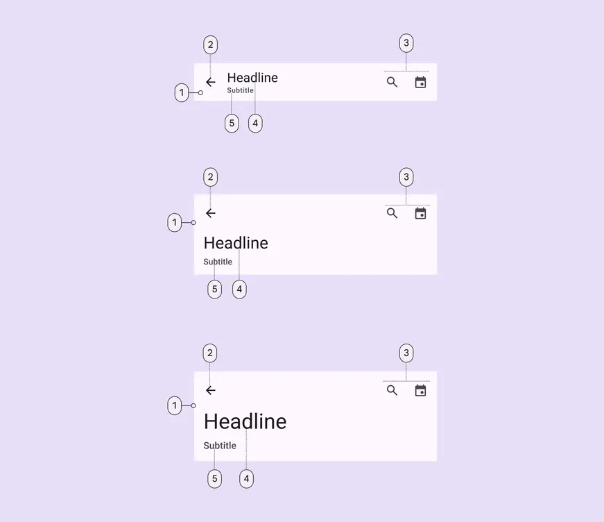
1. Container
2. Leading button
3. Trailing elements
4. Headline
5. Subtitle
App bars can be customized to include:
* An image or logo
* A subtitle
* A filled icon button
Avoid customizing the size of the heading and subtitle, or adding too many actions.
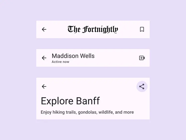
The app bar can have different layouts depending on which elements are shown
### Search
The search app bar can include trailing actions inside and outside the search bar. When the search bar is selected, it should open the [search view](../search/overview.md "The search view is a full-screen modal often used to display a list of search results. It can also be opened by selecting a search icon.") component.
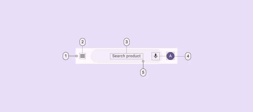
1. Container
2. Leading icon button
3. Hinted search text
4. Trailing icon or avatar
5. Search container
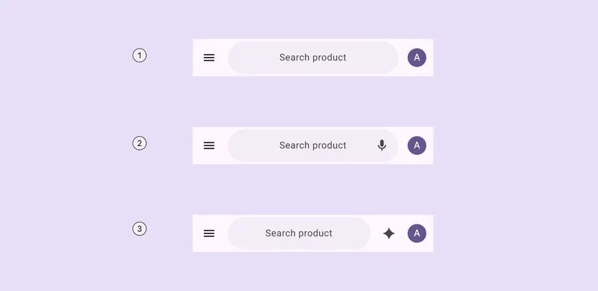
1. A leading element and a trailing element outside search
2. A leading element, a trailing element inside search, and a trailing element outside search
3. A leading element and two trailing elements outside search
### Image
An image can be placed in the app bar. In small app bars, this can replace the label text.
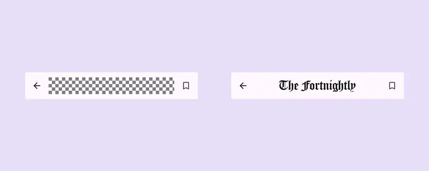
Images can be added to app bars and can replace label text on small app bars
### Filled trailing icon button
The app bar's trailing icon buttons can be replaced with a single, primary, or tonal filled icon button in default or wide sizes.

The trailing icons can be configured to be a single filled icon button
### Subtitle
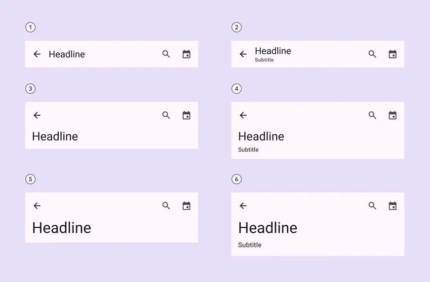
The medium flexible and large flexible app bars hug the text contents, so they are taller when a subtitle is visible
1. Small
2. Small with subtitle
3. Medium flexible
4. Medium flexible with subtitle
5. Large flexible
6. Large flexible with subtitle
## Color
Color values are implemented through design tokens. For design, this means working with color values that correspond with tokens. For implementation, a color value will be a token that references a value. [Learn more about design tokens](../../foundations/design-tokens/overview.md)
All app bars share the same color roles. On scroll, the container changes color to **surface container**.
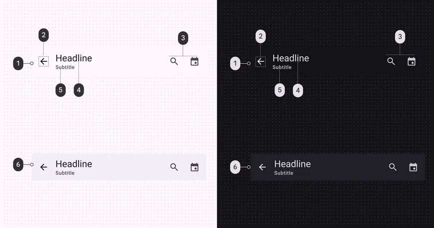
App bar color roles used for light and dark themes:
1. Surface
2. On surface
3. On surface variant
4. On surface
5. On surface variant
6. Surface container (on scroll)
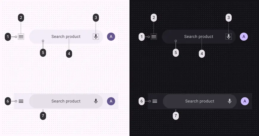
Search app bar color roles used for light and dark themes:
1. Surface
2. On surface variant
3. On surface variant
4. On surface variant
5. Surface container
6. Surface container
7. Surface container highest
### Scroll states
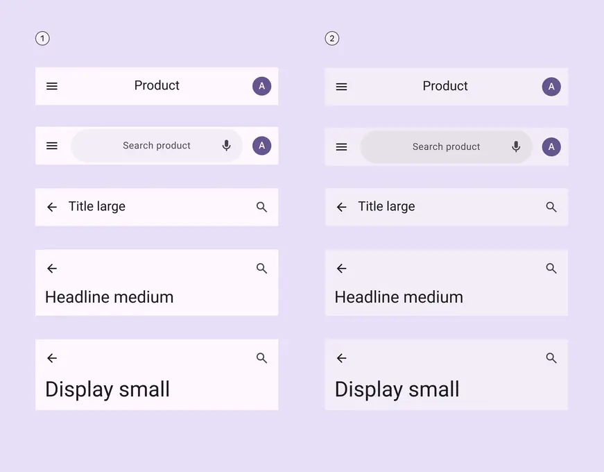
The app bar changes color when flat or on scroll. The search bar can also change color on scroll.
1. Flat
2. On scroll
## Measurements
### Search app bar
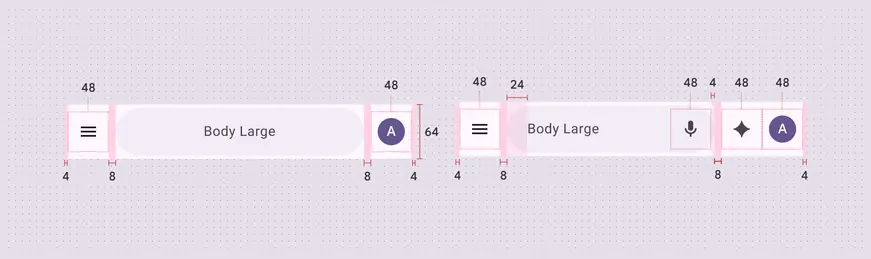
Search app bar padding and size measurements
### Small app bar
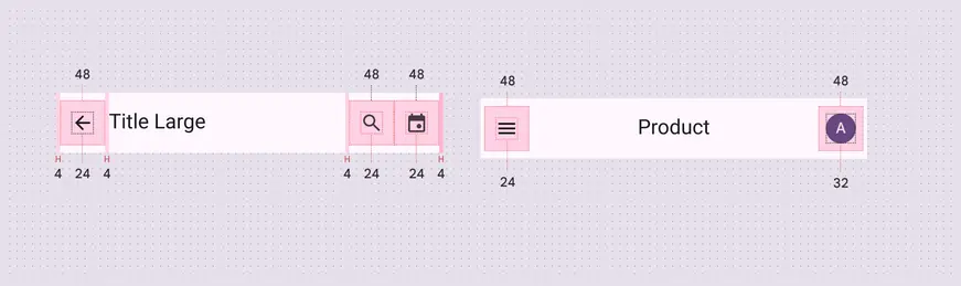
Small app bar padding and size measurements
### Medium flexible app bar
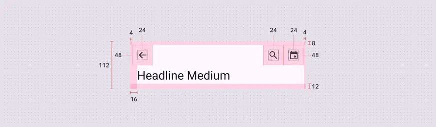
Medium flexible app bar padding and size measurements
### Large flexible app bar
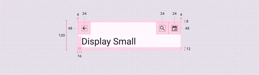
Large flexible app bar padding and size measurements
***
## Baseline app bars
The **medium** and **large** app bars are no longer recommended in M3 Expressive. Use the **medium flexible** and **large flexible** app bars in their place.
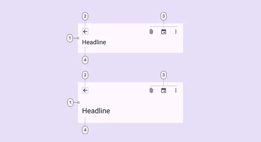
Medium and large app bars have the same elements:
1. Container
2. Leading button
3. Trailing icons
4. Headline
### Tokens & specs
Select a token set to view in the table's menu. Baseline app bar token sets are organized into medium, large, and older baseline token sets. [Learn about design tokens](../../foundations/design-tokens/overview.md)
::: token-table token-table-3ec622835c7987b5-4da6e74f
**App bars tokens** · 6 token sets · 80 tokens · [live token table](https://m3.material.io/components/app-bars/specs) · DSDB `TOKEN_TABLE.3ec622835c7987b5`
* Default context: Theme: Light · Platform: Android · Audience: 3P · Font: Static · Contrast: Default · iOS dark theme elevation: None · iOS weight setting: Default
* Not configurable here (group default used): Motion scheme: Standard · Language height: Small
* Other contexts: Theme: Dark · Contrast: Medium contrast, High contrast. "Other contexts" lists values that differ from the default when only that one context changes.
* Reference chain: aliases from the token to its source value (`token → alias → … → value`). "—" means the token holds a literal value.
**App bar - Size - Medium (baseline)** · `md.comp.app-bar.medium` · 4 tokens
For the baseline medium app bar. In expressive, consider using medium flexible instead \`md.comp.app-bar.medium-flexible\`.
| Group | Token | Type | Reference chain | Resolved value | Other contexts |
| --- | --- | --- | --- | --- | --- |
| All tokens | `md.comp.app-bar.medium.container.height` | Length | — | `112dp` | — |
| All tokens | `md.comp.app-bar.medium.title.font` | Typography | `md.sys.typescale.headline-small` → composite
font names: `md.sys.typescale.headline-small.font` → `md.ref.typeface.brand`
font weight: `md.sys.typescale.headline-small.weight` → `md.ref.typeface.weight-regular`
font size: `md.sys.typescale.headline-small.size`
line height: `md.sys.typescale.headline-small.line-height`
font tracking: `md.sys.typescale.headline-small.tracking` | `Roboto · weight 400 · size 24pt · line height 32pt · tracking 0pt` | — |
| All tokens | `md.comp.app-bar.medium.icon.size` (deprecated) | Length | — | `24dp` | — |
| All tokens | `md.comp.app-bar.medium.subtitle.font` (deprecated) | Typography | `md.sys.typescale.label-large` → composite
font names: `md.sys.typescale.label-large.font` → `md.ref.typeface.plain`
font weight: `md.sys.typescale.label-large.weight` → `md.ref.typeface.weight-medium`
font size: `md.sys.typescale.label-large.size`
line height: `md.sys.typescale.label-large.line-height`
font tracking: `md.sys.typescale.label-large.tracking` | `Roboto · weight 500 · size 14pt · line height 20pt · tracking 0.1pt` | — |
**App bar - Size - Large (baseline)** · `md.comp.app-bar.large` · 4 tokens
For the baseline large app bar. In expressive, consider using large flexible instead \`md.comp.app-bar.large-flexible\`.
| Group | Token | Type | Reference chain | Resolved value | Other contexts |
| --- | --- | --- | --- | --- | --- |
| All tokens | `md.comp.app-bar.large.container.height` | Length | — | `152dp` | — |
| All tokens | `md.comp.app-bar.large.title.font` | Typography | `md.sys.typescale.headline-medium` → composite
font names: `md.sys.typescale.headline-medium.font` → `md.ref.typeface.brand`
font weight: `md.sys.typescale.headline-medium.weight` → `md.ref.typeface.weight-regular`
font size: `md.sys.typescale.headline-medium.size`
line height: `md.sys.typescale.headline-medium.line-height`
font tracking: `md.sys.typescale.headline-medium.tracking` | `Roboto · weight 400 · size 28pt · line height 36pt · tracking 0pt` | — |
| All tokens | `md.comp.app-bar.large.icon.size` (deprecated) | Length | — | `24dp` | — |
| All tokens | `md.comp.app-bar.large.subtitle.font` (deprecated) | Typography | `md.sys.typescale.title-medium` → composite
font names: `md.sys.typescale.title-medium.font` → `md.ref.typeface.plain`
font weight: `md.sys.typescale.title-medium.weight` → `md.ref.typeface.weight-medium`
font size: `md.sys.typescale.title-medium.size`
line height: `md.sys.typescale.title-medium.line-height`
font tracking: `md.sys.typescale.title-medium.tracking` | `Roboto · weight 500 · size 16pt · line height 24pt · tracking 0.15pt` | — |
**\[Deprecated] Top app bar - Small** · `md.comp.top-app-bar.small` · 19 tokens
This token set is deprecated. Use \`md.comp.app-bar\` and \`md.comp.app-bar.small\` tokens instead. Original tokens for the small top app bar.
| Group | Token | Type | Reference chain | Resolved value | Other contexts |
| --- | --- | --- | --- | --- | --- |
| \[Deprecated] Enabled › \[Deprecated] Container | `md.comp.top-app-bar.small.container.color` (deprecated) | Color | `md.sys.color.surface` → `md.ref.palette.neutral98` | `#FEF7FF` | Dark: `#141218` via `md.ref.palette.neutral6` |
| \[Deprecated] Enabled › \[Deprecated] Container | `md.comp.top-app-bar.small.on-scroll.container.color` (deprecated) | Color | `md.sys.color.surface-container` → `md.ref.palette.neutral94` | `#F3EDF7` | Dark: `#211F26` via `md.ref.palette.neutral12` |
| \[Deprecated] Enabled › \[Deprecated] Container | `md.comp.top-app-bar.small.container.shape` (deprecated) | Shape | `md.sys.shape.corner.none` | `Rounded corners 0dp` | — |
| \[Deprecated] Enabled › \[Deprecated] Container | `md.comp.top-app-bar.small.container.height` (deprecated) | Length | — | `64dp` | — |
| \[Deprecated] Enabled › \[Deprecated] Container | `md.comp.top-app-bar.small.container.elevation` (deprecated) | Elevation | `md.sys.elevation.level0` | `0dp` | — |
| \[Deprecated] Enabled › \[Deprecated] Container | `md.comp.top-app-bar.small.container.surface-tint-layer.color` (deprecated) | Color | `md.sys.color.surface-tint` → `md.sys.color.primary` → `md.ref.palette.primary40` | `#6750A4` | Dark: `#D0BCFF` via `md.ref.palette.primary80`
Medium contrast: `#4F378B` via `md.ref.palette.primary30`
High contrast: `#381E72` via `md.ref.palette.primary20` |
| \[Deprecated] Enabled › \[Deprecated] Container | `md.comp.top-app-bar.small.on-scroll.container.shadow-color` (deprecated) | Color | `md.sys.color.shadow` → `md.ref.palette.neutral0` | `#000000` | — |
| \[Deprecated] Enabled › \[Deprecated] Leading icon | `md.comp.top-app-bar.small.leading-icon.size` (deprecated) | Length | — | `24dp` | — |
| \[Deprecated] Enabled › \[Deprecated] Leading icon | `md.comp.top-app-bar.small.leading-icon.color` (deprecated) | Color | `md.sys.color.on-surface` → `md.ref.palette.neutral10` | `#1D1B20` | Dark: `#E6E0E9` via `md.ref.palette.neutral90`
Medium contrast: `#000000` via `md.ref.palette.neutral0`
High contrast: `#000000` via `md.ref.palette.neutral0` |
| \[Deprecated] Enabled › \[Deprecated] Trailing icon | `md.comp.top-app-bar.small.trailing-icon.size` (deprecated) | Length | — | `24dp` | — |
| \[Deprecated] Enabled › \[Deprecated] Trailing icon | `md.comp.top-app-bar.small.trailing-icon.color` (deprecated) | Color | `md.sys.color.on-surface-variant` → `md.ref.palette.neutral-variant30` | `#49454F` | Dark: `#CAC4D0` via `md.ref.palette.neutral-variant80`
Medium contrast: `#322F37` via `md.ref.palette.neutral-variant20`
High contrast: `#000000` via `md.ref.palette.neutral-variant0` |
| \[Deprecated] Enabled › \[Deprecated] Headline | `md.comp.top-app-bar.small.headline.font` (deprecated) | Font names | `md.sys.typescale.title-large.font` → `md.ref.typeface.brand` | `Roboto` | — |
| \[Deprecated] Enabled › \[Deprecated] Headline | `md.comp.top-app-bar.small.headline.line-height` (deprecated) | Line height | `md.sys.typescale.title-large.line-height` | `28pt` | — |
| \[Deprecated] Enabled › \[Deprecated] Headline | `md.comp.top-app-bar.small.headline.size` (deprecated) | Font size | `md.sys.typescale.title-large.size` | `22pt` | — |
| \[Deprecated] Enabled › \[Deprecated] Headline | `md.comp.top-app-bar.small.headline.tracking` (deprecated) | Font tracking | `md.sys.typescale.title-large.tracking` | `0pt` | — |
| \[Deprecated] Enabled › \[Deprecated] Headline | `md.comp.top-app-bar.small.headline.weight` (deprecated) | Font weight | `md.sys.typescale.title-large.weight` → `md.ref.typeface.weight-regular` | `400` | — |
| \[Deprecated] Enabled › \[Deprecated] Headline | `md.comp.top-app-bar.small.headline.type` (deprecated) | Typography | composite
font names: `md.comp.top-app-bar.small.headline.font` → `md.sys.typescale.title-large.font` → `md.ref.typeface.brand`
font weight: `md.comp.top-app-bar.small.headline.weight` → `md.sys.typescale.title-large.weight` → `md.ref.typeface.weight-regular`
font size: `md.comp.top-app-bar.small.headline.size` → `md.sys.typescale.title-large.size`
line height: `md.comp.top-app-bar.small.headline.line-height` → `md.sys.typescale.title-large.line-height`
font tracking: `md.comp.top-app-bar.small.headline.tracking` → `md.sys.typescale.title-large.tracking` | `Roboto · weight 400 · size 22pt · line height 28pt · tracking 0pt` | — |
| \[Deprecated] Enabled › \[Deprecated] Headline | `md.comp.top-app-bar.small.headline.color` (deprecated) | Color | `md.sys.color.on-surface` → `md.ref.palette.neutral10` | `#1D1B20` | Dark: `#E6E0E9` via `md.ref.palette.neutral90`
Medium contrast: `#000000` via `md.ref.palette.neutral0`
High contrast: `#000000` via `md.ref.palette.neutral0` |
| \[Deprecated] Enabled › \[Deprecated] On scroll | `md.comp.top-app-bar.small.on-scroll.container.elevation` (deprecated) | Elevation | `md.sys.elevation.level2` | `3dp` | — |
**\[Deprecated] Top app bar - Medium** · `md.comp.top-app-bar.medium` · 16 tokens
This token set is deprecated. Use \`md.comp.app-bar\` and \`md.comp.app-bar.medium\` tokens instead. Original tokens for the medium top app bar.
| Group | Token | Type | Reference chain | Resolved value | Other contexts |
| --- | --- | --- | --- | --- | --- |
| \[Deprecated] Enabled › \[Deprecated] Container | `md.comp.top-app-bar.medium.container.color` (deprecated) | Color | `md.sys.color.surface` → `md.ref.palette.neutral98` | `#FEF7FF` | Dark: `#141218` via `md.ref.palette.neutral6` |
| \[Deprecated] Enabled › \[Deprecated] Container | `md.comp.top-app-bar.medium.container.shape` (deprecated) | Shape | `md.sys.shape.corner.none` | `Rounded corners 0dp` | — |
| \[Deprecated] Enabled › \[Deprecated] Container | `md.comp.top-app-bar.medium.container.height` (deprecated) | Length | — | `112dp` | — |
| \[Deprecated] Enabled › \[Deprecated] Container | `md.comp.top-app-bar.medium.container.elevation` (deprecated) | Elevation | `md.sys.elevation.level0` | `0dp` | — |
| \[Deprecated] Enabled › \[Deprecated] Container | `md.comp.top-app-bar.medium.container.surface-tint-layer.color` (deprecated) | Color | `md.sys.color.surface-tint` → `md.sys.color.primary` → `md.ref.palette.primary40` | `#6750A4` | Dark: `#D0BCFF` via `md.ref.palette.primary80`
Medium contrast: `#4F378B` via `md.ref.palette.primary30`
High contrast: `#381E72` via `md.ref.palette.primary20` |
| \[Deprecated] Enabled › \[Deprecated] Leading icon | `md.comp.top-app-bar.medium.leading-icon.size` (deprecated) | Length | — | `24dp` | — |
| \[Deprecated] Enabled › \[Deprecated] Leading icon | `md.comp.top-app-bar.medium.leading-icon.color` (deprecated) | Color | `md.sys.color.on-surface` → `md.ref.palette.neutral10` | `#1D1B20` | Dark: `#E6E0E9` via `md.ref.palette.neutral90`
Medium contrast: `#000000` via `md.ref.palette.neutral0`
High contrast: `#000000` via `md.ref.palette.neutral0` |
| \[Deprecated] Enabled › \[Deprecated] Trailing icon | `md.comp.top-app-bar.medium.trailing-icon.size` (deprecated) | Length | — | `24dp` | — |
| \[Deprecated] Enabled › \[Deprecated] Trailing icon | `md.comp.top-app-bar.medium.trailing-icon.color` (deprecated) | Color | `md.sys.color.on-surface-variant` → `md.ref.palette.neutral-variant30` | `#49454F` | Dark: `#CAC4D0` via `md.ref.palette.neutral-variant80`
Medium contrast: `#322F37` via `md.ref.palette.neutral-variant20`
High contrast: `#000000` via `md.ref.palette.neutral-variant0` |
| \[Deprecated] Enabled › \[Deprecated] Headline | `md.comp.top-app-bar.medium.headline.font` (deprecated) | Font names | `md.sys.typescale.headline-small.font` → `md.ref.typeface.brand` | `Roboto` | — |
| \[Deprecated] Enabled › \[Deprecated] Headline | `md.comp.top-app-bar.medium.headline.line-height` (deprecated) | Line height | `md.sys.typescale.headline-small.line-height` | `32pt` | — |
| \[Deprecated] Enabled › \[Deprecated] Headline | `md.comp.top-app-bar.medium.headline.size` (deprecated) | Font size | `md.sys.typescale.headline-small.size` | `24pt` | — |
| \[Deprecated] Enabled › \[Deprecated] Headline | `md.comp.top-app-bar.medium.headline.tracking` (deprecated) | Font tracking | `md.sys.typescale.headline-small.tracking` | `0pt` | — |
| \[Deprecated] Enabled › \[Deprecated] Headline | `md.comp.top-app-bar.medium.headline.weight` (deprecated) | Font weight | `md.sys.typescale.headline-small.weight` → `md.ref.typeface.weight-regular` | `400` | — |
| \[Deprecated] Enabled › \[Deprecated] Headline | `md.comp.top-app-bar.medium.headline.type` (deprecated) | Typography | composite
font names: `md.comp.top-app-bar.medium.headline.font` → `md.sys.typescale.headline-small.font` → `md.ref.typeface.brand`
font weight: `md.comp.top-app-bar.medium.headline.weight` → `md.sys.typescale.headline-small.weight` → `md.ref.typeface.weight-regular`
font size: `md.comp.top-app-bar.medium.headline.size` → `md.sys.typescale.headline-small.size`
line height: `md.comp.top-app-bar.medium.headline.line-height` → `md.sys.typescale.headline-small.line-height`
font tracking: `md.comp.top-app-bar.medium.headline.tracking` → `md.sys.typescale.headline-small.tracking` | `Roboto · weight 400 · size 24pt · line height 32pt · tracking 0pt` | — |
| \[Deprecated] Enabled › \[Deprecated] Headline | `md.comp.top-app-bar.medium.headline.color` (deprecated) | Color | `md.sys.color.on-surface` → `md.ref.palette.neutral10` | `#1D1B20` | Dark: `#E6E0E9` via `md.ref.palette.neutral90`
Medium contrast: `#000000` via `md.ref.palette.neutral0`
High contrast: `#000000` via `md.ref.palette.neutral0` |
**\[Deprecated] Top app bar - Large** · `md.comp.top-app-bar.large` · 16 tokens
This token set is deprecated. Use \`md.comp.app-bar\` and \`md.comp.app-bar.large\` tokens instead. Original tokens for the large top app bar.
| Group | Token | Type | Reference chain | Resolved value | Other contexts |
| --- | --- | --- | --- | --- | --- |
| \[Deprecated] Enabled › \[Deprecated] Container | `md.comp.top-app-bar.large.container.color` (deprecated) | Color | `md.sys.color.surface` → `md.ref.palette.neutral98` | `#FEF7FF` | Dark: `#141218` via `md.ref.palette.neutral6` |
| \[Deprecated] Enabled › \[Deprecated] Container | `md.comp.top-app-bar.large.container.shape` (deprecated) | Shape | `md.sys.shape.corner.none` | `Rounded corners 0dp` | — |
| \[Deprecated] Enabled › \[Deprecated] Container | `md.comp.top-app-bar.large.container.height` (deprecated) | Length | — | `152dp` | — |
| \[Deprecated] Enabled › \[Deprecated] Container | `md.comp.top-app-bar.large.container.elevation` (deprecated) | Elevation | `md.sys.elevation.level0` | `0dp` | — |
| \[Deprecated] Enabled › \[Deprecated] Container | `md.comp.top-app-bar.large.container.surface-tint-layer.color` (deprecated) | Color | `md.sys.color.surface-tint` → `md.sys.color.primary` → `md.ref.palette.primary40` | `#6750A4` | Dark: `#D0BCFF` via `md.ref.palette.primary80`
Medium contrast: `#4F378B` via `md.ref.palette.primary30`
High contrast: `#381E72` via `md.ref.palette.primary20` |
| \[Deprecated] Enabled › \[Deprecated] Leading icon | `md.comp.top-app-bar.large.leading-icon.size` (deprecated) | Length | — | `24dp` | — |
| \[Deprecated] Enabled › \[Deprecated] Leading icon | `md.comp.top-app-bar.large.leading-icon.color` (deprecated) | Color | `md.sys.color.on-surface` → `md.ref.palette.neutral10` | `#1D1B20` | Dark: `#E6E0E9` via `md.ref.palette.neutral90`
Medium contrast: `#000000` via `md.ref.palette.neutral0`
High contrast: `#000000` via `md.ref.palette.neutral0` |
| \[Deprecated] Enabled › \[Deprecated] Trailing icon | `md.comp.top-app-bar.large.trailing-icon.size` (deprecated) | Length | — | `24dp` | — |
| \[Deprecated] Enabled › \[Deprecated] Trailing icon | `md.comp.top-app-bar.large.trailing-icon.color` (deprecated) | Color | `md.sys.color.on-surface-variant` → `md.ref.palette.neutral-variant30` | `#49454F` | Dark: `#CAC4D0` via `md.ref.palette.neutral-variant80`
Medium contrast: `#322F37` via `md.ref.palette.neutral-variant20`
High contrast: `#000000` via `md.ref.palette.neutral-variant0` |
| \[Deprecated] Enabled › \[Deprecated] Headline | `md.comp.top-app-bar.large.headline.font` (deprecated) | Font names | `md.sys.typescale.headline-medium.font` → `md.ref.typeface.brand` | `Roboto` | — |
| \[Deprecated] Enabled › \[Deprecated] Headline | `md.comp.top-app-bar.large.headline.line-height` (deprecated) | Line height | `md.sys.typescale.headline-medium.line-height` | `36pt` | — |
| \[Deprecated] Enabled › \[Deprecated] Headline | `md.comp.top-app-bar.large.headline.size` (deprecated) | Font size | `md.sys.typescale.headline-medium.size` | `28pt` | — |
| \[Deprecated] Enabled › \[Deprecated] Headline | `md.comp.top-app-bar.large.headline.tracking` (deprecated) | Font tracking | `md.sys.typescale.headline-medium.tracking` | `0pt` | — |
| \[Deprecated] Enabled › \[Deprecated] Headline | `md.comp.top-app-bar.large.headline.weight` (deprecated) | Font weight | `md.sys.typescale.headline-medium.weight` → `md.ref.typeface.weight-regular` | `400` | — |
| \[Deprecated] Enabled › \[Deprecated] Headline | `md.comp.top-app-bar.large.headline.type` (deprecated) | Typography | composite
font names: `md.comp.top-app-bar.large.headline.font` → `md.sys.typescale.headline-medium.font` → `md.ref.typeface.brand`
font weight: `md.comp.top-app-bar.large.headline.weight` → `md.sys.typescale.headline-medium.weight` → `md.ref.typeface.weight-regular`
font size: `md.comp.top-app-bar.large.headline.size` → `md.sys.typescale.headline-medium.size`
line height: `md.comp.top-app-bar.large.headline.line-height` → `md.sys.typescale.headline-medium.line-height`
font tracking: `md.comp.top-app-bar.large.headline.tracking` → `md.sys.typescale.headline-medium.tracking` | `Roboto · weight 400 · size 28pt · line height 36pt · tracking 0pt` | — |
| \[Deprecated] Enabled › \[Deprecated] Headline | `md.comp.top-app-bar.large.headline.color` (deprecated) | Color | `md.sys.color.on-surface` → `md.ref.palette.neutral10` | `#1D1B20` | Dark: `#E6E0E9` via `md.ref.palette.neutral90`
Medium contrast: `#000000` via `md.ref.palette.neutral0`
High contrast: `#000000` via `md.ref.palette.neutral0` |
**\[Deprecated] Top app bar - Small, Center-aligned** · `md.comp.top-app-bar.small.centered` · 21 tokens
This token set is deprecated. Use \`md.comp.app-bar\` and \`md.comp.app-bar.small\` tokens instead. Original component tokens for the center-aligned top app bar.
| Group | Token | Type | Reference chain | Resolved value | Other contexts |
| --- | --- | --- | --- | --- | --- |
| Enabled › Avatar | `md.comp.top-app-bar.small.centered.avatar.size` (deprecated) | Length | — | `30dp` | — |
| Enabled › Avatar | `md.comp.top-app-bar.small.centered.avatar.shape` (deprecated) | Shape | `md.sys.shape.corner.full` | `Circular (fully rounded)` | — |
| Enabled › Container | `md.comp.top-app-bar.small.centered.container.color` (deprecated) | Color | `md.sys.color.surface` → `md.ref.palette.neutral98` | `#FEF7FF` | Dark: `#141218` via `md.ref.palette.neutral6` |
| Enabled › Container | `md.comp.top-app-bar.small.centered.container.shape` (deprecated) | Shape | `md.sys.shape.corner.none` | `Rounded corners 0dp` | — |
| Enabled › Container | `md.comp.top-app-bar.small.centered.container.height` (deprecated) | Length | — | `64dp` | — |
| Enabled › Container | `md.comp.top-app-bar.small.centered.container.elevation` (deprecated) | Elevation | `md.sys.elevation.level0` | `0dp` | — |
| Enabled › Container | `md.comp.top-app-bar.small.centered.container.surface-tint-layer.color` (deprecated) | Color | `md.sys.color.surface-tint` → `md.sys.color.primary` → `md.ref.palette.primary40` | `#6750A4` | Dark: `#D0BCFF` via `md.ref.palette.primary80`
Medium contrast: `#4F378B` via `md.ref.palette.primary30`
High contrast: `#381E72` via `md.ref.palette.primary20` |
| Enabled › Container | `md.comp.top-app-bar.small.centered.on-scroll.container.shadow-color` (deprecated) | Color | `md.sys.color.shadow` → `md.ref.palette.neutral0` | `#000000` | — |
| Enabled › Container | `md.comp.top-app-bar.small.centered.on-scroll.container.color` (deprecated) | Color | `md.sys.color.surface-container` → `md.ref.palette.neutral94` | `#F3EDF7` | Dark: `#211F26` via `md.ref.palette.neutral12` |
| Enabled › Leading icon | `md.comp.top-app-bar.small.centered.leading-icon.size` (deprecated) | Length | — | `24dp` | — |
| Enabled › Leading icon | `md.comp.top-app-bar.small.centered.leading-icon.color` (deprecated) | Color | `md.sys.color.on-surface` → `md.ref.palette.neutral10` | `#1D1B20` | Dark: `#E6E0E9` via `md.ref.palette.neutral90`
Medium contrast: `#000000` via `md.ref.palette.neutral0`
High contrast: `#000000` via `md.ref.palette.neutral0` |
| Enabled › Trailing icon | `md.comp.top-app-bar.small.centered.trailing-icon.size` (deprecated) | Length | — | `24dp` | — |
| Enabled › Trailing icon | `md.comp.top-app-bar.small.centered.trailing-icon.color` (deprecated) | Color | `md.sys.color.on-surface-variant` → `md.ref.palette.neutral-variant30` | `#49454F` | Dark: `#CAC4D0` via `md.ref.palette.neutral-variant80`
Medium contrast: `#322F37` via `md.ref.palette.neutral-variant20`
High contrast: `#000000` via `md.ref.palette.neutral-variant0` |
| Enabled › Headline | `md.comp.top-app-bar.small.centered.headline.font` (deprecated) | Font names | `md.sys.typescale.title-large.font` → `md.ref.typeface.brand` | `Roboto` | — |
| Enabled › Headline | `md.comp.top-app-bar.small.centered.headline.line-height` (deprecated) | Line height | `md.sys.typescale.title-large.line-height` | `28pt` | — |
| Enabled › Headline | `md.comp.top-app-bar.small.centered.headline.size` (deprecated) | Font size | `md.sys.typescale.title-large.size` | `22pt` | — |
| Enabled › Headline | `md.comp.top-app-bar.small.centered.headline.tracking` (deprecated) | Font tracking | `md.sys.typescale.title-large.tracking` | `0pt` | — |
| Enabled › Headline | `md.comp.top-app-bar.small.centered.headline.weight` (deprecated) | Font weight | `md.sys.typescale.title-large.weight` → `md.ref.typeface.weight-regular` | `400` | — |
| Enabled › Headline | `md.comp.top-app-bar.small.centered.headline.type` (deprecated) | Typography | composite
font names: `md.comp.top-app-bar.small.centered.headline.font` → `md.sys.typescale.title-large.font` → `md.ref.typeface.brand`
font weight: `md.comp.top-app-bar.small.centered.headline.weight` → `md.sys.typescale.title-large.weight` → `md.ref.typeface.weight-regular`
font size: `md.comp.top-app-bar.small.centered.headline.size` → `md.sys.typescale.title-large.size`
line height: `md.comp.top-app-bar.small.centered.headline.line-height` → `md.sys.typescale.title-large.line-height`
font tracking: `md.comp.top-app-bar.small.centered.headline.tracking` → `md.sys.typescale.title-large.tracking` | `Roboto · weight 400 · size 22pt · line height 28pt · tracking 0pt` | — |
| Enabled › Headline | `md.comp.top-app-bar.small.centered.headline.color` (deprecated) | Color | `md.sys.color.on-surface` → `md.ref.palette.neutral10` | `#1D1B20` | Dark: `#E6E0E9` via `md.ref.palette.neutral90`
Medium contrast: `#000000` via `md.ref.palette.neutral0`
High contrast: `#000000` via `md.ref.palette.neutral0` |
| Enabled › On scroll | `md.comp.top-app-bar.small.centered.on-scroll.container.elevation` (deprecated) | Elevation | `md.sys.elevation.level2` | `3dp` | — |
:::
### Color
Color values are implemented through design tokens. For designers, this means working with color values that correspond with tokens. In implementation, a color value will be a token that references a value. [Learn more about design tokens](../../foundations/design-tokens/overview.md)
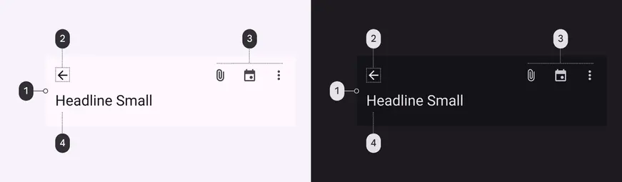
Medium top app bar color roles used for light and dark schemes:
1. Surface
2. On surface
3. On surface
4. On surface variant
### Measurements
#### Medium app bar

Medium app bar padding and size measurements
#### Large app bar

Large app bar padding and size measurements