---
url: /components/app-bars/overview.md
description: >-
Top app bars display navigation, actions, and text at the top of a screen.
They contain a title and actions related to the current screen.
---
# App bars
Top app bars display navigation, actions, and text at the top of a screen. They contain a title and actions related to the current screen.
**Overview** · [Specs](specs.md) · [Guidelines](guidelines.md) · [Accessibility](accessibility.md)
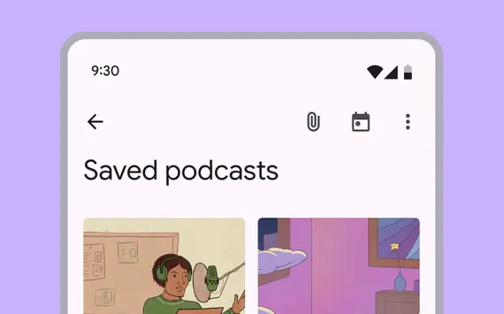
* Focus on describing the current page and provide 1–2 essential actions
* Displays labels and page navigation controls at the top of the page. (Use a [toolbar](../toolbars/overview.md "Toolbars display frequently used actions relevant to the current page.") to display page actions)
* Four variants: Search app bar, small, medium flexible, large flexible
* On scroll, apply a fill color to separate from body content
* Can animate on and off screen with another bar of controls, like a row of [chips](../chips/overview.md "Chips help people enter information, make selections, filter content, or trigger actions.")
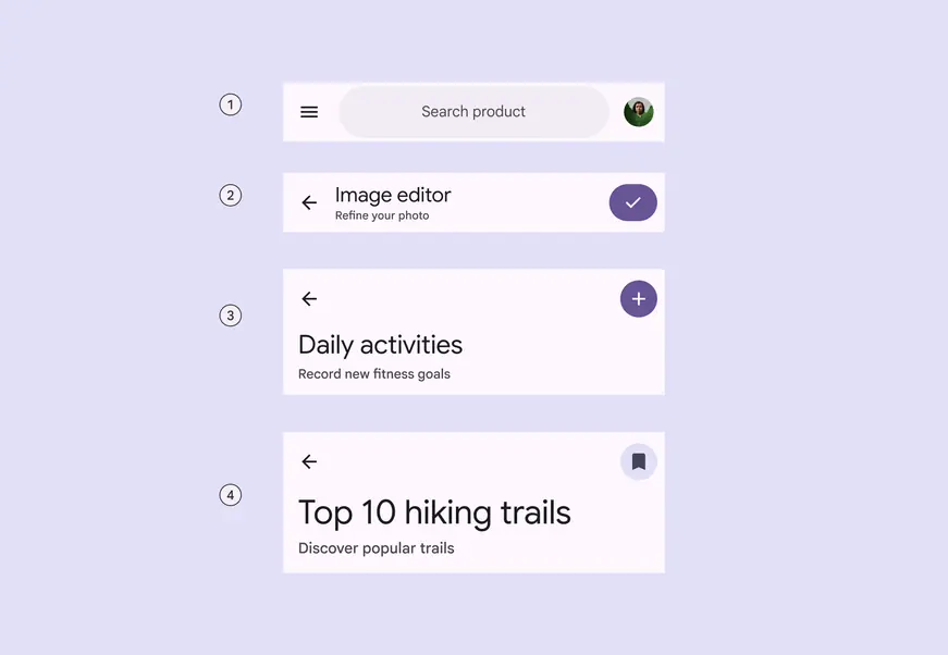
1. Search app bar
2. Small
3. Medium flexible
4. Large flexible
## Availability & resources
| Type | Resource | Status |
| --- | --- | --- |
| Design | [Design Kit (Figma)](https://www.figma.com/community/file/1035203688168086460) | Available |
| Implementation | [Flutter](https://api.flutter.dev/flutter/material/AppBar-class.html) | Available |
| Implementation | [Jetpack Compose](https://developer.android.com/develop/ui/compose/components/app-bars?hl=en) | Available |
| Implementation | [Jetpack Compose: Expressive](https://developer.android.com/reference/kotlin/androidx/compose/material3/package-summary#AppBarRow\(kotlin.Function1,androidx.compose.ui.Modifier,kotlin.Function1\)) | Available |
| Implementation | [Android Views (MDC-Android)](https://github.com/material-components/material-components-android/blob/master/docs/components/TopAppBar.md) | Available |
| Implementation | [Android Views (MDC-Android): Expressive](https://github.com/material-components/material-components-android/blob/master/docs/components/TopAppBar.md) | Available |
| Implementation | Web | Unavailable |
| Implementation | Web: Expressive | Unavailable |
## M3 Expressive update
**May 2025**
The new **search app bar** supports icons inside and outside the search bar, and centered text. It opens the [search view](../search/overview.md) component when selected.
The new **medium flexible** and **large flexible** app bars come with significant improvements, and should replace **medium** and **large** app bars, which are no longer recommended. The **small** app bar is updated with the same flexible improvements.
[More on M3 Expressive](https://m3.material.io/blog/building-with-m3-expressive)
Variants and naming:
* Renamed component from **top app bar** to **app bar**
* Added **search app bar**
* **Medium** and **large** app bars are no longer recommended
* Added **medium flexible** and **large flexible **app bars with:
* Reduced overall height
* Larger title text
* Subtitle
* Left- and center-aligned text options
* Text wrapping
* More flexible elements for imagery and filled buttons
* Added features to **small **app bar:
* Subtitle
* Center-aligned text option
* More flexible elements for imagery and filled buttons
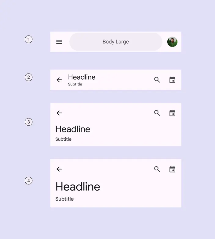
1. Search app bar
2. Small
3. Medium flexible
4. Large flexible
## Differences from M2
* Color: New color mappings and compatibility with dynamic color
* On scroll: No drop shadow, instead a color fill creates separation from content
* Typography: Larger default text
* Layout: Smaller default height
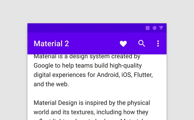
M2: Elevation and a drop shadow raise the top app bar when content is present underneath
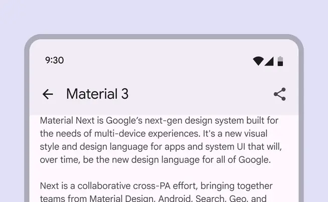
M3: On scroll, a color fill overlay separates the app bar from the content beneath